Making a tall, skinny plot in Mathematica

Yesterday’s post included this plot:
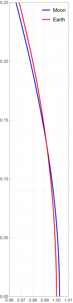
I figured it was worth a quick post to show how I made it.
I had already done most of the work back in 2022 in a Mathematica notebook I made to support my original orbital curvature post. So I copied the pertinent calculations from that notebook, pasted them into a new one, and made the adjustments necessary to produce the plot. Here’s the new notebook:
The bottom half of the notebook is where the plotting commands are. The key items are:
- The definitions of
xGrid,xTicks,yGrid, andyTicks. These produce lists of values used to lay out the grid spacing and tick mark labels. Most of this is self-explanatory, but I do want to call out the use ofNumberFormto format the tick labels with two decimal places.NumberForm[x, {3, 2}]is very much like Python’s{x:3.2f}in an f-string. Like most things in Mathematica, it’s kind of verbose, but it is readable. - The call to
ParametricPlotincludes the optionAspectRatio -> .25/.05AspectRatiosets the ratio of height to width for the plot as a whole, so the value I set it to was based on the ratio of the values given in thePlotRangeoption. The overall plot is 0.25 units high and 0.05 units wide, so to make the x and y units the same size,AspectRatiois set to that ratio. I entered it as a division instead of as the number 5 because I wanted the reasoning behind it to be clear. I suppose I could have been even more explicit by saying
but there are limits to my verbosity, even when using Mathematica.AspectRatio -> (.25 - 0)/(1.01 - .96)
To get the image out of the notebook, I right-clicked on it, selected Save Graphic As… from the popup menu, and chose SVG as the format. That’s why the plot stays smooth if you zoom in on it.

 点赞
点赞 收藏
收藏 点踩
点踩 分享
分享评论
?
参与讨论