Distorted plots
Rhett Allain, physics professor and blogger, published a nice article today about the Moon’s orbit. It follows largely the same line of reasoning as my post on the same topic (and the various write-ups I linked to in that post) from a few years ago. I nodded my head as I read through it, until I got to a plot at the end of the article.
For much of the article, Allain complains about how the orbit of the Moon as it and the Earth make their way around the Sun is often distorted in textbooks. Like this, which is a frame from an animated GIF in the article.
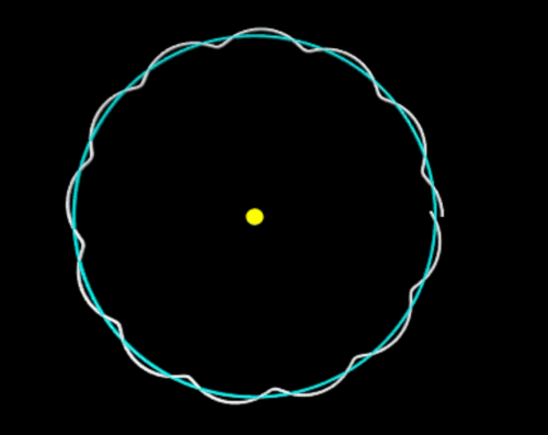
In this image, the Earth-Moon distance is exaggerated, and it looks like the Moon curves away from the Sun when it’s between the Earth and the Sun. To show that this is wrong, he plots portions of the Moon and Earth orbits without exaggerating the Moon-Earth distance:
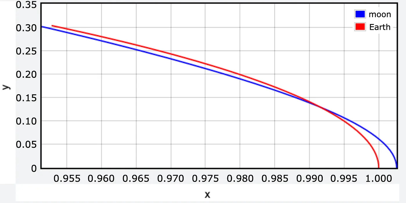
Forgive me, but what the actual fuck? How can you spend over 1000 words complaining about graphical distortions and then produce this? Sure, it’s not the same distortion he was complaining about, but still. The whole point of the article was to show that the Moon’s path over the course of an Earth year is a sort of wobbly circle around the Sun. The arcs in this plot are nowhere near circular.
Here’s a properly scaled version of Allain’s plot:
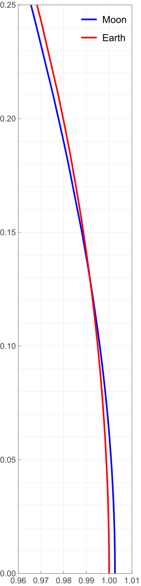
Yes, the plot is really tall and skinny. It has to be to avoid distorting the paths. Note that the grids are square and represent the same distance in each direction.
We all know how this happened. The range of the x data is very small compared to the range of the y data, but because the plotting software defaults to a landscape-style graph, the paths come out looking like arcs of very wide ellipses. Unless the person running the software steps in to make sure x and y distances are drawn to the same scale.
I could write a post like this almost every day. So many people accept the defaults of their graphing software without thinking about how one or two small tweaks could make their plots so much better.

 点赞
点赞 收藏
收藏 点踩
点踩 分享
分享