Ten ways designers lie to themselves

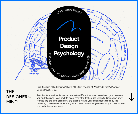
I just finished “The Designer’s Mind,” the first section of Wouter de Bres’s Product Design Psychology. Ten chapters, and each one picks apart a different way your own head gets between you and the user. Read back to back, they stop feeling like separate biases and start looking like one long argument: the biggest risk to your design isn’t the user, the deadline, or the stakeholder. It’s you, and how convinced you are that your read on the screen is the correct one.
Here’s what stuck, chapter by chapter, and where I’ve caught myself doing it.

False consensus: you assume other people would choose what you’d choose, and when they don’t, you decide something’s wrong with them, not your design. Ross’s Stanford experiments from 1977 found this runs both directions. People who pay a speeding ticket assume that’s the normal move, and read anyone who fights it as combative or paranoid. People who fight it think the ticket-payers are pushovers. Everyone starts from their own choice and treats it as the baseline.
I’ve sat in reviews where a usability test participant misses a menu label and the room’s first move is to explain the participant, not the label. “They weren’t paying attention.” “Not our target user.” That’s the tell. Color launched in 2011 with $41 million and a photo app nobody outside the building understood, because the people inside it already got the point.
The check: name whose preference is driving the decision. If you hesitate, it’s yours.
Impostor phenomenon doesn’t stay private. Clance and Imes named it in 1978 as a feeling of intellectual phoniness that persists no matter how much evidence contradicts it. What makes it a design problem, not just a feelings problem, is self-handicapping: you pull the bold version before anyone gets to react to it, so you’ve got a built-in excuse ready if it flops.
The Degreed story in the book is the clearest version of this: a designer builds a correct, exhausting admin screen, has better explorations sitting in the file, and waves them off as “too crazy.” They weren’t. They got built. They worked. The safe version would have shipped if nobody had asked what else was in the file.
The check: before you cut a bold direction, ask if the evidence says it’s wrong, or if you’re just scared to be the one who backed it.

Cognitive dissonance turns feedback into a threat once the work has started standing in for your competence. Festinger described the discomfort of holding two conflicting beliefs; Tavris and Aronson showed how people build elaborate justifications to protect a decision once their identity is wrapped around it. Kahan’s point is the ugly one: smart people are often better at defending a bad idea, because they’re better at generating reasons.
Microsoft’s Kin is the example — a $1 billion, two-year project that shipped without an app store or calendar on a phone built for teenagers who lived on apps. The flaws weren’t subtle. They were just inconvenient to say out loud that late.
The check: pre-mortem the thing. Not “what might go wrong” — say it already failed, then explain why. It’s a small wording shift, but it takes you out of defense mode.
Processing fluency: familiar things are easier to think about, and your brain reads that ease as quality. Reber, Schwarz, and Winkielman’s research says the fluency itself produces the positive reaction, not the object. Add Rozenblit and Keil’s finding that people wildly overestimate how well they understand ordinary things until they’re asked to explain them step by step, and you get a designer who thinks a screen is obvious because they’ve stopped having to work to read it.
Google Wave is the case study — built by people who’d already shipped Google Maps, killed a year after launch because the people who built it could still read it and nobody else could.
The check: narrate the screen out loud like you’re seeing it cold. The first place the narration gets muddy isn’t a speaking problem.
Real taste comes from Hekkert’s expert-viewer studies: trained eyes tolerate and correctly judge altered work better than untrained ones, because training changes what you can evaluate. But Zajonc’s mere exposure research shows a cheap version of the same feeling — you like a shape, word, or face more just from seeing it repeatedly, with zero change in quality. Bornstein’s review of 200+ studies confirms it holds across images, sounds, faces, symbols.
The dangerous part for anyone who lives inside their own Figma file all day: you can’t always tell which one is talking. MySpace’s clutter felt expressive to the people who built and lived inside it, and looked like “eyeball-melting page layouts” to Wired by 2008. Facebook’s plainness read as empty to MySpace natives and legible to everyone else. One of those won.
The check: put your screen next to three things you respect solving the same problem. Comparison breaks the closed loop that repetition builds.

Divergent thinking, per Guilford’s 1950 APA address, needs output to work against. You can’t generate options by staring at a wall; you generate them by making something rough and reacting to it. Amabile’s research on creative work names domain skill, creative thinking skill, and motivation as the real inputs. Inspiration isn’t on the list.
IDEO’s five-day shopping cart redesign for ABC Nightline is the proof: no time to wait for a good idea, so they didn’t. They watched shoppers, sketched fast, built wrong versions on purpose, and the working prototype by day five beat what was on the market.
The check: twenty minutes, timer on, make something bad on purpose. If that feels too soon, that’s the signal, not the excuse.
Yerkes and Dodson’s 1908 experiments found a middle zone where pressure helps and a point past it where it doesn’t — it narrows thinking down to “ship or don’t ship” and drowns out the nuance a real decision needs. Staw’s 1981 research on threatened teams found they pull decisions upward, share less, and fall back on old patterns. Nobody wants to be the one who slows things down.
Challenger is the extreme version: engineers who’d never tested O-rings below 12°C told NASA not to launch at -6°C, got told to prove it would fail rather than prove it was safe, and were overruled. Seventy-three seconds after launch, the shuttle broke apart.
The check, at the worst possible moment: not “should we delay,” which invites the easy answer, but “what do we need to check this.” Turns a vague worry into an estimate you can actually act on.

Design fixation: Jansson and Smith’s 1991 study showed engineers who saw a flawed sample kept reproducing its shape even after being told it was flawed and shown why. Knowing about the trap didn’t get them out of it. The Einstellung effect is the broader version — once your brain finds one route through a problem, it keeps reaching for that route even when a better one is sitting right there.
Zune is the product case: Microsoft built a straight answer to the iPod — scroll wheel, music-first interface, sync software — because the question they asked from day one was “how do we do what the iPod does, but better.” That question locked the frame before the product had a chance to be anything else. It never outsold Apple, trailed SanDisk, and got pulled in 2011.
The check: name the one assumption your first sketch takes for granted, then do a rough draft assuming the opposite. Not a variation — a contradiction. Most “exploration” is just polish on the sketch from the first twenty minutes.
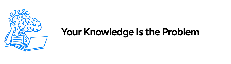
The curse of knowledge: once you know how something works, you can’t reconstruct what it looks like to someone who doesn’t. Camerer, Loewenstein, and Weber’s 1989 Wharton experiments found this failure holds no matter how hard people try to correct for it, and knowing more makes the prediction worse, not better. Carl Wieman found the same thing in physics professors who couldn’t understand why students found “obvious” concepts hard.
Your brain doesn’t slow down and inspect a familiar screen. It rebuilds the meaning from memory, below awareness. So the vague label reads as clear, the buried feature doesn’t look hidden, because you’re filling in the gaps with context the user never had. Photoshop is the case here: built by and for professionals, so basic to its own team that Adobe eventually had to ship an entirely separate product, Elements, to reach anyone without that vocabulary. Polishing Photoshop couldn’t fix it. The gap wasn’t in the execution.
The check: put the product in front of someone with zero context, go quiet, and watch where they slow down, misread, or quit. Each of those spots is a hole your own knowledge was filling in without telling you.
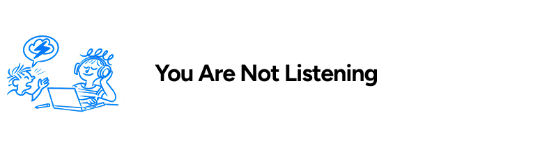
Confirmation bias doesn’t just distort how you interpret feedback — it decides what feedback you notice in the first place. Wason’s 1960 rule-guessing experiment found people test the theory they already hold, not the one that could disprove it. Nickerson’s review of the research names the mechanism outright: once you’ve taken a position, your primary purpose becomes defending it.
It shows up in research synthesis as an asymmetry: the confirming quote gets written down in full, the contradicting one gets compressed to two words — “edge case,” “needs onboarding.” Segway is the product case. Every round of pushback on price, sidewalks, and city infrastructure got reread as “people don’t get it yet” instead of “this doesn’t fit.” Five years, thirty thousand units. Production ended in 2020.
The check: before the research starts, write down what would prove you wrong. Not “keep an open mind” — a specific failure condition on paper. Then in synthesis, assign someone the job of arguing the current direction shouldn’t ship, and mark the moments that made the room go quiet before you mark the moments that confirmed what you already thought.
What ties these together:
Every chapter is the same shape: your brain protects a belief it already holds, and it does that protecting so quietly it feels like judgment instead of defense. False consensus protects your assumptions about users. Impostor syndrome protects you from exposure. Cognitive dissonance protects your identity. Fluency protects your read on your own screen. Mere exposure protects your attachment to what you’ve stared at longest. Waiting for inspiration protects you from making something embarrassing. Stress protects you from sitting with an unresolved risk. Fixation protects the first idea that felt right. The curse of knowledge protects the gap between what you know and what the user knows. Confirmation bias protects the conclusion you walked in with.
None of it announces itself as bias. It shows up as confidence. That’s the actual finding across all ten chapters, and it’s the reason a decade and a half in the industry doesn’t make you immune — it can just make the defense more articulate.
Every check in this section points at the same move: get a version of the truth that doesn’t come from inside your own head. A fresh viewer, a named assumption you argue against, a failure condition written down before you go looking for it, someone in the room whose job is to disagree with you. None of these are cures. They’re just ways of forcing a second source into a process that’s otherwise a closed loop between you and the thing you already made.
Ten ways designers lie to themselves was originally published in Bootcamp on Medium, where people are continuing the conversation by highlighting and responding to this story.

 点赞
点赞 收藏
收藏 点踩
点踩 分享
分享