
Ninth Circuit Reminds Businesses: “Clickwrap or It’s Crap”
 2


The Ninth Circuit struck down two more TOS formations this week. In both cases, the panels applied exacting standards when reviewing the screens. You’ve been warned about this risk (many times).
Morrison v. Yippee Entertainment, Inc., No. 25-7161 (9th Cir. Nov. 5, 2026)
In 2025, the Ninth Circuit held that Yippee’s TOS provided reasonably conspicuous notice, but that decision did not resolve if consumers manifested assent to the TOS. On remand, the district court said there was no assent. On appeal, with a completely different panel of judges than the 2025 panel, the Ninth Circuit agrees.
This is the screen in question (the panel opinion doesn’t display it):
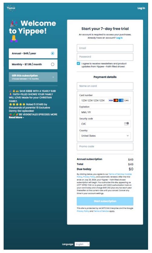
Citing Godun, the panel says:
The sign-in wrap here did not explicitly and unambiguously identify how a user manifested assent to the arbitration agreement. The advisal on Yippee’s webpage said that a user agreed to the terms containing the arbitration agreement by “clicking below,” but there is no unambiguous reference that this required the user to click the “Start subscription” action button. Instead, there were six clickable items “below” that advisal: hyperlinks to Yippee’s terms of service, cookie policy, and privacy policy; slightly farther down, the “Start Subscription” button; and directly below that, hyperlinks to Google’s terms of service and privacy policy. There is no explicit indication which of these clickable items “below” manifests assent to arbitrate.
Motion to arbitrate denied.
Yippee’s execution was suboptimal, but also, c’mon. Kicking out this TOS formation for the offer/acceptance mismatch was pretty harsh. Look at the screen again. Below the “by clicking below” line, there are 5 text links embedded in text and one giant blue button saying “start subscription.” It would have been trivially easy for Yippee to say “by clicking the ‘start subscription’ button” rather than the vaguer “by clicking below” phrase. At the same time, did consumers not understand what was going to happen when they clicked on the “start subscription” button?
This switcheroo from the last 9th Circuit decision is a good example of how Godun encouraged formalistic pixel-policing to nuke any TOS formation with even small flaws. It probably also didn’t help Yippee to have a complete turnover in the court’s panel composition.
* * *
In re Snowlake, Inc. Data Security Breach Litigation (Nader v. LendingTree LLC), No. 25-7045 (9th Cir. Nov. 4, 2026)
Note: The caption contains a typo. This is Snowflake’s Data Security Breach Litigation, not Snowlake’s.
This panel doesn’t show its screenshots either. The panel says the TOS formations are both sign-in-wraps that don’t pass muster: “the Websites here did not provide reasonably conspicuous notice of the terms of use containing the arbitration provision.”
the district court properly found that the font size, the clutter of the webpages, and the general layout all evidenced a lack of conspicuousness. As in Berman, both Websites’ terms were printed in a tiny font “considerably smaller than the font used in the surrounding website elements.” “[T]he comparatively larger font used in all of the surrounding text naturally directs the user’s attention everywhere else.” And unlike in Keebaugh, which featured a sign-in screen that “lack[ed] clutter” with the notice directly below the action button, here, like in Berman, “the textual notice is [] deemphasized by the overall design of the webpage, in which other visual elements draw the user’s attention away from the barely readable critical text.” The QuoteWizard form also requires the user to scroll past larger and more conspicuous text elements, including “Good News! We’ve Found Matches For You!” and the operative bright green box inviting the user to “Get My Quotes.” LendingTree’s forms similarly place the Terms of Use hyperlink well below the confirmation button to “View Your Rates,” and the page contains various other hyperlinks that draw attention away from the Terms of Use link. “The notice seems to fade into the irrelevancy of other aspects of the page” because the webpage has multiple hyperlinks and “varying font sizes and images.”
I went back to the appellant brief to grab the screenshots. Here is the QuoteWizard TOS formation screen:
Putting the TOS offer below the action button, with some intervening white space, is definitely suboptimal.
Here is LendingTree’s TOS formation screen:
There are so many things that could be improved about this screen, including how it’s weird they form the TOS at the stage where the consumer enters their phone number. However, I think the small number of topics on this page make the TOS offer more conspicuous. There is so much text below the action button that it’s impossible to miss, despite the many flaws in its presentation. After seeing this screenshot, I think this analysis from the panel was quite ungenerous:
LendingTree’s forms similarly place the Terms of Use hyperlink well below the confirmation button to “View Your Rates,” and the page contains various other hyperlinks that draw attention away from the Terms of Use link.
The fact that bright minds might disagree leads to the obvious countermove to reduce the risk of failed TOS formation:

The post appeared first on Technology & Marketing Law Blog.