Apple’s App Icon HOA
Louie Mantia has a great post about how app icons are converging towards the squircle on iOS and macOS.
His post reads like a history. If you’re wondering, “How did we get to a place where all app icons are becoming squircles?” Mantia’s post answers that question by starting at the beginning.
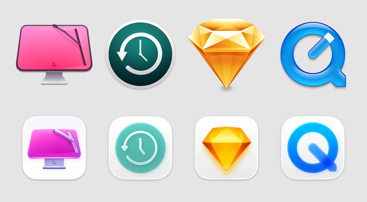
It’s hard to walk away from Mantia’s article without a sense of empathy for Apple’s position, like “Oh ok, I get why they’re doing what they’re doing. It makes sense.”
Apple’s direction is kind of a tacit acknowledgement to how most people are shipping app icons. Apple is “paving the cowpaths” as it were, because most app icons are just brand logos.
Nowadays, it’s these bland, big-business logo icons that make up a good chunk of iOS Home Screens and macOS Docks, instead of the beautiful, illustrative app icons that used to dominate our devices.
So many app icons are just logos in a squircle, so Apple made tools like the Icon Composer and glass effects to help make that approach look good by default.
Apple is helping most people most of the time make app icons that don’t suck.
[Apple is making] it easier for all apps to fit in on the platform, especially apps built by designers and developers who aren’t familiar with how to make an icon that looks great next to first-party icons.
The net effect is:
some of the platform’s best icons look worse, while some of the platform’s worst icons look better.
In other words, this new approach raises the floor but it also lowers the ceiling.
The thought that came to mind as I read Mantia’s post was, “This reminds me of HOAs.”
I grew up in a neighborhood where anyone could do anything with their homes and yards, so you had this eclectic mix throughout the neighborhood — everything from “Wow, that house is so unique!” to “That thing is a dump.”
Somewhere along the way HOAs became more prevalent (in my neck of the woods), where all the houses in a neighborhood have to meet a certain standard — and so they all start to look the same.
It keeps the dumpy things out, yet nobody stands out.
That’s kinda what macOS feels like right now with regard to app icons.
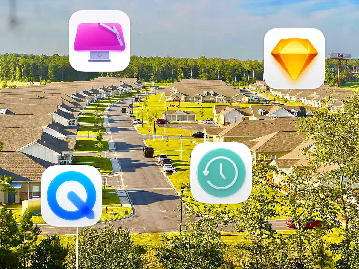
For better or worse, squircle app icons are Apple’s HOA and we’re all just living in it.

 点赞
点赞 收藏
收藏 点踩
点踩 分享
分享