VIX and Trend Following Revisited: Nearly a Decade of Out-of-Sample Evidence
In September 2017, Alpha Architect published VIX and Trend-Following, the Killer Combo?, an empirical examination of whether volatility information could improve a traditional trend-following allocation model. The central idea was intuitive: market volatility may contain useful information about how quickly an investor should measure momentum. A shorter momentum window may react more effectively when volatility rises, while a longer window may provide a more stable signal during calmer markets.
The original analysis, however, was necessarily based on the historical backtest evidence available at the time. Nearly nine years have now passed since its publication. This creates a useful opportunity to revisit the original hypothesis using a period that was entirely unavailable when the initial article was written.
This case study evaluates the strategy from August 2017 through June 2026. The test period includes the COVID volatility shock, the inflation and interest-rate shock of 2022, several rapid equity-market reversals, and a variety of calmer market environments. More importantly, the period functions as a genuinely out-of-sample extension of the original research idea.
The purpose is not to reproduce the original index backtest exactly. Instead, the analysis uses a transparent ETF proxy implementation based on SPY, VXF, EFA, AGG, and BIL, with the volatility regime derived from the ^VIX index. The practical question is straightforward: did a VIX-dependent momentum lookback continue to add value after the original research was published?
The Research Question
Traditional momentum strategies typically use a fixed lookback period. A portfolio ranks assets according to their trailing returns and allocates capital to the strongest performers. The same measurement window is applied regardless of whether market volatility is low, elevated, or extreme. (For background on why simple trend rules have historically helped manage tail risk, see Avoiding the Big Drawdown with Trend-Following Investment Strategies.)
The alternative model tested here adjusts the momentum window according to the prevailing VIX regime.
When volatility is low, the model uses a slower momentum signal. When volatility becomes elevated, the model shortens the lookback period. During the most extreme volatility regime, it reacts even faster.
The intuition is that market conditions may affect the appropriate speed of a trend-following signal. A slow signal can help filter noise during stable periods, while a faster signal may adapt more quickly when market leadership changes abruptly.
Four portfolios are evaluated.
VIX Top 1 selects the single highest-ranked asset using the VIX-dependent momentum window. VIX Top 2 applies the same regime-sensitive logic but allocates equally across the two strongest assets.
The benchmark portfolios, 10M Top 1 and 10M Top 2, use a constant ten-month momentum window and select either one or two assets.
Signals are calculated at the end of each month and used to determine the portfolio for the following calendar month. This signal-return separation prevents the strategy from using information that was unavailable at the time of allocation.
Building the VIX Regime Signal
Each signal month is classified as Green, Yellow, or Red. The regime determines which momentum lookback is used to rank the ETF universe for the following month.
Green represents the lowest-volatility environment and uses the slowest momentum window. Yellow represents an elevated-volatility environment and uses a faster momentum signal. Red represents the highest-volatility environment and uses the fastest lookback.
Most of the out-of-sample period falls into the Green and Yellow regimes.

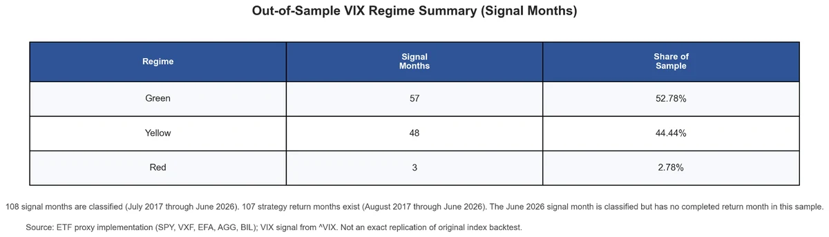
Green accounts for 57 of the 108 classified signal months, representing 52.78 percent of the sample. Yellow accounts for 48 months, or 44.44 percent. Only three months are classified as Red.
There are 108 classified signal months from July 2017 through June 2026, but only 107 completed strategy return months from August 2017 through June 2026. This difference is expected rather than an alignment error. The June 2026 signal is available, but its corresponding July 2026 return month is not yet included in the data.
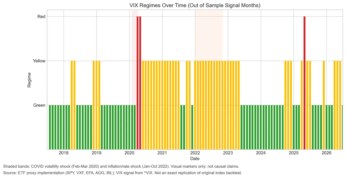
The regime timeline also shows that the classifications are persistent rather than switching randomly every month.

Long Yellow periods appear during 2020 and 2021 and again around the inflation and interest-rate shock of 2022. Red regimes are rare and concentrated around isolated periods of extreme volatility.
The limited Red sample is an important constraint. Results during those months may be economically interesting, but three observations cannot support strong statistical conclusions.
Portfolio Construction
The investable universe contains five liquid ETF proxies covering several major asset groups.
SPY represents large-cap US equities. VXF represents US equities outside the S&P 500. EFA represents developed international equities. AGG represents investment-grade bonds. BIL represents short-term US Treasury bills.
At each month-end, the strategy calculates momentum scores for all five assets. The VIX portfolios use the lookback associated with the current volatility regime, while the benchmark portfolios always use ten-month momentum.
The Top 1 variants allocate the full portfolio to the highest-ranked asset. The Top 2 variants allocate 50 percent to each of the two strongest assets.
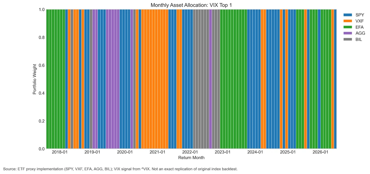
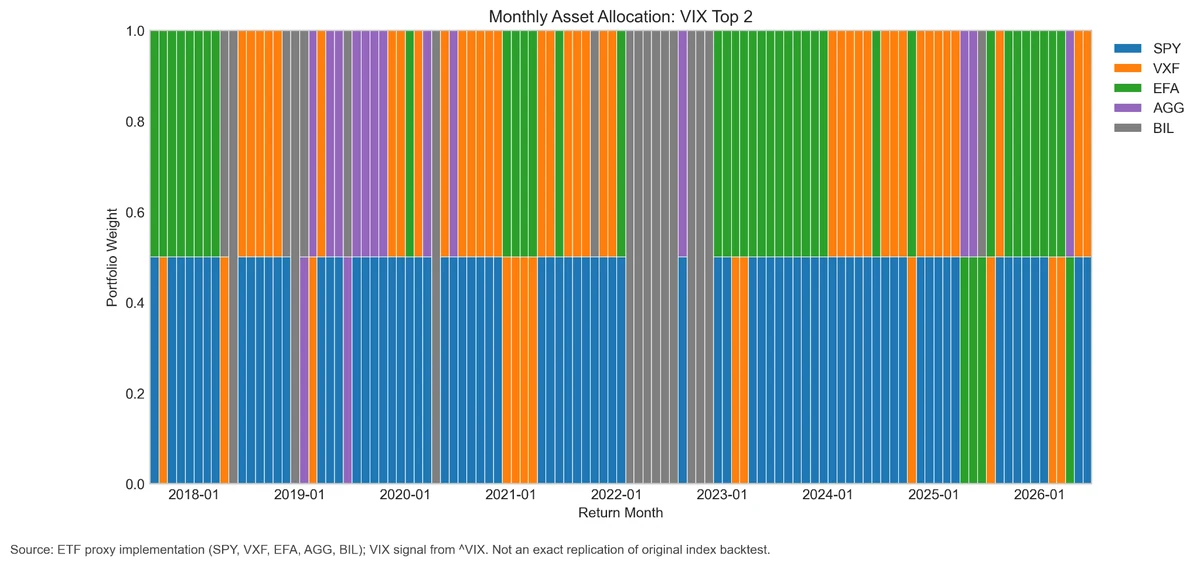
The allocation history shows how the VIX-dependent rule translated changes in volatility into different portfolio decisions.

The results are hypothetical results and are NOT an indicator of future results and do NOT represent returns that any investor actually attained. Indexes are unmanaged and do not reflect management or trading fees, and one cannot invest directly in an index.
VIX Top 1 is highly concentrated by construction. Every month, the strategy holds one ETF. This makes the portfolio responsive to the ranking signal, but it also means that a single correct or incorrect selection can have a large effect on performance.

The results are hypothetical results and are NOT an indicator of future results and do NOT represent returns that any investor actually attained. Indexes are unmanaged and do not reflect management or trading fees, and one cannot invest directly in an index.
VIX Top 2 is more diversified. It divides capital equally between two assets, reducing the effect of any single ranking decision. That diversification can limit losses from an incorrect selection, but it can also dilute the benefit of correctly identifying the strongest asset.
Out-of-Sample Performance
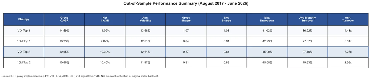
The main test period runs from August 2017 through June 2026.

The results are hypothetical results and are NOT an indicator of future results and do NOT represent returns that any investor actually attained. Indexes are unmanaged and do not reflect management or trading fees, and one cannot invest directly in an index.
VIX Top 1 produced the strongest aggregate result.
Its gross compound annual growth rate was 14.59 percent, compared with 10.23 percent for 10M Top 1. After the baseline transaction-cost assumption, VIX Top 1 generated a net CAGR of 14.09 percent, while the fixed ten-month benchmark produced 9.87 percent.
The improvement was also visible in risk-adjusted performance. VIX Top 1 achieved a gross Sharpe ratio of 1.07 and a net Sharpe ratio of 1.03. The corresponding values for 10M Top 1 were 0.84 and 0.81.
Maximum drawdown was negative 11.02 percent for VIX Top 1, compared with negative 12.99 percent for 10M Top 1. The volatility-sensitive strategy therefore combined a higher return with a moderately smaller peak-to-trough loss.
The Top 2 comparison produced a substantially different result.
VIX Top 2 generated a gross CAGR of 10.65 percent and a net CAGR of 10.30 percent. The 10M Top 2 benchmark generated 10.66 percent gross and 10.40 percent net.
The two strategies therefore delivered almost identical long-term returns. VIX Top 2 also had a slightly lower Sharpe ratio and essentially the same maximum drawdown as its benchmark.
This contrast is central to the study. The VIX-dependent lookback added meaningful value when the strategy made a concentrated Top 1 selection. The advantage largely disappeared when the portfolio diversified across two assets.
Growth of Capital
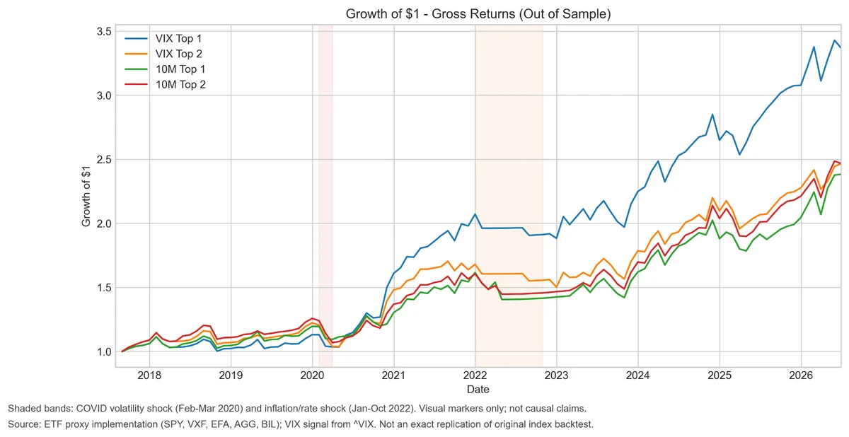
The cumulative gross return chart shows how the strategies evolved through time.

The results are hypothetical results and are NOT an indicator of future results and do NOT represent returns that any investor actually attained. Indexes are unmanaged and do not reflect management or trading fees, and one cannot invest directly in an index.
All four portfolios followed relatively similar paths during the early part of the out-of-sample period. The largest separation emerged after 2020, when VIX Top 1 began compounding materially faster than the other strategies.
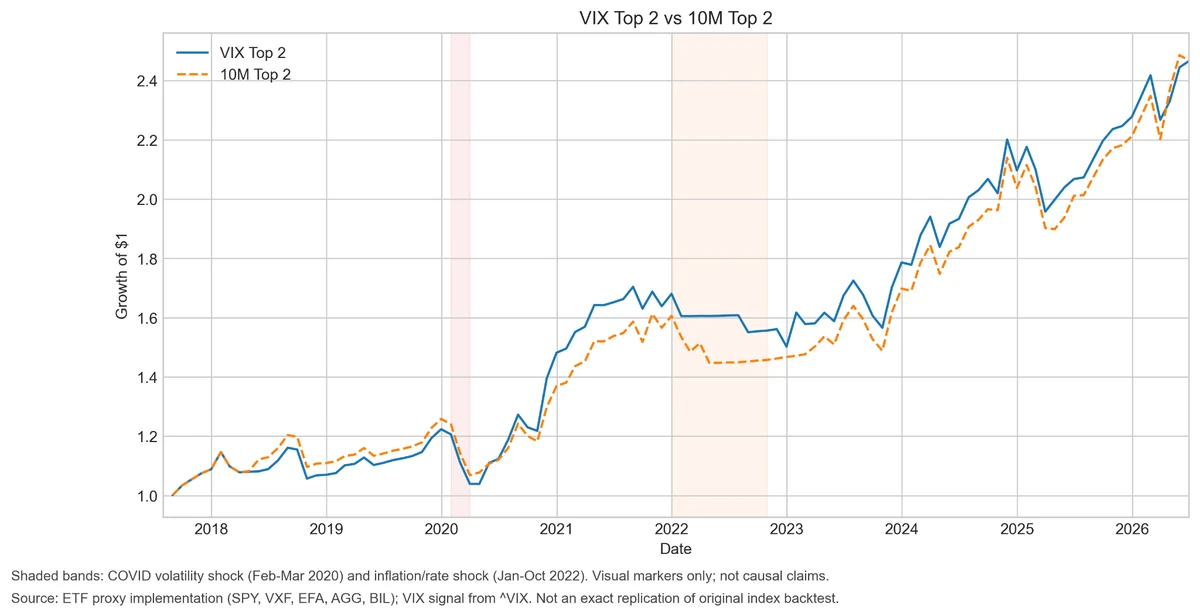
The shaded periods identify the COVID volatility shock from February through March 2020 and the inflation and rate shock from January through October 2022. These bands are included as visual reference points rather than causal claims. They help identify when strategy behavior changed but do not prove that the labeled events caused the return differences.
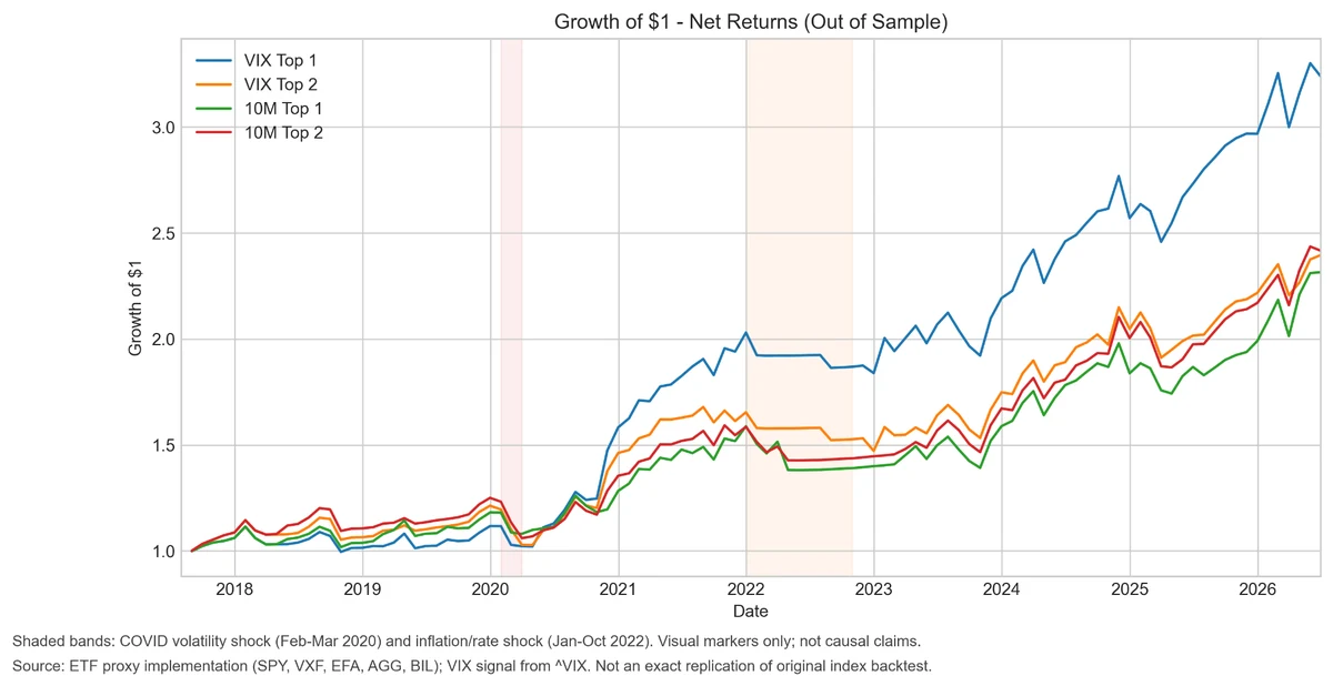
The net return chart incorporates the baseline transaction-cost assumption.

The results are hypothetical results and are NOT an indicator of future results and do NOT represent returns that any investor actually attained. Indexes are unmanaged and do not reflect management or trading fees, and one cannot invest directly in an index.
Transaction costs reduce final wealth for all four strategies, but the overall ranking remains unchanged. VIX Top 1 still finishes substantially ahead of the fixed ten-month Top 1 benchmark.
The gap between gross and net performance is larger for the VIX strategies because their adaptive momentum windows produce more portfolio changes. This makes turnover and implementation costs an important part of the evaluation.
Direct Comparison with the Fixed-Lookback Benchmarks
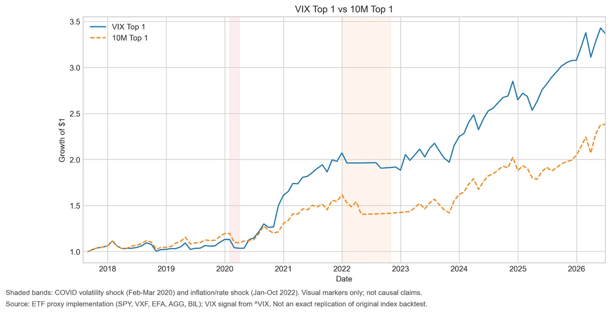
The paired charts isolate the comparison between each VIX strategy and its corresponding ten-month benchmark.

The results are hypothetical results and are NOT an indicator of future results and do NOT represent returns that any investor actually attained. Indexes are unmanaged and do not reflect management or trading fees, and one cannot invest directly in an index.
VIX Top 1 and 10M Top 1 frequently produce identical monthly results. Their equity curves overlap during long parts of the sample because both methods often select the same asset.
However, a relatively small number of different allocation decisions created a substantial cumulative performance gap. The VIX strategy did not outperform slightly every month. Instead, several important months had a disproportionately large effect on the final result.

The results are hypothetical results and are NOT an indicator of future results and do NOT represent returns that any investor actually attained. Indexes are unmanaged and do not reflect management or trading fees, and one cannot invest directly in an index.
The Top 2 curves remain much closer together. Their final values are nearly identical, showing that the adaptive lookback did not create a persistent performance advantage after the portfolio was diversified across two assets.
Drawdown Behavior
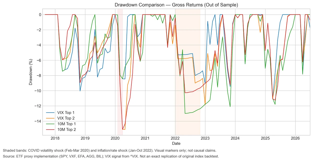
Return is only one dimension of a strategy. A practical allocation model must also be evaluated through the depth and duration of its losses.

The results are hypothetical results and are NOT an indicator of future results and do NOT represent returns that any investor actually attained. Indexes are unmanaged and do not reflect management or trading fees, and one cannot invest directly in an index.
VIX Top 1 experienced a smaller maximum drawdown than 10M Top 1. The difference was particularly visible during the 2022 inflation and rate shock, when the fixed ten-month portfolio remained in a deeper drawdown.
The advantage was not universal. During some historical declines, VIX Top 1 and the benchmark behaved similarly, while in other periods the adaptive strategy temporarily experienced a deeper loss.
For the Top 2 comparison, maximum drawdowns were almost identical. VIX Top 2 recorded a drawdown of negative 15.09 percent, compared with negative 15.08 percent for 10M Top 2.
The VIX rule therefore did not produce a general improvement in downside protection. The observed drawdown benefit was concentrated in the Top 1 implementation.
Rolling Relative Performance
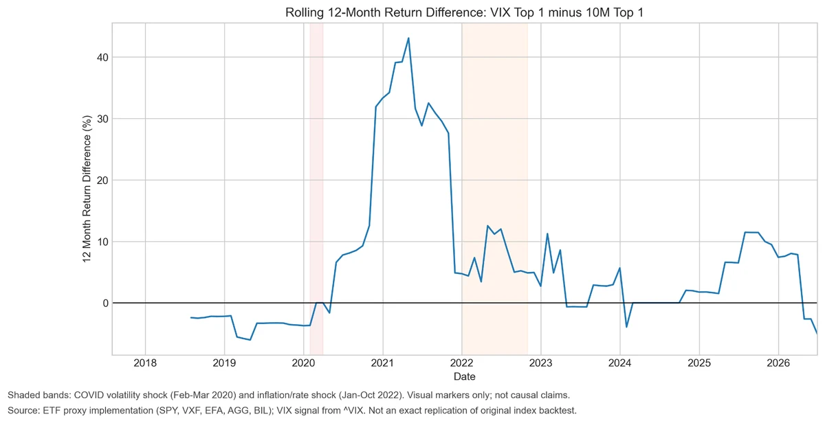
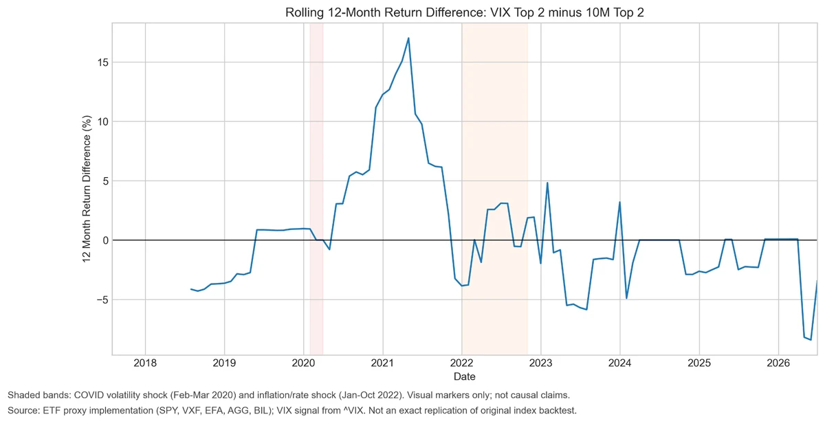
A single CAGR can hide substantial changes through time. Rolling return differences help determine whether the VIX advantage was persistent or concentrated in a specific historical period.

The results are hypothetical results and are NOT an indicator of future results and do NOT represent returns that any investor actually attained. Indexes are unmanaged and do not reflect management or trading fees, and one cannot invest directly in an index.
Before 2020, the rolling twelve-month return difference between VIX Top 1 and 10M Top 1 was generally negative. The adaptive model then gained a large advantage during 2020 and 2021, with the rolling difference temporarily exceeding 40 percentage points.
The advantage declined after that period. It remained positive through several later windows but eventually moved below zero again near the end of the test.
This is an important qualification. VIX Top 1 did not outperform consistently across every rolling twelve-month period. A meaningful share of its long-term advantage was created during a concentrated cluster of months.

The results are hypothetical results and are NOT an indicator of future results and do NOT represent returns that any investor actually attained. Indexes are unmanaged and do not reflect management or trading fees, and one cannot invest directly in an index.
The Top 2 comparison is less favorable. It also produced a strong relative period around 2020 and 2021, but the advantage subsequently moved around zero and was frequently negative.
The rolling evidence confirms that the Top 2 adaptation was not reliably better than the fixed ten-month model.
Rolling Risk-Adjusted Performance
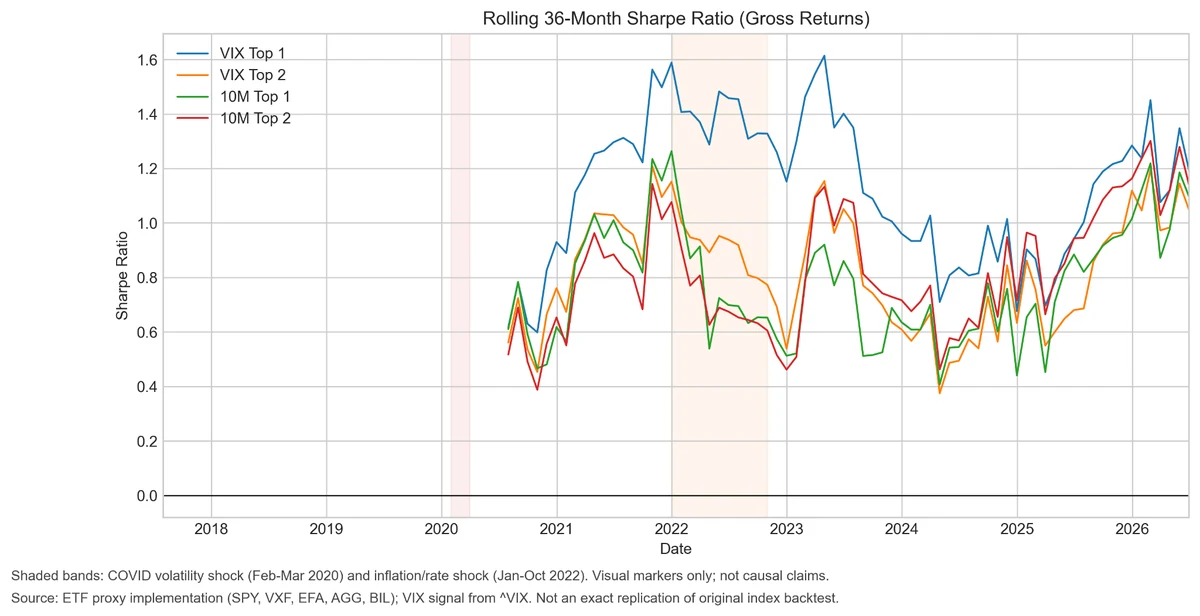
The rolling 36-month Sharpe ratio provides another view of strategy stability.

The results are hypothetical results and are NOT an indicator of future results and do NOT represent returns that any investor actually attained. Indexes are unmanaged and do not reflect management or trading fees, and one cannot invest directly in an index.
VIX Top 1 achieved the highest rolling Sharpe ratio during much of the period following 2020. At several points, its rolling Sharpe exceeded 1.4 while the alternative portfolios remained closer to 1.0.
The gap narrowed later in the sample. By 2025 and 2026, all four strategies had improved risk-adjusted performance, and the differences were smaller.
The chart reinforces the broader conclusion. VIX Top 1 produced a real historical advantage, but the strength of that advantage varied considerably across market environments.
Calendar-Year Results
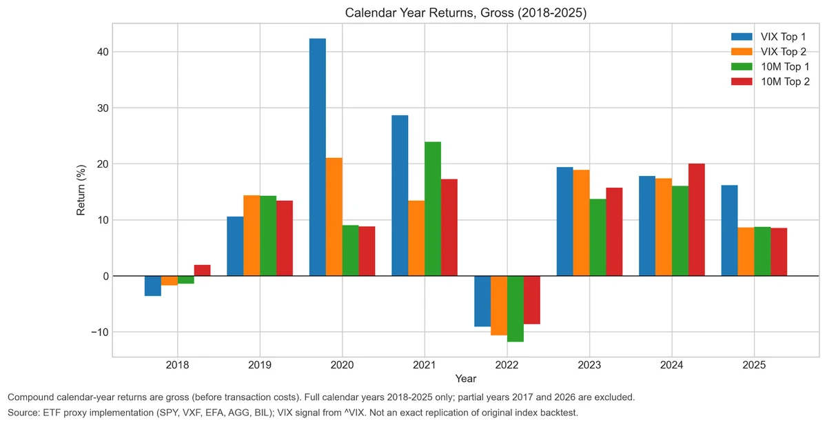
Calendar-year returns help identify the specific years responsible for the final performance difference.

The results are hypothetical results and are NOT an indicator of future results and do NOT represent returns that any investor actually attained. Indexes are unmanaged and do not reflect management or trading fees, and one cannot invest directly in an index.
VIX Top 1 materially outperformed the other strategies in 2020 and 2021. It generated approximately 42 percent in 2020 and nearly 29 percent in 2021.
The strategy also produced the strongest return in 2025.
However, it did not outperform in every year. VIX Top 1 lost more than the other portfolios in 2018, and all four strategies generated negative returns during 2022.
The long-term advantage therefore did not come from a uniformly higher annual return. It came primarily from several large positive years in which the faster volatility-dependent signal selected substantially better assets than the slower benchmark.
Monthly Return Diagnostics
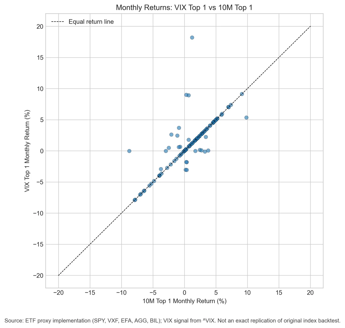
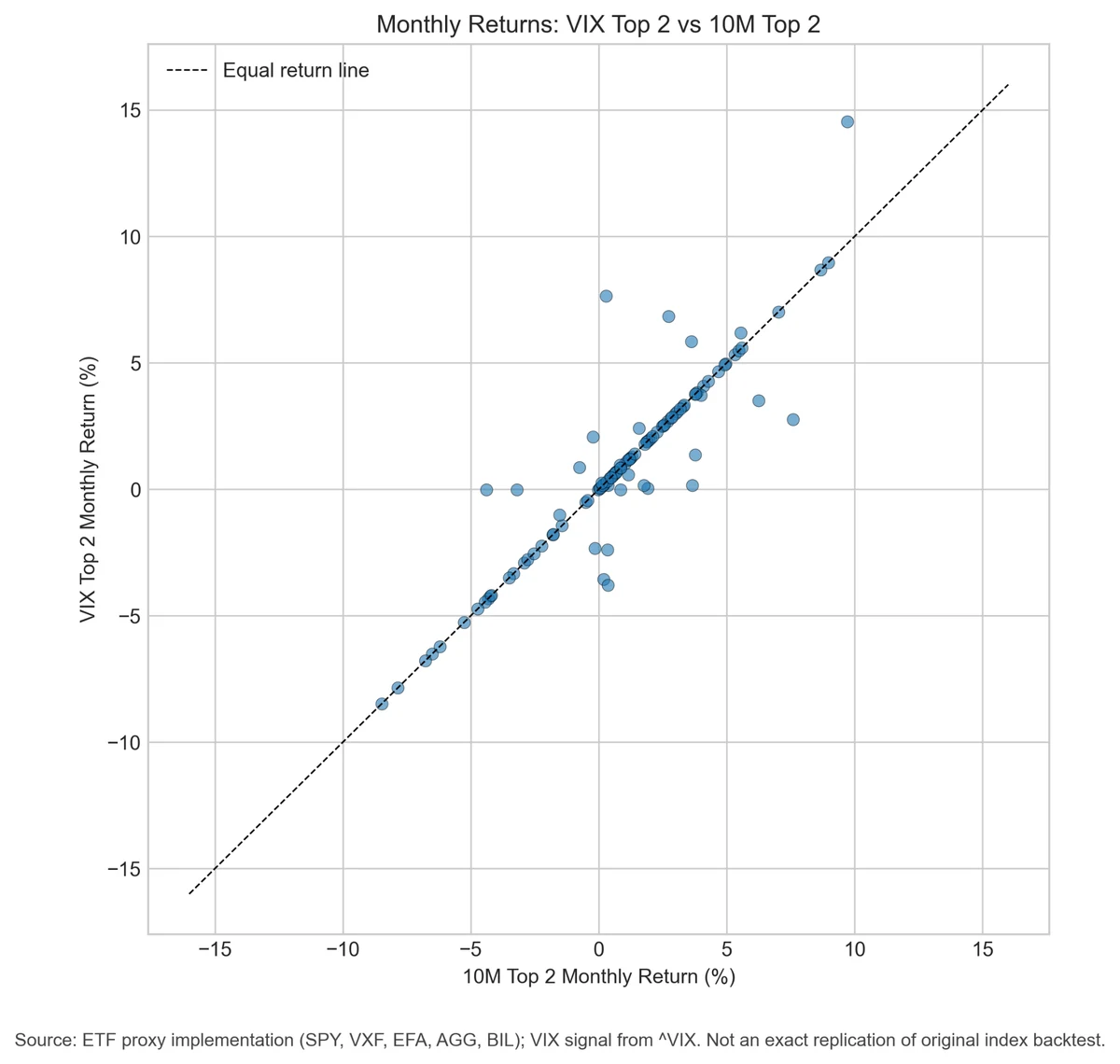
The monthly scatter plots compare each VIX strategy with its corresponding fixed-lookback benchmark.
Points positioned directly on the equal-return line represent months when both strategies produced the same return. This normally occurs because they selected the same portfolio.

The results are hypothetical results and are NOT an indicator of future results and do NOT represent returns that any investor actually attained. Indexes are unmanaged and do not reflect management or trading fees, and one cannot invest directly in an index.
Most Top 1 observations lie on the equal-return line. This confirms that the two strategies frequently held the same asset.
The cumulative advantage was created by a relatively small number of observations away from the line. Some represented large positive differences for the VIX strategy, while others represented meaningful underperformance.

The results are hypothetical results and are NOT an indicator of future results and do NOT represent returns that any investor actually attained. Indexes are unmanaged and do not reflect management or trading fees, and one cannot invest directly in an index.
The Top 2 observations are even more tightly concentrated around the equal-return line. This is consistent with the nearly identical long-term performance of VIX Top 2 and 10M Top 2.
The benchmark comparison table quantifies these differences.

The results are hypothetical results and are NOT an indicator of future results and do NOT represent returns that any investor actually attained. Indexes are unmanaged and do not reflect management or trading fees, and one cannot invest directly in an index.
VIX Top 1 produced a net CAGR improvement of 4.22 percentage points. Its gross Sharpe ratio was higher by 0.23 and its net Sharpe ratio was higher by 0.22.
Its maximum drawdown improvement was 1.96 percentage points. In this table, a positive value means that the VIX strategy experienced a smaller peak-to-trough decline than the benchmark.
Despite the substantial annualized return difference, VIX Top 1 beat the benchmark in only 13.08 percent of all return months. The two strategies held different portfolios in 24.07 percent of months.
These figures are not contradictory. During most months, both strategies selected the same asset and generated identical returns. The final performance advantage arose from the smaller subset of months when their holdings differed.
The Information Ratio of 0.46 indicates positive excess return relative to tracking error. However, the statistical tests are inconclusive. The paired t-test has a p-value of 0.1696, while the Wilcoxon test has a p-value of 0.4237. Neither meets conventional thresholds for statistical significance.
For Top 2, the net CAGR difference is negative 0.11 percentage points. The Information Ratio is only 0.01, and the statistical tests provide no evidence of a meaningful difference.
The appropriate interpretation is therefore restrained. VIX Top 1 produced economically stronger out-of-sample results, but the available monthly sample does not establish that the difference is statistically robust.
Which Months Created the Advantage?
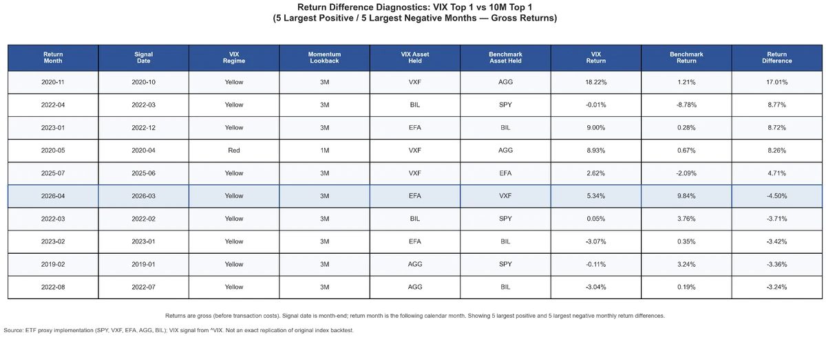
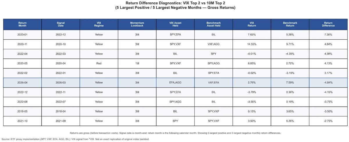
The diagnostic tables identify the five largest positive and five largest negative monthly differences.

The results are hypothetical results and are NOT an indicator of future results and do NOT represent returns that any investor actually attained. Indexes are unmanaged and do not reflect management or trading fees, and one cannot invest directly in an index.
The largest positive Top 1 difference occurred in November 2020.
The VIX strategy held VXF and gained 18.22 percent. The fixed ten-month benchmark held AGG and returned 1.21 percent. The resulting difference was 17.01 percentage points in a single month.
Another important positive month occurred in April 2022. The VIX strategy held BIL and generated a nearly flat return, while the benchmark held SPY and lost 8.78 percent. Avoiding that equity decline added 8.77 percentage points relative to the benchmark.
In January 2023, VIX Top 1 held EFA and gained 9.00 percent, while the benchmark remained in BIL and returned only 0.28 percent.
These examples show two different ways in which the adaptive model added value. In some months, it moved more quickly into a strong risk asset. In others, it moved more defensively before the fixed ten-month signal adjusted.
The same flexibility occasionally worked against the strategy. In April 2026, VIX Top 1 held EFA and returned 5.34 percent, while the benchmark held VXF and returned 9.84 percent. The adaptive strategy underperformed by 4.50 percentage points.

The results are hypothetical results and are NOT an indicator of future results and do NOT represent returns that any investor actually attained. Indexes are unmanaged and do not reflect management or trading fees, and one cannot invest directly in an index.
The Top 2 differences were generally smaller.
Diversification reduced the effect of both correct and incorrect ranking decisions. This helps explain why VIX Top 2 finished close to its benchmark despite holding a different portfolio in approximately one-quarter of all months.
Performance Across VIX Regimes
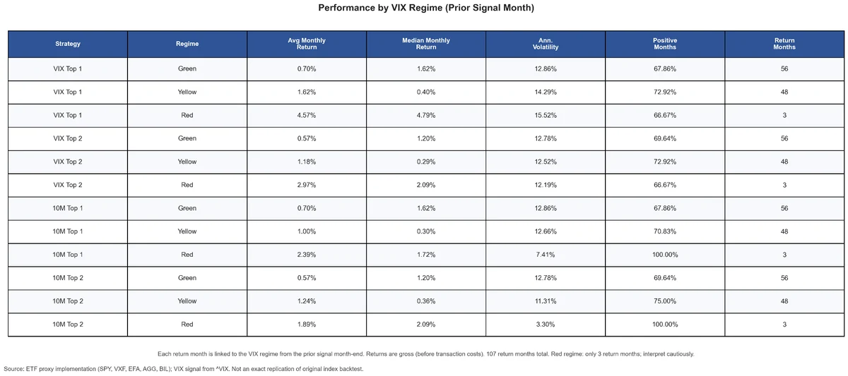
The next step is to determine whether the observed advantage was associated with a specific volatility regime.

The results are hypothetical results and are NOT an indicator of future results and do NOT represent returns that any investor actually attained. Indexes are unmanaged and do not reflect management or trading fees, and one cannot invest directly in an index.
During Green months, VIX Top 1 and 10M Top 1 produced identical aggregate statistics. Both generated an average monthly return of 0.70 percent, a median return of 1.62 percent, annualized volatility of 12.86 percent, and positive returns in 67.86 percent of months.
This indicates that the VIX rule did not change the Top 1 result during the Green regime. The adaptive and fixed-lookback strategies effectively behaved the same.
The difference appeared during Yellow and Red months.
During Yellow return months, VIX Top 1 generated an average monthly return of 1.62 percent, compared with 1.00 percent for 10M Top 1.
During Red months, VIX Top 1 generated an average monthly return of 4.57 percent, compared with 2.39 percent for the benchmark.
The Red result must be interpreted cautiously because it is based on only three completed return months. A high average across three observations may represent useful regime sensitivity, but it may also be heavily influenced by sample-specific outcomes.
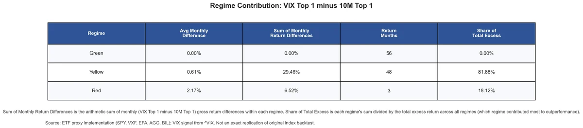
The contribution table provides a clearer decomposition.

The results are hypothetical results and are NOT an indicator of future results and do NOT represent returns that any investor actually attained. Indexes are unmanaged and do not reflect management or trading fees, and one cannot invest directly in an index.
Green months contributed no excess return because VIX Top 1 and 10M Top 1 produced the same results.
Yellow months generated an arithmetic sum of monthly return differences equal to 29.46 percentage points. This represents 81.88 percent of the total excess return generated across all regimes.
Red months contributed 6.52 percentage points, representing the remaining 18.12 percent.
The key result is that most of the observed advantage came from the Yellow regime rather than the rare Red regime. This is important because the Yellow result is based on 48 completed return months and therefore has a broader empirical foundation.
The evidence suggests that the VIX signal was most useful during elevated but not necessarily extreme volatility. That is precisely the environment in which a faster momentum lookback may react to changing market leadership without depending entirely on a small number of crisis observations.
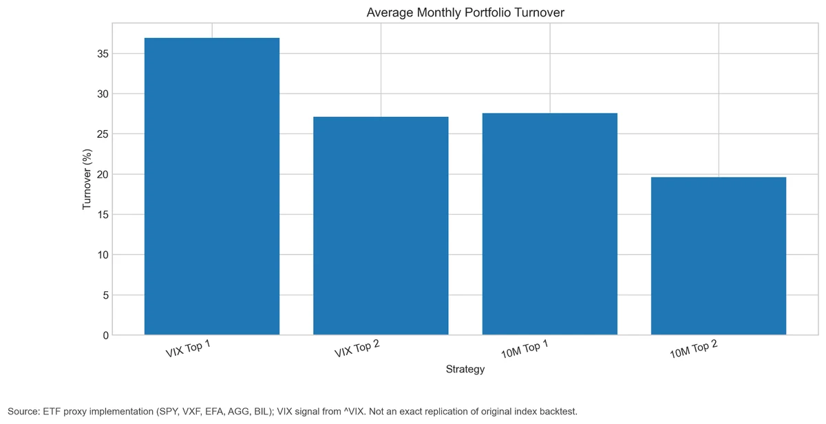
Portfolio Turnover
Adaptive signals are not free. Changing the momentum lookback can create more frequent portfolio changes than a fixed ten-month rule.

The results are hypothetical results and are NOT an indicator of future results and do NOT represent returns that any investor actually attained. Indexes are unmanaged and do not reflect management or trading fees, and one cannot invest directly in an index.
VIX Top 1 had average monthly turnover of 36.92 percent, compared with 27.57 percent for 10M Top 1.
Annualized turnover was 4.43 times for VIX Top 1 and 3.31 times for the benchmark.
VIX Top 2 also had higher turnover. Its average monthly turnover was 27.10 percent and its annualized turnover was 3.25 times, compared with 19.63 percent monthly and 2.36 times annually for 10M Top 2.
The adaptive strategy therefore creates a meaningful implementation burden. Its value must be evaluated after spreads, commissions, market impact, taxes, and other trading frictions inherent to trend-following strategies.
Transaction-Cost Sensitivity
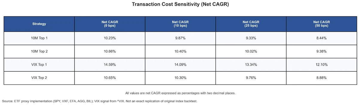
The cost-sensitivity analysis applies several transaction-cost assumptions to portfolio turnover.

The results are hypothetical results and are NOT an indicator of future results and do NOT represent returns that any investor actually attained. Indexes are unmanaged and do not reflect management or trading fees, and one cannot invest directly in an index.
At zero transaction costs, VIX Top 1 has a CAGR of 14.59 percent, compared with 10.23 percent for 10M Top 1.
At 10 basis points, the corresponding net CAGRs are 14.09 percent and 9.87 percent.
At 25 basis points, VIX Top 1 declines to 13.34 percent but remains ahead of the benchmark’s 9.33 percent.
Even at 50 basis points, VIX Top 1 retains a net CAGR of 12.10 percent, compared with 8.44 percent for 10M Top 1.
The Top 1 advantage therefore survives all tested cost assumptions.
The Top 2 result is weaker. At zero cost, the strategies are almost identical. As costs increase, the higher turnover of VIX Top 2 becomes a disadvantage. Under the 50-basis-point assumption, its net CAGR declines to 8.88 percent, below the 9.38 percent generated by 10M Top 2.
The additional complexity and turnover of the adaptive model therefore appear justified for Top 1 but not for Top 2.
What the Out-of-Sample Evidence Shows
Nearly a decade of new data provides meaningful support for one part of the original hypothesis.
The concentrated VIX Top 1 strategy produced a higher return, a higher Sharpe ratio, and a smaller maximum drawdown than the fixed ten-month Top 1 benchmark. Its advantage survived increasingly conservative transaction-cost assumptions.
However, the diagnostics also reveal why the result should not be treated as universal proof.
Most months generated identical returns because the VIX and benchmark strategies frequently selected the same asset. The cumulative difference was driven by a limited subset of months when the volatility-sensitive lookback produced a different ranking.
Much of the advantage was concentrated in 2020 and 2021. Rolling relative performance was not consistently positive, and the VIX Top 1 strategy moved below its benchmark during several subperiods.
The statistical tests also failed to reject the hypothesis that the monthly return differences could have occurred by chance. The economic result is meaningful, but the sample remains too limited for a definitive statistical conclusion.
The Red regime is particularly difficult to evaluate because it contains only three completed return observations. The stronger evidence comes from the Yellow regime, which accounted for more than 80 percent of total excess return and included 48 months.
Finally, the improvement did not extend to the Top 2 portfolio. Diversification reduced the effect of the strongest regime-dependent decisions, while higher turnover reduced net performance.
Practical Research Value
This case study demonstrates a practical workflow for revisiting an older investment hypothesis.
The original article provided the research question and the strategy logic. The next step was to reconstruct a transparent ETF-based proxy, extend the signal through June 2026, preserve the original month-end timing structure, and evaluate only the observations that became available after publication.
The analysis then moved beyond a simple equity-curve comparison.
Performance was decomposed by regime, calendar year, monthly return difference, portfolio allocation, turnover, transaction cost, rolling performance, drawdown, and statistical significance.
This diagnostic process matters because a stronger final equity curve does not automatically imply a universally stronger strategy. The important research question is how the difference was created.
In this case, the answer is relatively specific. The VIX-dependent lookback added value primarily when it changed a concentrated Top 1 allocation during Yellow volatility regimes. It did not improve results during Green regimes, and the Red sample was too small for a strong conclusion. Readers interested in related approaches that condition on volatility information may also want to review the evidence on portfolio strategies for volatility investing.
Key takeaways
- Over the August 2017 through June 2026 out-of-sample period, the VIX-dependent Top 1 strategy delivered a net CAGR of 14.09 percent versus 9.87 percent for the fixed ten-month Top 1 benchmark, with a higher net Sharpe ratio (1.03 vs. 0.81) and a smaller maximum drawdown (-11.02 percent vs. -12.99 percent).
- The Top 1 advantage survived transaction-cost assumptions as high as 50 basis points per unit of turnover, but the Top 2 version added no value and turned negative at higher cost assumptions.
- More than 80 percent of the excess return came from the Yellow (elevated but not extreme) volatility regime, which spans 48 months — not from the rare Red regime, which contains only three observations.
- VIX Top 1 beat its benchmark in only 13.08 percent of months; the cumulative edge came from a small number of divergent allocation decisions, and neither the paired t-test (p = 0.1696) nor the Wilcoxon test (p = 0.4237) achieves statistical significance.
- The defensible conclusion is narrow: volatility information may improve the speed of a concentrated momentum signal during elevated-volatility environments, not that VIX universally improves trend following.
Conclusion
The original idea behind combining VIX information with trend following remains economically plausible after nearly a decade of out-of-sample evidence.
In this ETF proxy implementation, VIX Top 1 generated a net CAGR of 14.09 percent, compared with 9.87 percent for a fixed ten-month Top 1 momentum benchmark. It also achieved a higher net Sharpe ratio and a smaller maximum drawdown.
The advantage remained present under transaction costs as high as 50 basis points per unit of turnover.
However, the result was not broad or uniform. The strategy did not outperform consistently across every period, most monthly returns were identical to the benchmark, and the statistical tests were inconclusive. The observed excess return was concentrated in a limited number of allocation decisions, particularly during Yellow volatility regimes.
The same logic did not improve the Top 2 portfolio. Once the strategy diversified across two assets, its return converged with the fixed ten-month benchmark and its additional turnover reduced net performance.
The most defensible conclusion is therefore not that the VIX automatically improves trend following.
Rather, volatility information may improve the speed of a concentrated momentum signal during elevated-volatility environments. Whether that advantage persists in the future remains uncertain, but the nearly nine-year out-of-sample period provides a stronger empirical basis for continuing the research than the original backtest alone.
VIX and Trend Following Revisited: Nearly a Decade of Out-of-Sample Evidence was originally published at Alpha Architect. Please read the Alpha Architect disclosures at your convenience.