Where interaction design stops guiding and starts manipulatin

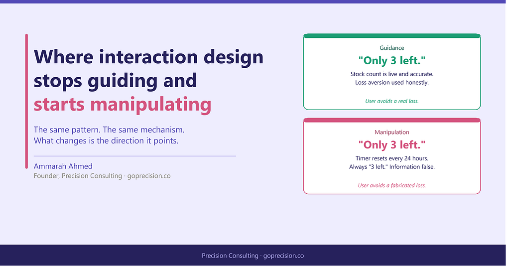
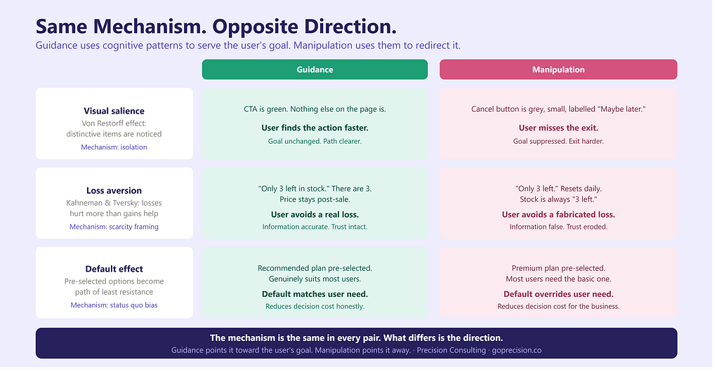
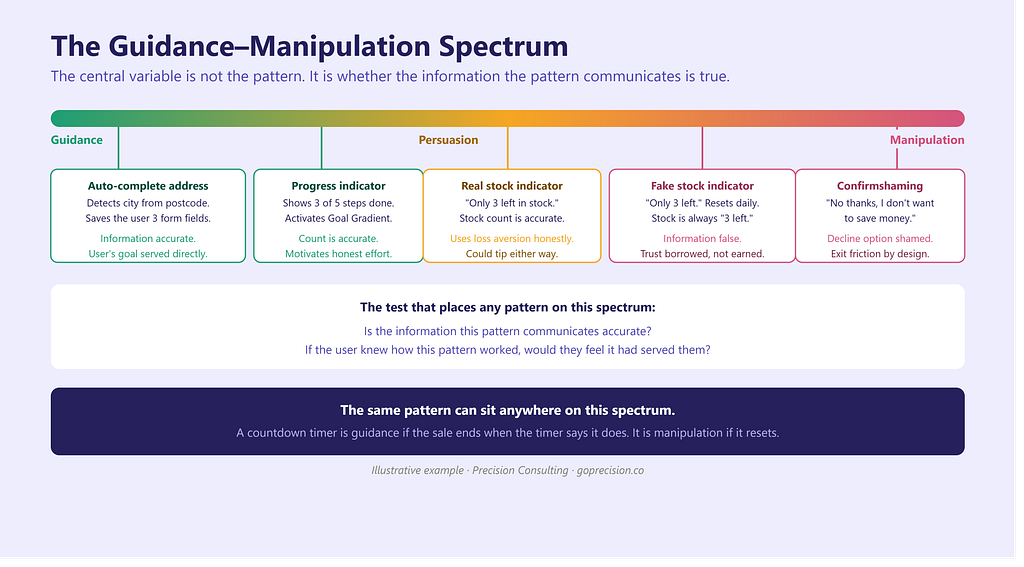
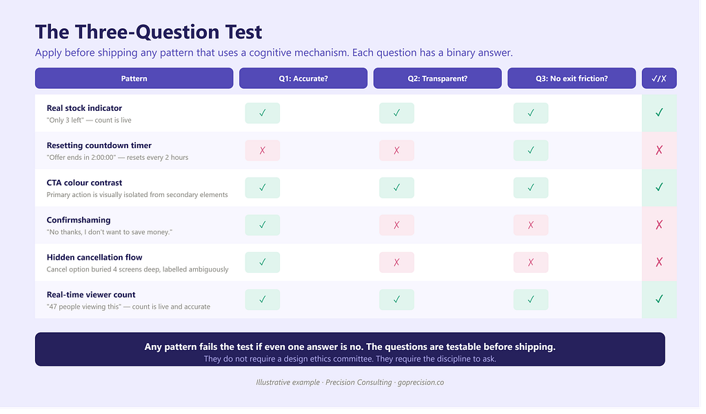
Image: Ammarah Ahmed/ Precision Consulting
There is a line in interaction design between guiding a user toward an action and manipulating them into it. Most design teams would say they are on the right side of that line. Most of them have not drawn the line precisely enough to know.
The problem is not intent. Most manipulative patterns in digital interfaces were not designed to deceive. They were designed to convert, to retain, to activate. The designers who built them were optimising for measurable outcomes and reached for patterns that worked. The fact that those patterns work by exploiting cognitive weaknesses rather than by genuinely serving the user is rarely examined as a separate question.
This essay tries to draw the line precisely. Not as a moral argument, but as a design one. Manipulation and guidance are technically distinguishable. Knowing the difference is part of being a competent practitioner.
What guidance looks like
Guidance reduces friction between a user’s intent and the action that fulfils it. The user already has a goal. The design makes it easier to reach. Nothing about the goal changes. Nothing about what the user wants is altered. The design simply removes obstacles.
A checkout flow that auto-detects a user’s city from their postcode is guidance. The user intended to enter their address. The interface made that faster. A search bar that surfaces the most relevant result at the top is guidance. The user intended to find something. The interface made it more findable. A progress indicator in a multi-step form is guidance. The user intended to complete the form. The interface made the remaining distance visible.
The common thread: the user’s goal is unchanged. The design serves that goal. The user finishes the interaction closer to what they came for.
Guidance answers the question the user is already asking. Manipulation answers a question they were not asking and frames the answer in a way that makes it look like the answer to the question they were.
What manipulation looks like
Manipulation changes what a user believes about a situation in order to produce an action the designer wants, regardless of whether that action serves the user’s interests. The goal of the design is not to help the user reach their goal faster. It is to redirect the user toward a different goal entirely, usually one that benefits the product or business.
Harry Brignull coined the term ‘dark patterns’ in 2010 to describe exactly this category of design. His taxonomy includes roach motels (easy to get into, hard to leave), trick questions (deliberately ambiguous opt-in language), misdirection (visual design that draws attention away from an important element), and confirmshaming (making the decline option read as self-deprecating). Each of these works not by removing friction from the user’s path but by adding friction to the user’s escape route, or by altering the user’s perception of their options.
The mechanism, in each case, is cognitive. Manipulation exploits the same heuristics and biases that guidance works with, but in the opposite direction. Guidance uses proximity to reduce search effort. Manipulation uses proximity to associate a desired action with something trusted. Guidance uses visual salience to make the primary action findable. Manipulation uses visual salience to make the cancellation option unfindable.
Four pattern pairs: the guidance version and the manipulation version of the same interaction. Each pair uses the same psychological mechanism; what differs is whether the mechanism serves the user’s goal or redirects it. Image: Ammarah Ahmed/Precision Consulting
The grey area: persuasion
Between guidance and manipulation sits persuasion, and this is where the design community has the most unresolved argument.
A limited-stock indicator is persuasive. It communicates genuine scarcity and activates loss aversion, the tendency to weight losses more heavily than equivalent gains, first documented by Kahneman and Tversky in their 1979 Prospect Theory paper. If the stock information is accurate, the indicator guides the user toward a decision they might otherwise delay and later regret. If the stock information is fabricated or perpetually refreshed to create artificial scarcity, the same indicator is manipulation. The design is identical. The ethics depend entirely on the accuracy of the underlying information.
This is the most useful test I know for the grey area: is the information true? A countdown timer for a sale that ends on Friday is persuasion if the sale actually ends on Friday and returns to the original price on Saturday. It is manipulation if the timer resets every 24 hours regardless of what the price does. The psychological mechanism is the same. The distinction is factual, not visual.
Social proof works the same way. Showing that 47 people are viewing a product right now is guidance if 47 people are actually viewing it. It is manipulation if the number is fabricated or algorithmically inflated. The design element looks identical in both cases. Its character as guidance or manipulation is entirely determined by whether it accurately represents reality.
A spectrum from guidance to manipulation, with persuasion in the middle. Each position on the spectrum is illustrated with a real interaction pattern. The central variable is not the design element itself but the accuracy of the information it communicates. Image: Ammarah Ahmed/ Precision Consulting
Why the distinction matters to designers specifically
The argument is sometimes made that this is a business ethics question, not a design question. Designers design. Leadership decides what information to surface. If leadership decides to show fabricated stock counts, that is their decision, not the designer’s.
This argument fails on two grounds. The first is practical. Designers are the people who build the systems that display the information. A designer who builds a ‘people viewing this now’ counter knows, or should know, what data source it pulls from. A designer who builds a countdown timer knows, or should know, whether it resets. The technical knowledge is on the designer’s side of the table. The decision to use it manipulatively or honestly may be made elsewhere, but the capacity to flag the distinction belongs to the designer.
The second ground is the user relationship. Every design decision is an implicit communication with the user. When an interface uses a pattern associated with genuine scarcity to signal artificial scarcity, it is borrowing trust that was earned by honest use of that pattern elsewhere and spending it on a fiction. That trust belongs to the user. Spending it without their knowledge is a relationship decision, not just a business one. And the long-term consequence of that decision, eroded trust, reduced willingness to return, increased scepticism toward future communications, falls on the product and its users, not on the metric that was optimised in the short term.
Susan Weinschenk’s work on the psychology of design describes this as the trust loop: interfaces that behave predictably and honestly build a mental model in the user that allows them to act with confidence. Interfaces that behave manipulatively break that model. Once broken, it is not easily rebuilt. Users who have been tricked by a countdown timer that resets will disbelieve the next countdown timer they see, even if it is accurate.
A working test
Before shipping any pattern that uses a cognitive bias or psychological mechanism, ask three questions.
First: is the information this pattern communicates accurate? Not approximately accurate. Accurately accurate. If a stock counter shows ‘only 3 left’ and the actual count is 47, the pattern communicates something false. That is manipulation regardless of whether the intent was to deceive.
Second: if the user knew exactly how this pattern worked, would they feel it had served them? This is the transparency test, described by Ryan Calo in his 2014 paper on digital market…

 点赞
点赞 收藏
收藏 点踩
点踩 分享
分享