Announcing: Skeleton 🩻, the culminating project of my PhD!

The final project of my PhD, titled “ Skeleton: Visual Authoring of Non-visual Data Experiences” has now been fully accepted at IEEE VIS 2026. Woohoo! ( You can check out the pre-print of the paper at this link.) Depending on who you are, my reader, this announcement means different things. To my fellow academics: this is great news! VIS is the premier venue for visualization research. This will be a fantastic opportunity for me to share my work and findings with other researchers. I look forward to future chats with you all!
But for my fellow practitioners, why does this matter? Well, our paper outlines this a bit more (and if you’ve never read an academic paper, give it a shot!), but we oriented our work as action research. That means that our technical projects (the things we built) were grounded in work with practitioners. Our work was relevant to them, so I hope to you my reader, it will be relevant too.
Yet before I jump into a bulleted list of TL;DR takeaways, I desperately hope that whoever you are, an academic, practitioner, or someone random, that you will stick around at least for my short pre-requisite introduction to this topic first.
But here is the bulleted list of takeaways:
Sighted people face barriers when authoring non-visual data experiences
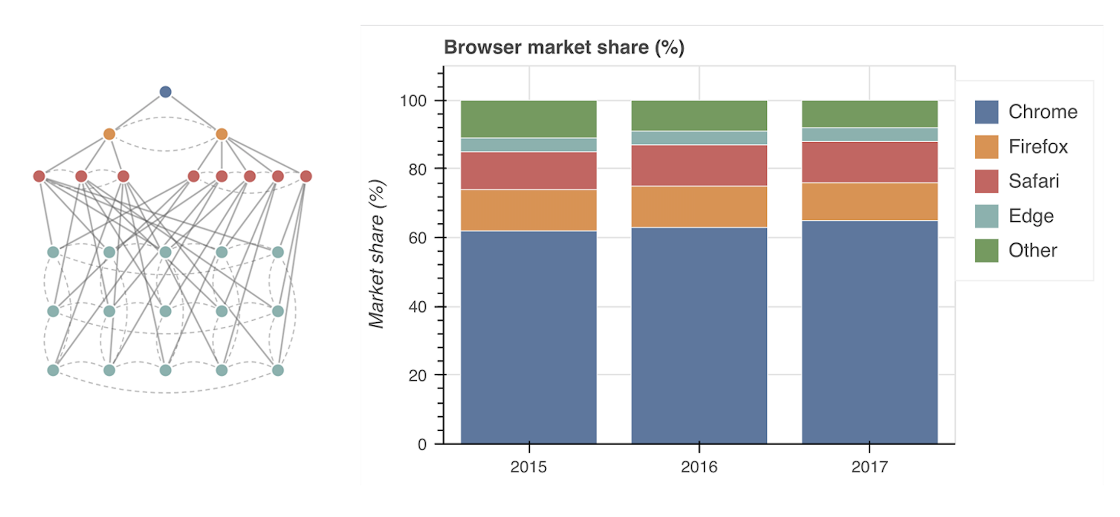
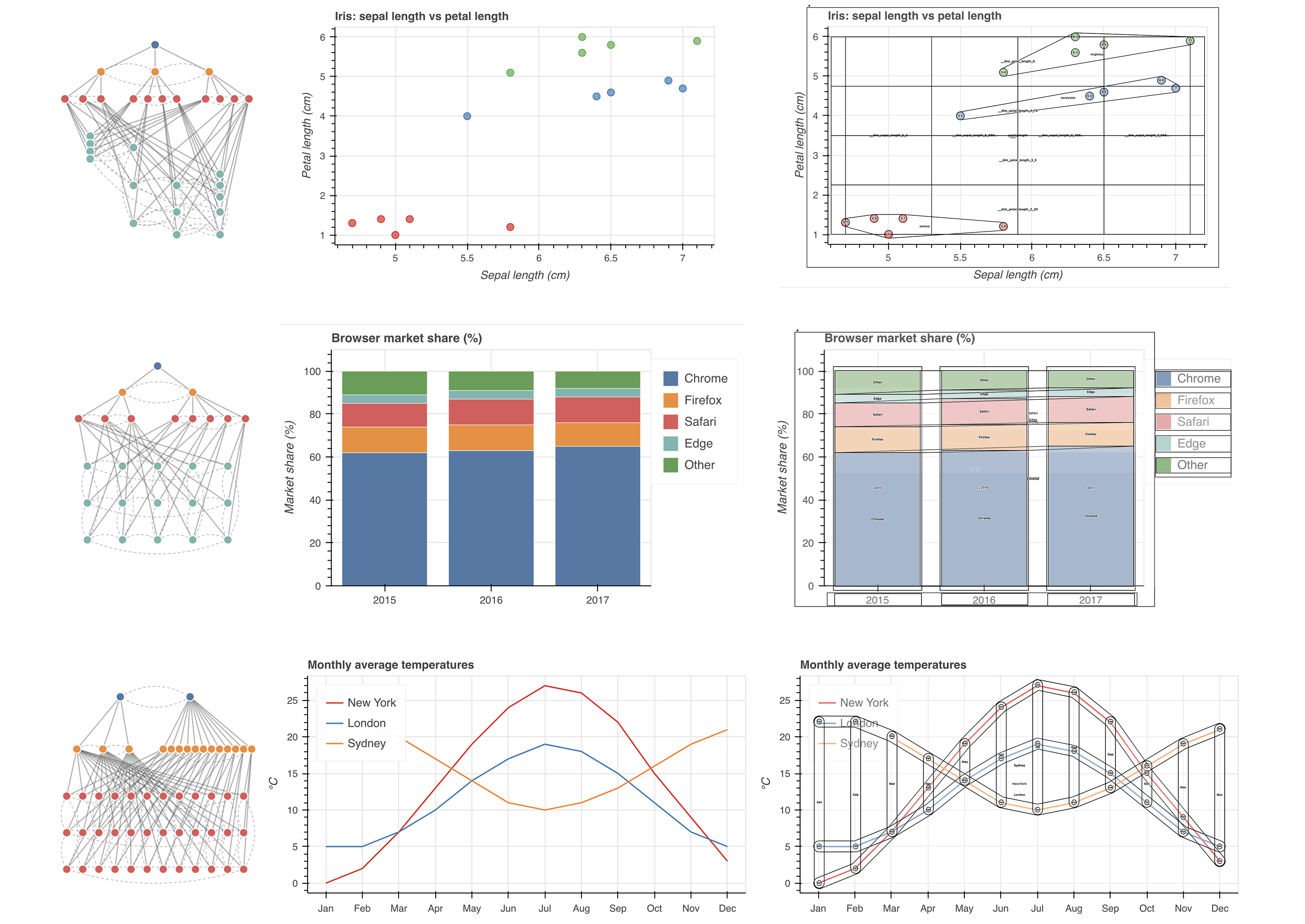
We built a tool to visualize the data structure used to make charts and graphs navigable
We built a tool that mirrors the grammar of graphics, but focuses on non-visual navigation dimensions in charts and graphs
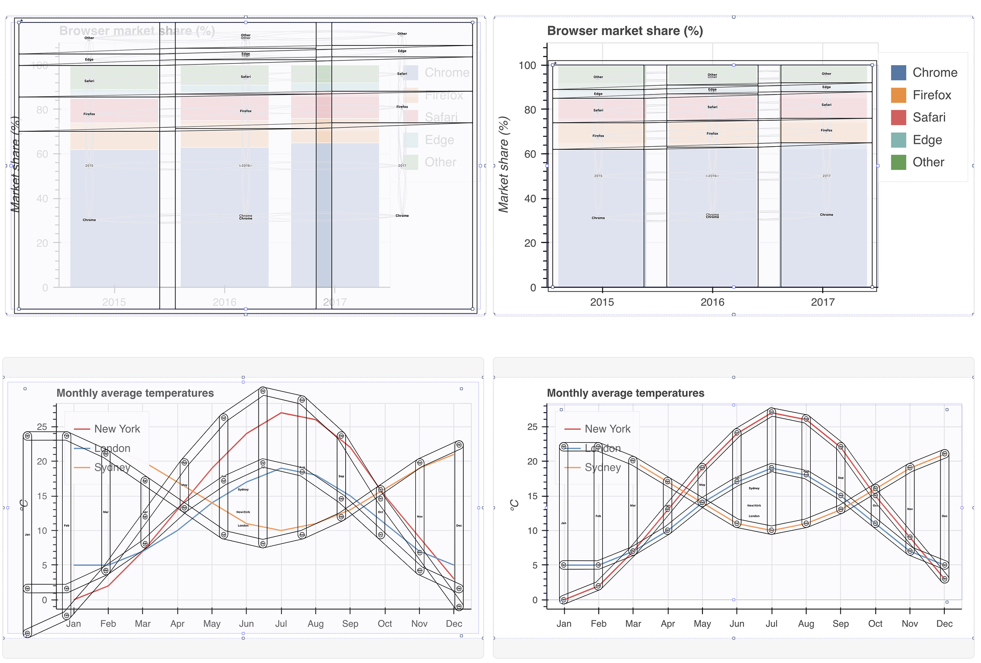
We then built a visual user interface that makes it so that a user can directly manipulate non-visual data experiences they are authoring as well as test their experiences
We also had some fun with heuristic-based (non-ML) computer vision and some other neat tricks to make scaffolding navigation experiences as fast and easy as possible
Lastly, our study revealed quite a lot! But our most important finding was that sighted practitioners treat non-visual experiences as equal to visuals once they can see and manipulate them. They iterate independently and substantially once they can see a design element, they treat non-visual experiences as a complex and serious space of design, and they even iterated on their visual design choices once they understood how their visuals might influence the non-visual experiences people will have of their charts!
A brief introduction: What is wrong? What matters? Why accessibility and visualization?
I finally articulate and unpack why I do this work, in length, in my thesis (which is now out in the world, officially). If you want a deeper dive, check it out (or my smaller baby thesis sub-docs).
But people who live with disabilities deserve to live full lives. They deserve to participate in their communities, in our world, in the politics that affect them, in political and civic action, in well-paying jobs, in decisions about their healthcare, and in staying informed about matters like the economy, their personal finances, academic research, local news, and more. And in our world, interacting with and being able to communicate with information is an important part living a connected, happy, healthy life. People with disabilities deserve to have access to data.
And yet, the problem is that people with disabilities are often not considered when software and hardware are designed. Ultimately, this means that simple access to information for someone who is sighted becomes a tedious, time-consuming, painful chore for someone who is blind. And most often, people are fully excluded from access due to how we have built our technological world.
But things don’t have to be this way. We can build things better. We can make our websites, tools, software, applications, and devices more accessible for people with disabilities.
And the good news? To some degree, people have been doing this work. This field of work is called “accessibility” work. And some people specialize in it (it is their whole thing) while others integrate it into the work they do (such as people who make data visualizations but understand how to make them more accessible or leverage tools that help them do this work.)
These people, this subset of “practitioners” who work, or want to work, on accessibility related to data interfaces are the people I set out to work with in this research project.
My sighted collaborators struggled to work with non-visual design materials
We collaborated with 3 different groups of practitioners, with varying degrees of involvement in the design or development work that they were undertaking, related to making visual representations of data more accessible to people with disabilities. Our collaborators were primarily sighted, although we did also have blind co-designers who joined us in those collaborations (or who specifically helped us with our later work).
Part of the work of making visualizations accessible is making them navigable for people who use assistive technologies. Some assistive technologies that navigate might include screen readers, keyboards, voice controls, “switches,” sip and puff devices, and more. My past project (linked above), “ Data Navigator,” focuses on making this translation work possible. Designers and engineers can work to create non-visual and visual navigation and interaction experiences with data structures.
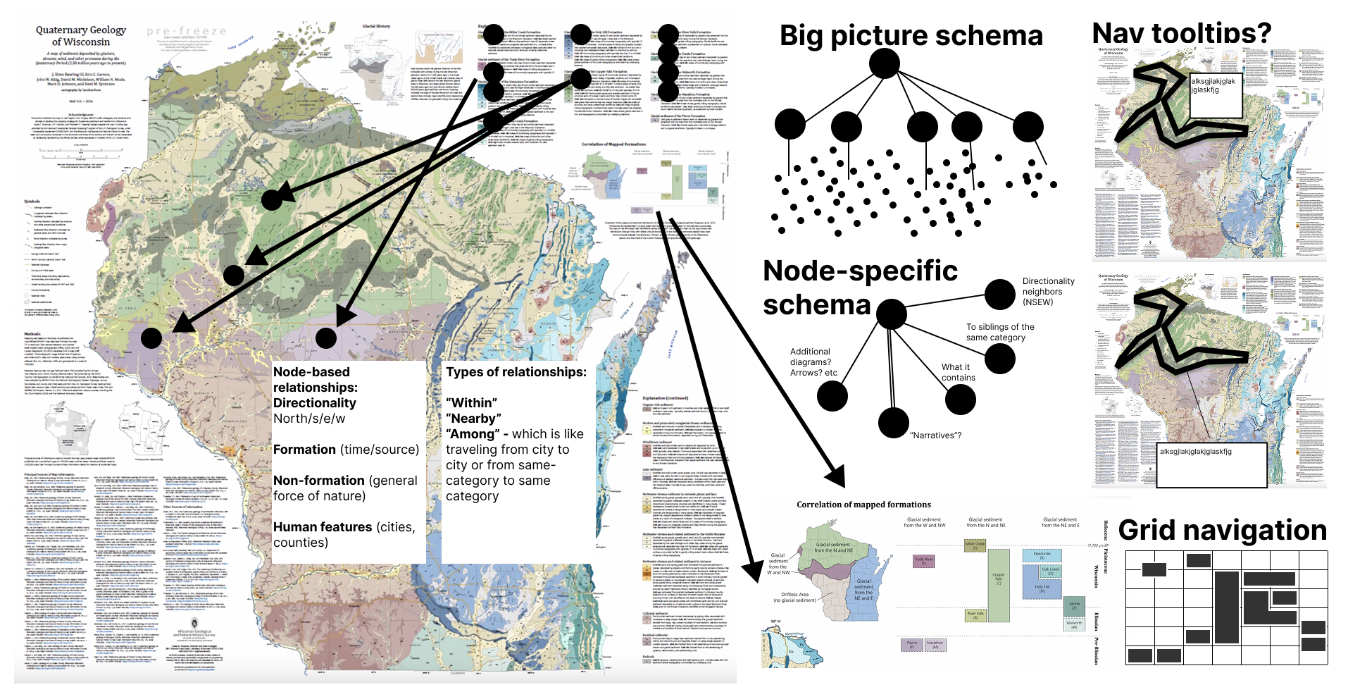
However, doing this work is quite hard. Our collaborators iterated heavily in visual design tools. They used visual, diagrammatic markers and artifacts to iterate on their ideas. “If we place a navigation node here, would could navigate over to here” they might say, while laying a circle object over the first thing they’ve referenced and then dragging out an arrow from that circle onto a new area of our design space. Our collaborators reasoned about the spatial structures and experiences of their imagined end users in visual metaphors and symbols.
Using diagrammatic symbols and markers while designing screen reader navigation of a map, in Figma. Note: This is from our collaboration with the folks from the University of Wisconson's Quaternary Geology of Wisconsin map (and their fantastic efforts to make this map more accessible ). We explain the process behind this in the paper as well as more technically via an example in our documention for Data Navigator.
And yet, building these structures (enacting these designs in real, working prototypes) involved working entirely in code (in text) without any visual representation of what they were doing. Testing the designs required interacting with non-visual structures using non-visual tools: loading up a screen reader and stitching together the resulting prototype’s performance interactively, one piece at a time. Testing was not only manual, but also non-visual. This work became quite tedious, prone to errors, and difficult for our fellow practitioners.
Discovering inaccessibility for people without disabilities
We needed to improve the debugging process. And the first step was recognizing that we should probably visualize the data about the system’s structure. Ironic! We are trying to make visualizations more accessible for people who are blind. To do that, we need to make non-visual experiences that can make our visualizations (or their underlying data) more accessible. Yet, because those experiences are non-visual… they are inaccessible to our sighted collaborators!
In the social model of disability, which is a framing that can sometimes be quite useful, we talk about how our created world (be that curbs on our sidewalks, the politics that govern us, or our software) produces barriers for people with disabilities. Those barriers are where a person who has a disability actually experiences that disability. (Again, note that this framing isn’t complete, but it is useful.) What this means is that because we have brought artificial things into the world and those artificial things are now holding some people from participation in the world, it is up to us (the creat…

 点赞
点赞 收藏
收藏 点踩
点踩 分享
分享