Make tmux the OS

I recently watched the talk by Scott Jenson titled "Are we really going to use the same Desktop UX forever?" https://www.youtube.com/watch?v=V7AfAcQwLW0&t=445s. He's a great presenter, really articulate and concise. The kind of speaker that you'd gladly listen to for 3+ hours if given the chance. Which for a talk about window management is quite the compliment.
The overall point of the talk was "Apple and Microsoft aren't going to innovate anymore in the desktop OS space, so it is up to us all to decide what the desktop of the future is going to look like". I would argue that the actual situation to more nuanced than that, they're trying ideas they are just extremely conservative. As Jenson points out, a lot of what we treat as "how computers work" was a workaround for hardware we stopped having years ago. So why are we still accepting those tradeoffs?
To be clear, I'm not a UI/UX designer. I don't know what I'm doing and I lack the skill to make this. I'm making this mostly as a thought exercise and hopefully a prompt to get other people to think about this same problem. I have, however, suffered through others bad choices, which turns out to be most of the qualifications required.
TL;DR: The thing I want is "tmux is the OS", but I want tmux where a normal person could use it. I use it all the time, it's great, but is there a way to take the amazing experience of a scrollable, session-persisted, detachable, task-oriented system to normal people?
What are the high-level problems with windows management in 2026?
I think you can break the problem down to the following components:
My screen real estate is constantly changing and I have a lot more of it.
I am going from my laptop screen to my desktop monitor back to the laptop screen about 6 times a day. When I'm on my big monitor or multiple monitors, overlapping windows don't make sense because I have too much space as it is.
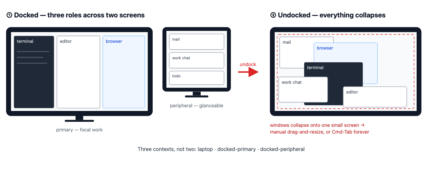
Different people use windows totally differently.
We have three distinct groups of people that we are trying to design around, while most modern OS optimizes only for the first use case.
Browsers are mini operating systems.
In 2026 everybody quietly agrees that most of your software runs in a browser tab. These web applications will cover a wide variety of use-cases that have historically been owned by local applications. My desktop OS treats a browser just like a normal application, when in fact it is closer to a virtualized OS running inside of my host OS.
The concept of "filesystem" is an increasingly weak concept.
My notes in Apple Notes belong to Apple Notes, not my filesystem. My texts live in iMessage's database, not my Documents folder. Teams and Slack content lives inside those applications unless I manually "bring it out," and when I do, I'm making a copy. Firefox will happily show me a PDF, but the PDF doesn't live with macOS unless I take an action to make it so.
What have people already tried?
So I'm not the first person to see this problem. Some of it got solved, but in a different direction than I want. Some of it got solved, but not for normal people.
I started with the document that I kept seeing everyone else cite to. Henderson, D. Austin and Stuart K. Card. “Rooms: the use of multiple virtual workspaces to reduce space contention in a window-based graphical user interface.” ACM Transactions on Graphics (TOG) 5 (1986): 211 - 243. Interesting that even back in the 80s there was a pretty clear understanding that the current system for managing windows wasn't very good. The design they were talking about looked something like this, which is pretty advanced compared to where we are.
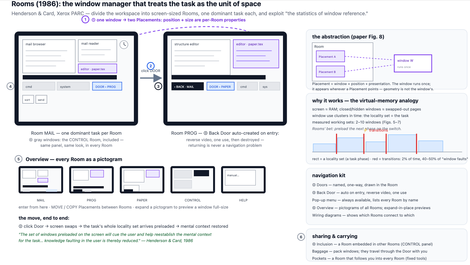
Henderson and Card measured window use the way operating systems people measured memory. The screen is RAM. A closed window is a page swapped out to disk. And windows, like memory pages, don't get touched at random: you sit inside a small set of them, two to ten, and that set is the task. Programs spend about 98% of their time inside one of these sets, and roughly half the cost of running happens during the 2% of time spent switching between them. Rooms' whole design was preloading the next set before you ask. They described this as reducing "knowledge faulting in the user," which is the best phrase in the literature and I intend to use it until someone stops me. Just try it out in a corporate meeting: "we need to reduce knowledge faulting in the user".
One of the more interesting side papers I found was "No Task Left Behind? Examining the Nature of Fragmented Work". Link. Mostly because it confirmed something I've long suspected, which is the single task for a long time focus on modern widowing systems isn't actually how people work. The title of the companion paper is a real participant quote: "Constant, constant, multi-tasking craziness." People were juggling around ten "working spheres" a day, minutes at a time.
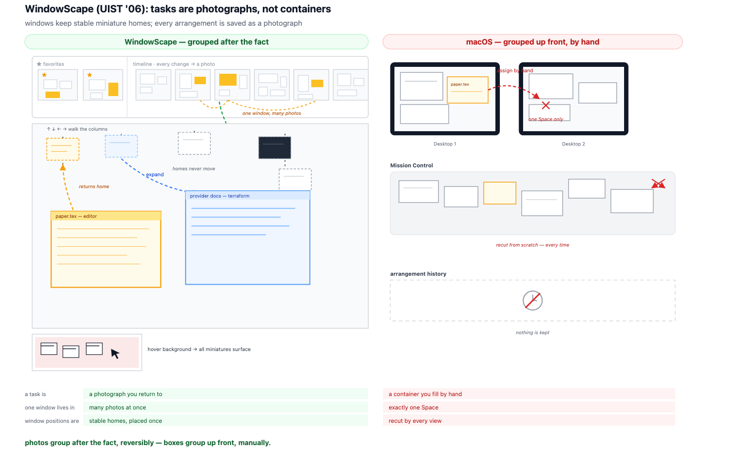
The closest to what I wanted is from the paper WindowScape: A Task Oriented Window Manager. Link.
WindowScape dropped explicit grouping entirely so now every time you changed the arrangement, it took a photograph, and you went back into photographs instead of filling containers. I love their one-line diagnosis of every system before them: "requiring windows to be in a single group forces users to decide ahead of time where a new window belongs." The photograph metaphor also cracks a problem I'll get to with browser tabs: one window can appear in many photos, because, as they put it, "people understand that there can be several photos of an object with there being only one underlying object." The catch is that the photos evaporated. That's the gap that I think you'd want to solve.
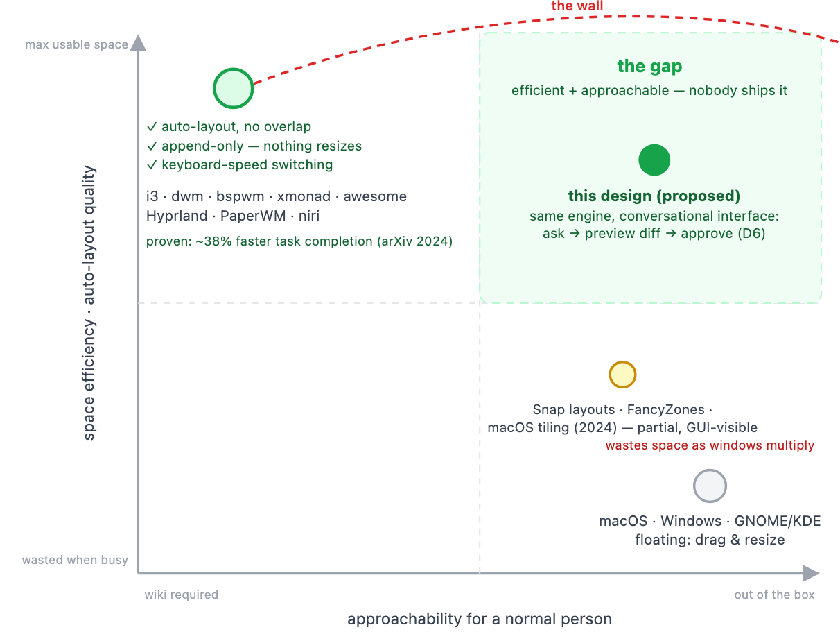
For the first problem, we have more or less already solved for overlapping windows. A tiling window manager ensures that you are maximizing your screen real estate in such a way that you can switch between different layouts with no need to manually modify the windows. There are basically 2 problems with tiling window managers as they exist now.
Browsers as mini-operating systems: people have tried to solve this, but in the wrong direction. They made the browser more of an operating system instead of making its contents first-class citizens of the one you already have.
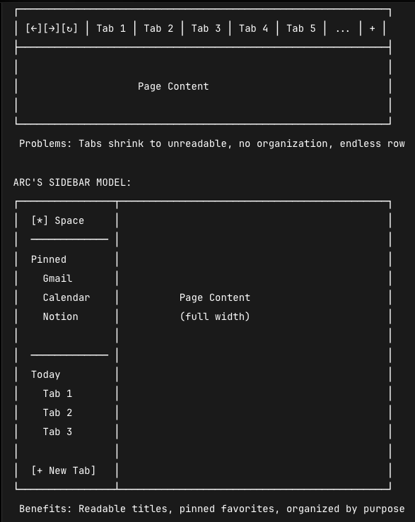
They also basically "took over" the concept of windows from the OS.
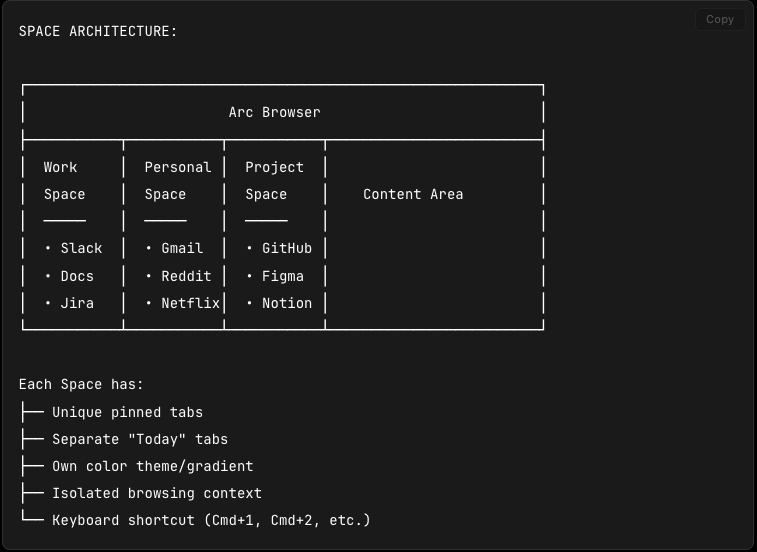
The diagrams above and a good write-up of Arc is available here: https://blakecrosley.com/guides/design/arc.
All of this makes sense from the perspective of "the browser is now the operating system", but I think this is a fundamentally flawed idea. If a web application is operating as an application, it should be its own window. If it is complimentary to another application, it should be a window associated with another application and be allowed to contain many tabs, to reflect the idea of the browser as the portal for all research and lookup.
I was shocked to go through the historical progress of people trying to solve this problem. I'm not the first person to try to solve this problem, I might not even be the 10,000th person.
Graveyard of Attempted Solutions
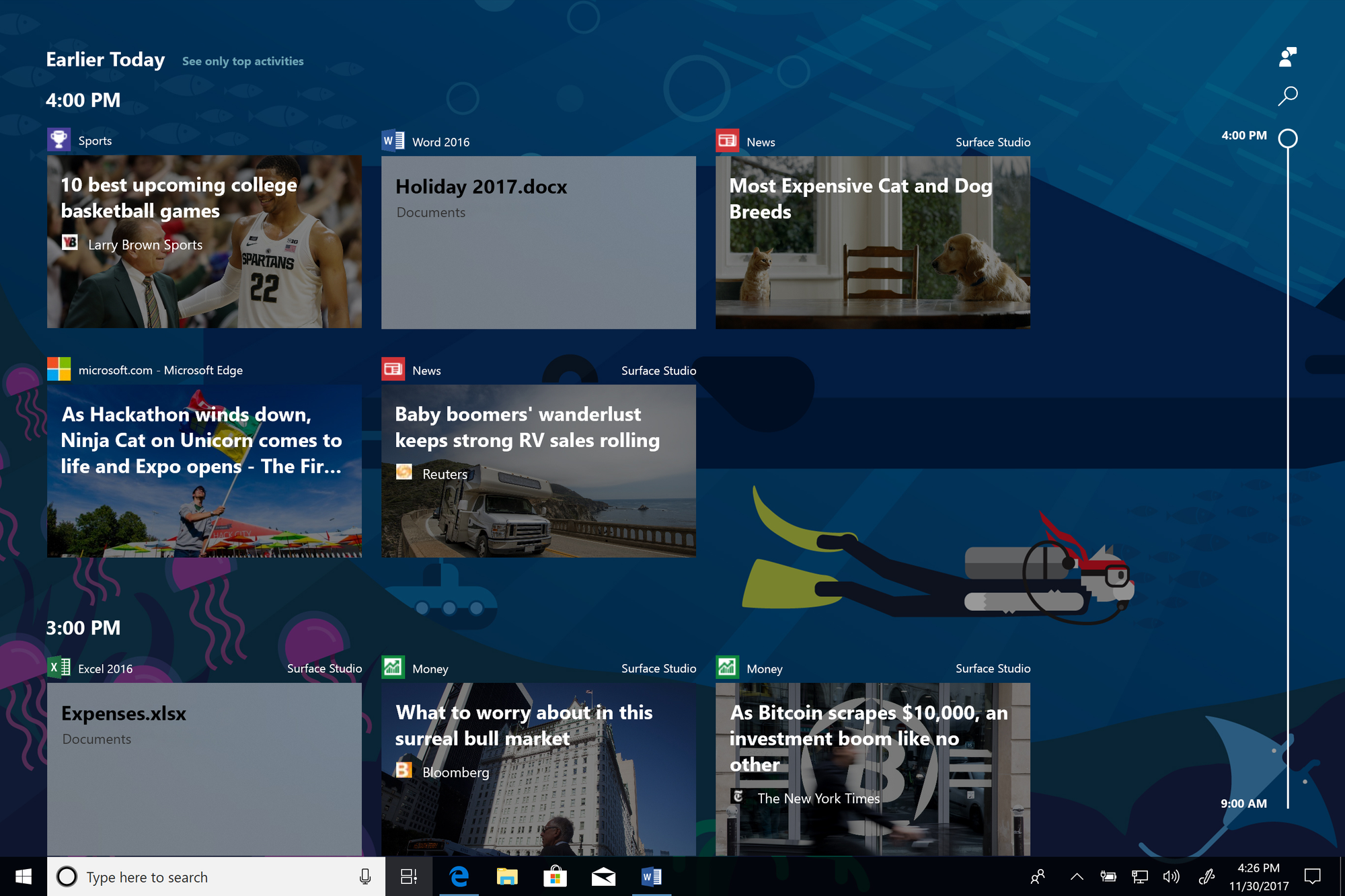
- Windows Timeline (2017–2019): All of your activity across all of your apps sorted and organized for you.
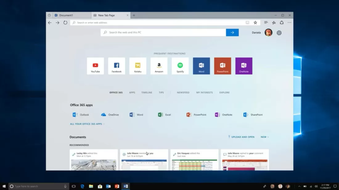
- Windows Sets (2018–19, canceled): apps and webpages in shared tabbed sets. Note what this actually was: the operating system grouping apps and web content into tasks, which makes it the closest thing anyone has ever shipped to what I'm about to propose.
- macOS Stage Manager (2022): automatic task-based window grouping, widely ignored. The reason I think Stage Manager didn't scratch this itch for people is that its super designed around the iPad style flow of "there is one thing you are using at a time and you need to be able to quickly switch between them". On iPad the model is "one thing at a time, switch fast." On desktop, two or three things have to work together. It compromised toward the iPad and hit for neither.
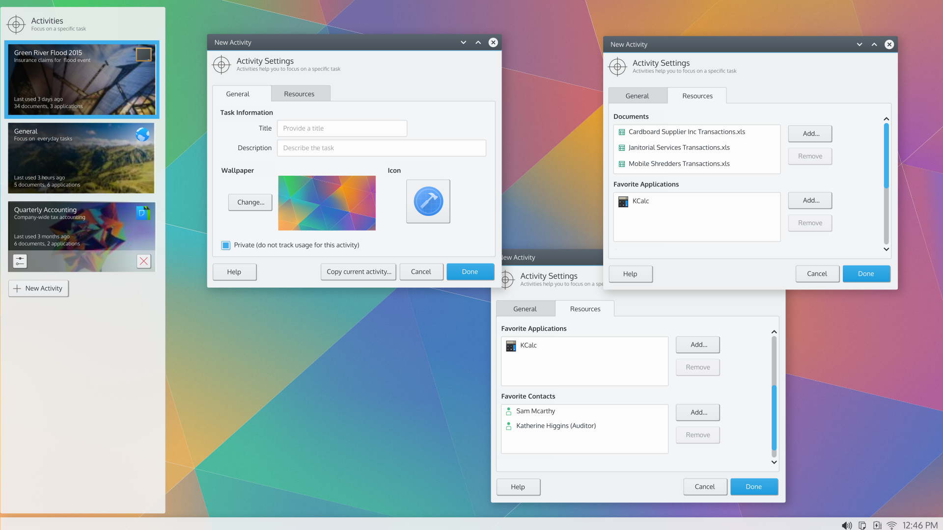
- KDE Activities: Everything I'm writing here is old news for KDE. They've been doing task-scoped desktop state for over a decade. Honestly this does most of what I'm writing about, it's just hyper manual and requires you to manage and set it all up. Also I love the KDE design docs, amazing stuff, worth reading. https://community.kde.org/Get_Involved/design
- PWA install: already gives web apps their own window and no browser chrome, which is clunky but at least makes them "real" applications.
So clearly we understand there's a problem. Why haven't these taken off like wildfire? I think there's a couple of different problems here.
Timeline needed apps to opt in to reporting activity, and most never did. It also logged everything, which read as creepy (which is a problem that my idea would have too), and the UI surfaced Edge features nobody wanted, so it felt like a browser push more than a feature. Sets died somewhere between internal strategy and app-compatibility chaos where the interesting question is why nobody demanded it loudly enough to save it. Stage Manager tried to be universal and pleased nobody. KDE Activities is opt-in, and opt-in means the people who need it most never configure it.
The pattern in the graveyard: the ideas aren't wrong, they're just not defaults, or they're not done at the OS level where they can see all apps. Everything I want has to be structural.
Filesystems as a weak abstraction.
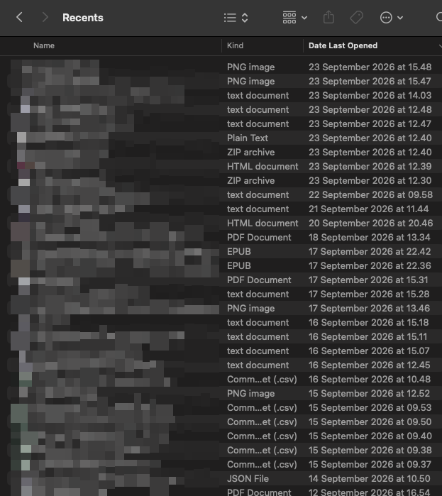
I have opened, downloaded and created dozens of documents since September 23rd (I'm writing this on September 28th). I don't have a single fucking clue how MacOS populates this window. Maybe its broken. Maybe its working as intended through some criteria I don't understand.
Maybe it's personal.
But the idea is here. The ideal would be "across my entire computer and applications, what are the recent files I have interacted with" and expand that out to include emails and Teams/Slacks and everything. I should be able to see everything going on with my machine, search through it and not care if its stored inside of Slack or iCloud or whatever. Single pane of glass.
Microsoft tried it, people didn't like it, but I think the concept makes sense.
What might a solution look like?
So what has changed? Why might we be able to crack this problem now when before it was too complicated? This is where I think a local LLM might make sense, if you can figure out a way to do it where it doesn't cause more problems than it solves.
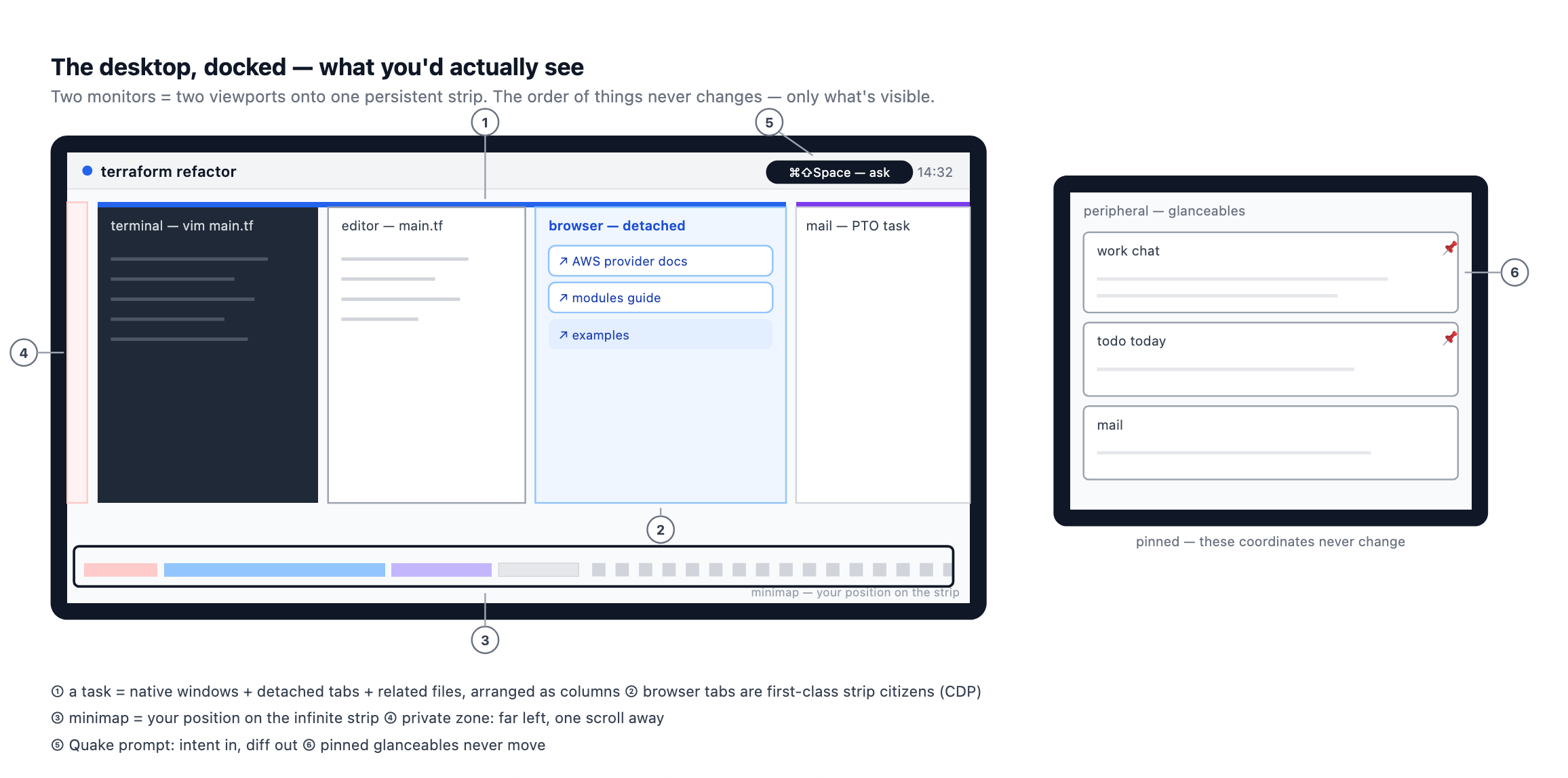
So what are we looking at here. The concept would be organizing it around the idea of tasks. When you define a task, this allows you to organize all the windows together, including specific browser tabs detached and associated with the task, not with the concept of "browser". You still get get the flexibility of defining glanceables that exist outside of the strict tiling view.
The basic window flow would look like this:
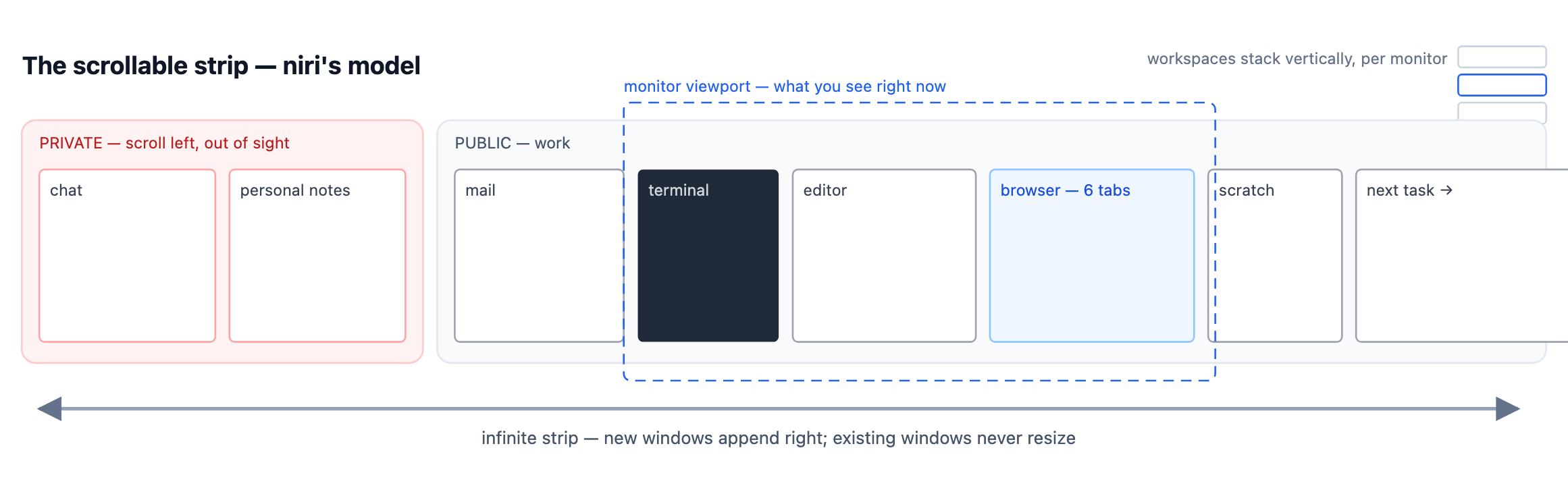
The desktop is one infinite canvas; each physical display is a viewport onto it.
You would end up with the following "transition contract" to handle my initial problem of "what about many monitors/new monitors".
- Never Change items: horizontal order of windows, scroll position, input focus, task membership.
- Reflows Deterministically: column widths, like a responsive layout. When the shelf narrows, the books stay in order, the rightmost ones fall off the edge of the viewport into the scroll region
- Is state, replayed on redock: viewport aims. Two monitors means two viewports aimed at two regions with one at your focal task, one at the glanceables region. Undock: second viewport disappears; its region is one scroll gesture away.Redock: it re-aims where it was.
The OS finally learns which monitor is focal. The display receiving keystrokes ~90% of the time is focal; windows that stay visible but rarely receive focus are glanceables. That's inferable from focus telemetry and requires no eye tracking or config. And when the laptop screen is small, glanceables demote to a thin strip rather than full tiles which is, note, exactly what tmux already does.
One substrate that covers our three user types. Remember the maximizers, near-maximizers, and coordinators? On the canvas they're just column counts. A maximizer is one full-width column. A near-maximizer is one column plus the glance strip. A coordinator is N columns. Nobody gets forced into anything. This is why the design can be a default where KDE Activities was a preference. It's because the substrate doesn't impose a style, it just stops punishing whichever style you already have.
Privacy becomes a first-class flag, driven by machine state. Private is a property of a window or tab, not a region of the screen. Private content renders occluded unless the machine can vouch for safety. The rule I landed on, at the cost of my favorite bad idea (story below): derive privacy state from machine-observable facts like connected displays, or active capture sessions and never from inferred human states like attention or idleness.
Connect to a novel display and it gets a "ready to present" screen by default. You explicitly aim it: this task, this window, or extend the canvas. Known displays skip the dance. Screen sharing is the same event with no cable. You don't need the model to have discipline if the door won't open, and you don't need the user to have memory if the default can't leak.
None of this is exotic. Apple's Keynote's presenter view has been shipping for twenty years plus with slides on the projector, notes on your screen. Apple never promoted the pattern to the OS even though it makes obvious sense. I'm asking for presenter view as a desktop primitive.
Browser tabs detach into real windows and join whatever task they belong to. The "browser" stops being a place windows live.
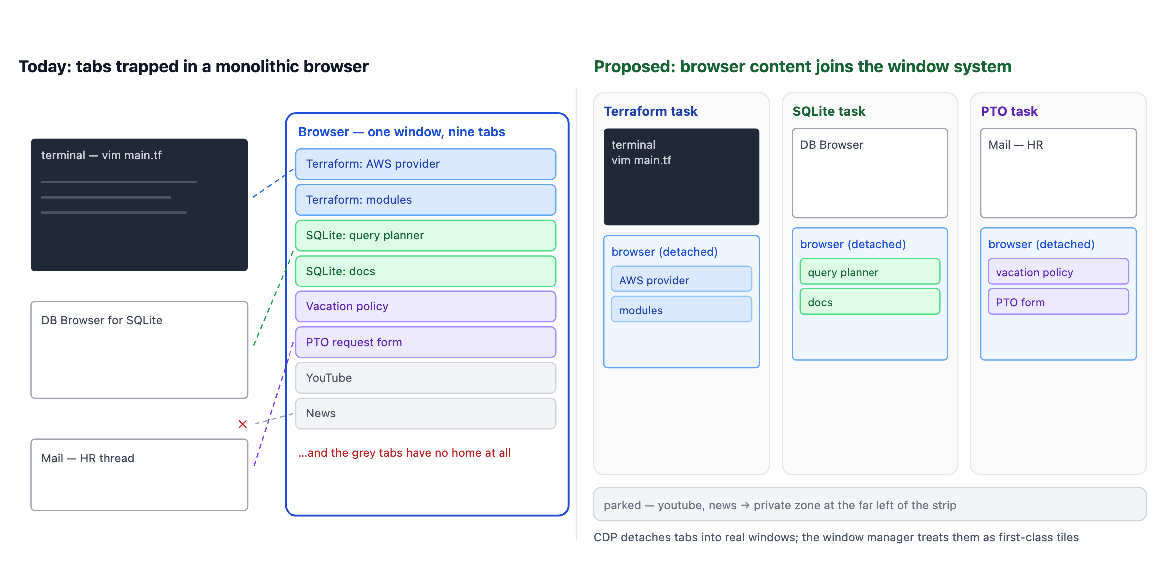
This all makes sense until you get to "how do you organize this stuff around tasks". I think for more expert users they're going to be able to do this stuff, but part of the problem is that we don't want them to ever have to drop back down into a configuration file. A mouse and dragging stuff around is too clunky for how this would work. Ideally I should be able to ask something that has access to what information is contained inside of each one of these browser tabs and window and help me organize it in some logical flow.
That's where the local LLM comes in.

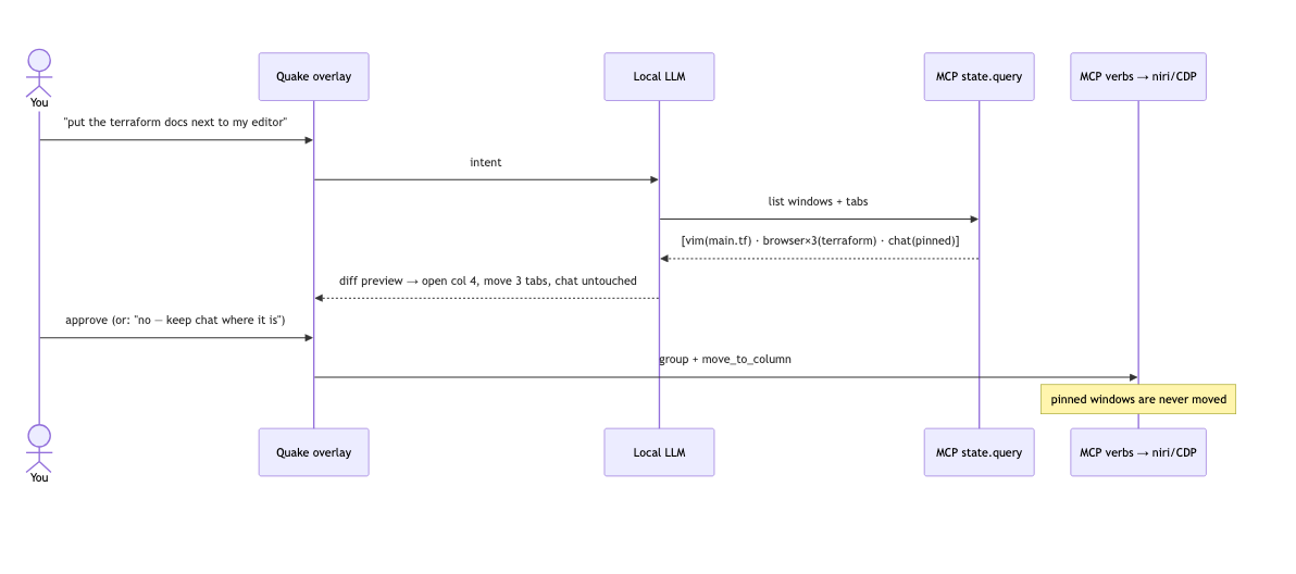
I'm calling it a "quake overlay" because I'm old and the idea of a text input that drops in from the top with a universal shortcut has always been the quake terminal dropdown to me. Younger people know the same pattern from the Discord overlay, which I have decided not to be mad about. However in the previous diagram its shown as a more friendly "Ask" box.
But the basic flow would be that you ask the LLM to assist you with organizing, it would show you what it's thinking by querying the information through a constrained MCP server with a set verb list and then gives you a preview of what the layout is going to look like. The model never touches the window manager directly. It proposes and you press y.
People rarely pick up completely novel tasks: a graphic designer spends their life in "open files from network storage, make changes, save output, paste into chat, repeat." People rarely sit down at novel display contexts: laptop-only, the desk, the conference room. People rarely attach novel displays. Novelty is rare everywhere, so the expensive one-time machinery of classify, propose, preview, confirm only runs rarely, and everything in between is deterministic replay. You organize a limited series of tasks once and reuse them forever. Check the tickets, open Vim and a browser, work the ticket, write the update, open the PR, post it for review, next ticket. You could make the config a nightmare of JSON and stop caring, because the only intended reader is a model that doesn't mind. The config file stops being an interface.
The biggest issue here would be spatial memory. People understand where things are in relationship to each other on their computer and they don't like it if they are changed. Think of it like "if I came and messed up your physical desk by moving stuff around and adjusting your chair". So I suspect you would need to enforce a strict "append, don't replace" model.
There's a name for this actually. Kirsh and Maglio call it epistemic action, where Tetris players rotate pieces more than the game requires, because rotating is how they think about the piece. Link Your window layout is thought in progress. A helper that "optimizes" it mid-thought is interrupting you.
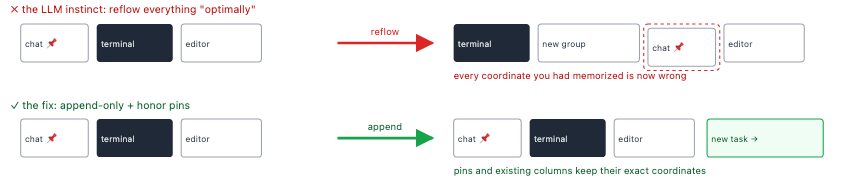
This is a problem I encountered with just trying this idea out though. Modern LLMs are actually not very good at "touch this stuff, never touch that stuff". So unclear if this is a realistic idea or not. One boring fix: the LLM proposes, dumb deterministic code executes, and the executor refuses to touch anything pinned. You don't need the model to have discipline if the door won't open.
You'd still need a high level UI element for users and this is where I think the more inclusive concept of filesystem could come in.
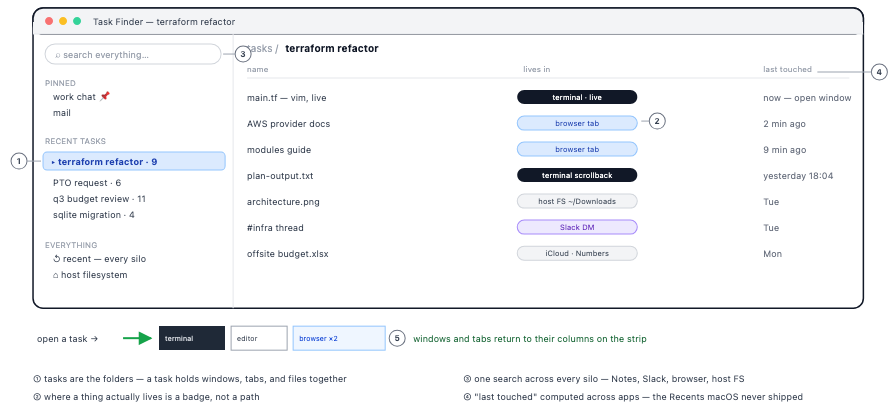
Tasks become roughly comparable to Directories now. But everything flows from the initial high level concept of "Tasks" and then flows out to individual things. One application is never the task. It's "some chat window, a browser, maybe Preview." Can we try to build it?
So my hope was that here I would be able to post a Linux desktop running an example. But as it turns out (unsurprisingly) it is insanely complicated to make something like this run at all. Some of the underlying ideas work reasonably well (global terminal shortcut dropdown from the top, scroll-able tiles), but it's still pretty clunky. I'm gonna keep working on it and see if I can get something as a demo running, so if you are interested either add me to an RSS reader or just....wait I guess.
In the interest of full disclosure I think this is gonna take many weekends of work to even get a functional demo running. So I'll do my best, but be patient.
Reasons this design sucks
So in attempting to get this up and running in a Linux VM, I immediately ran into serious logical issues with my design. I think failures are often more interesting to read about than successes, so let's talk about them.
- The privacy-minded design runs on surveillance-shaped data. There's an irony I sat with for a while. The design promises the OS will finally know which monitor is focal which is the thing Grudin measured twenty-five years ago and the mechanism is input-focus telemetry. Watch which display gets the keystrokes. Watch which windows never receive focus. Store that over time. The privacy-first window manager wants to know more about what you're doing than your current OS does. Keep it local, keep it ephemeral but it's still a lot of behavioral data to drive this system. Just the observation that every mechanism in this post is hungry for data that has historically derailed ideas like this.
- My favorite privacy feature was a joke. The original plan was elegant: private stuff far left, public to the right, and when you go idle the viewport drifts back to public. Like a friend changing the subject for you. Then I ran it, and the first thing I learned is that reading is an idle state. You stop typing to read the thing, and the system starts scrolling the thing away from you. Meanwhile, a person walking by sees everything, because a "private" window on a wide monitor isn't hidden it's just further left. The feature hides content from its owner and shows it to the threat. Privacy by occlusion needs to know when a threat exists, and the threat is a pedestrian, which is undetectable.
- Nothing in this design ever ages out. The canvas is infinite, the rule is append-only, spatial memory is sacred so the mess grows monotonically. I have solved the electronic messy desk by buying it an infinite desk. When I first read WindowScape, I called their evaporating photographs "the gap to fix." I've changed my mind because evaporation was quietly doing the job of a garbage collector. Something needs to go dormant without moving but deciding what goes dormant is a reaping decision, and reaping is exactly what append-only forbids. It didn't take long for the infinite desktop to feel overwhelming when I tried it.
Fun experiment
I don't know if this underlying idea is a good idea, but it is liberating to stop waiting for MacOS and Windows to do something better or interesting in this space and decide to try it yourself. The graveyard up there is full of good ideas that died of distribution. We're overdue for a radical experiment that ships as a default.
The most eye-opening part of this entire experience was how much the original overlapping window design was a hack to get around fundamental hardware limitations and how soon after it was launched did people clearly see the problems. I'm surprised how often that happens in technology, where you see a problem, search for academic papers about the problem and find just a massive wealth of information from people saying "oh yeah this is 100% a problem and one we should solve soon". Maybe this post inspires someone smarter than me to solve it finally.

 点赞
点赞 收藏
收藏 点踩
点踩 分享
分享