I designed 100+ screens in 4 days. Here’s what speed without research really costs.

Two years as the only designer at a startup, why competitor research became our only research, and what I’d fight for now.

Every brief I got looked the same: a screenshot or a rough idea, a deadline of today, and nothing else. No problem statement. No idea who the user was. No way to tell whether the design worked. Just “make this.”
For almost two years, I was the only designer at a startup running more than five products at once. On a normal day I’d jump between:
- UI fixes on live products
- Brand-new screens and features
- Keeping the design system alive
- Handoff, QA and design fixes after development
- Pitch visuals and one-off requests from leadership
I made one rule for myself: whatever the deadline, I’d look at competitors before I designed anything. It was the only research I could protect. User interviews, synthesis, a real brainstorm: none of that ever made it onto the calendar.
It took me a while to see what that rule was actually doing. We weren’t designing products. We were rebuilding other people’s products, minus the thinking that made them work.
Why competitor research always wins

Competitor research survives in a startup for one reason: it fits in an afternoon. You can open five apps, screenshot their flows and have something to show by evening. Interviews can’t do that. Neither can a brainstorm.
So it quietly becomes the whole research phase, and it answers the wrong question. It tells you what other teams built, not why they built it or whether any of it fits your users. On its own, it’s a mirror, not a map.
Everything else follows from that. With no access to real users and no time to explore, you design one direction: the first one, usually borrowed from whichever competitor looked best. Nothing gets measured after launch, so nobody finds out it missed. The next brief starts from zero.
A product for lawyers, built without asking one

One project made this concrete. We were building a product for lawyers, and it was designed the way everything else was: from other apps, the founder’s assumptions and a same-day brief.
When I finally looked at it from a lawyer’s point of view, it didn’t fit how they work at all. Lawyers organize their day around cases, court deadlines, document review and client confidentiality. Our flows followed a generic app pattern. Nobody had asked a lawyer.
It shipped on time, and it missed the user.
“Design isn’t a long process”

After about a year, a different problem showed up. None of our products looked like they came from the same company. Each one had drifted its own way, one rushed screen at a time, and the design system couldn’t keep up.
When I raised this, the answer was always some version of: design isn’t a long process, functionality comes first.
And functionality was coming fast. The team used AI to build features, so something could go from idea to working code in a day. I’d come in the next morning to find a new feature already built and waiting for me to “redesign” it.
But a redesign at that point had hard limits. I could apply the color scheme and make small UI changes. I couldn’t question the flow, the concept, or whether the feature should exist in that form at all. That conversation had already been skipped.
That’s the part I don’t see talked about enough. When AI makes building nearly instant, design doesn’t get faster. It gets moved to the end, where it can only change the surface.
Nobody to tell me I was wrong

There was no design lead. I reported to the technical head and the product manager, and both were always busy shipping features. There was no time to brainstorm together, and usually no time to explain why we were adding a feature in the first place.
So there was nobody to ask “why this pattern?” or “what did users say?” The feedback I did get came as taste: “make it pop,” “can we make it more modern,” “I don’t like this color.” It was honest, but it was about preference, not the user’s problem. I revised until the stakeholder was happy, which isn’t the same thing as the user being served.
100+ screens in four days

Here’s the moment that sums it up. Because of a strict timeline, I designed one complete product, more than 100 screens including popups and modals, in four days.
That’s about 25 screens a day. At that pace, you aren’t designing. You’re drawing boxes and hoping the logic holds.
It didn’t. In the end, the whole product started collapsing, and the first questions landed on design.
That’s not surprising. Design is the layer everyone can see, so when a product breaks, it looks like a design failure. Nobody sees the brief that came without a user, the feature built before anyone asked why, or the four days. It isn’t one person’s fault. It’s what happens when design is the last step instead of the first.
It’s not just one startup

I used to think this was just how my company worked. It isn’t. AI has changed how fast startups can build, and research is the first thing that gets cut to keep up.
The shift is big. In early 2025, Y Combinator said that for a quarter of its current batch of startups, 95% or more of the code was written by AI. When a feature takes a day to build, a week of user interviews starts to look like the slowest thing in the company. So the message becomes “let’s move fast with AI”: build, launch, scale. Interviews, validating ideas, testing with users and iterating on feedback all fall off the list.
The logic sounds reasonable, but it’s backwards. AI made building cheaper, which means it also made building the wrong thing cheaper, faster and more often. The cost of skipping research doesn’t disappear. It shows up later as low adoption, rework and delays, higher costs and confused users, and by then it’s much harder to trace back to the decision that caused it.
Designers usually feel it first. We’re the ones asked to make sense of features nobody validated, and to make them look finished.
What I’d fight for now
None of this needs a bigger team or a bigger budget. It needs a few habits the leadership agrees to protect, and getting that agreement is the real work.

- Ask three questions before opening Figma. Who is this for? What problem does it solve? How will we know it worked? If nobody can answer, the brief isn’t ready, and saying so is part of the job.
- Get design in before the build, not after. If AI can build a feature in a day, a 30-minute concept review before building costs almost nothing. After the build, all you can change is the color.
- Timebox research instead of skipping it. Two days is enough for three to five short user calls. Ask for “two days,” not “a research phase.” A fixed number is much easier to say yes to.
- Talk to at least one real user per project. For the legal product, one conversation with a practicing lawyer would have changed the flows.
- Use competitors for patterns, not answers. Note what they do, then ask why, and whether it fits your users.
- Get critique from outside. If there’s no design lead, join a design community, swap reviews with another solo designer, or book a monthly mentor call.
- Limit parallel work. Agree on one or two focus products a week. Five products with one designer is how consistency dies.
- Write down the trade-offs. When a timeline forces a shortcut, note it in the handoff: what was skipped and why. It makes the cost of rushing visible, and it gives the whole team a clear record to learn from when something breaks.
The next screenshot
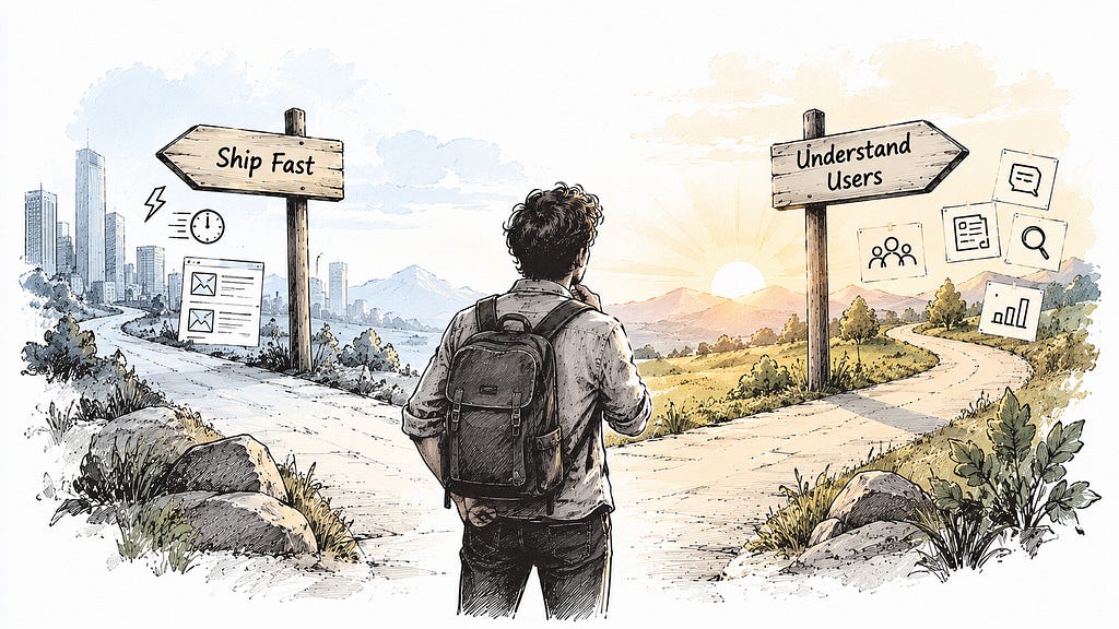
My skill and my speed were never the problem. I proved the speed: 100 screens in four days. The problem was the structure: one designer, five products, features built before design was in the room, and no time to understand the people we were designing for.
As AI keeps making the build faster, more startups will work this way. They’ll expect a team’s output from one person, and they’ll get fast screens and products that miss, unless someone makes room for the user before the build starts.
So the next time a screenshot lands with a deadline of today, don’t open Figma first. Ask the three questions. If nobody can answer them, that’s your first research finding.
I designed 100+ screens in 4 days. Here’s what speed without research really costs. was originally published in Bootcamp on Medium, where people are continuing the conversation by highlighting and responding to this story.

 点赞
点赞 收藏
收藏 点踩
点踩 分享
分享