Recognising and avoiding dark UX patterns

Common deceptive patterns, why they are deceptive, and what to do instead.

Key Takeaways:
- Dark patterns are widespread and harm user trust and business reputation.
- Dark patterns disproportionately impact users with accessibility needs.
- Legal regulations are evolving to address deceptive UX practices.
- Practical strategies exist for advocating ethical alternatives within organisations.
Dark UX, deceptive design, manipulative design, dark patterns — whatever you call it, chances are you’ve already experienced it. You may have accidentally signed up for a service or bought something you didn’t want. You may have even shrugged it off as poor UX, and sometimes it is. But poor usability can have a more sinister side: intentional, manipulative design.
Dark UX refers to interaction design crafted to get you to take an action you may not have wanted, because that action benefits the business. Trust goes out the window in favour of short-term gains. Things like forking over your hard-earned money for an item that will apparently sell out if you don’t buy it right now, or signing up for an online subscription, only to have to call and wait on hold for 30 minutes to cancel it. Those types of things.
Harry Brignull coined the term in 2010, but identifying the problem hasn’t reduced it. If anything, it seems more prevalent. A Princeton study of roughly 11,000 shopping sites found 1,818 instances of deceptive patterns across 15 distinct types in 7 broader categories — and automated detection can only catch patterns visible without interaction, so the real figure is probably higher (Mathur et al., 2019).
The trouble is that business goals are often tied to “getting more users to do x”, and that shapes decisions about how the experience gets designed. As UX practitioners, we have the difficult task of toeing that line — championing user needs while also serving business needs. That doesn’t mean you’ll eliminate these patterns from your product. But recognising them and understanding the behaviours they exploit helps you push for alternatives that lean toward user choice.
A note on names
Depending on who’s writing, I’ve seen the same pattern with three or four names. To keep it simple, I’ve used the naming from Brignull’s taxonomy throughout, because it’s the most widely recognised and it gives you shared language when you’re arguing a case with stakeholders (Brignull, n.d.). Where a pattern has a common alternative name, I’ve noted it.
A word on scope — this article doesn’t cover all eighteen of the types listed by Brignull. What follows are the patterns most likely to turn up in a product team’s own backlog. I left two out: addictive design and currency confusion are both real and serious, but they belong mostly to games and social platforms rather than the kind of product most of us are shipping. I’ve added one section that isn’t in the taxonomy list at all — cookie banners, which combine several patterns rather than forming their own, but are prevalent enough to be worth naming. If you want the complete, continuously updated taxonomy list, go to the source rather than any article, including this one.
Obstruction (the roach motel)
The user’s path to their intended destination is obfuscated or obstructed — not by tweaking the UI to manipulate them, but by the absence of an obvious route that creates a dead end. They can get in easily, but find it much harder to get out.
The subscription trap is a great example: signing up is quick and easy, while cancelling requires a phone call during business hours. Brignull’s taxonomy calls this variant “hard to cancel” (Brignull, n.d.).

Why it works: Having to call often delays cancellation, pushing users to put it off entirely. Users may keep paying for a service they aren’t using. Great for the company, bad for the individual — and increasingly a legal risk rather than a clever tactic (more on that below).
Visual interference and false hierarchy
Also called misdirection. The visual treatment of the interface steers you away from the choice you came to make: the action the business wants is prominent and styled like a primary button, while the action you want is grey text, or carries a warning icon, or is placed where nothing else on the site places a primary action.

Why it works: Colour, size, placement and expected behaviour all become second nature to users. Change those patterns between touchpoints, and people start clicking things by mistake or get lost and can’t proceed. Muscle memory takes over, and users often don’t read the text at all. In something like a cancel-subscription flow, the user focuses on the task and expects that clicking buttons that usually progress them will eventually complete that goal.
Trick wording
Language that misleads you into an action: double negatives, a label describing the opposite of what the control does, or a question phrased so that agreeing means declining. “Untick this box if you would prefer not to stop receiving updates” is the parody version — the real ones are only slightly better.

Why it works: People read labels, not sentences. Scanning lifts the operative word — updates, cancel, no — and assembles a meaning from it. Any label that rewards careful parsing is a label most users will get wrong, and a form built from such labels produces consent that isn’t really consent.
Confirmshaming
Wording that taps into emotion to make users feel negatively about the action they’re trying to take. The decline option is labelled something like “No thanks, I don’t like saving money” or “I’ll stay uninformed.”

Why it works: It costs the user something emotional to make the choice they came to make. Most people would rather click the neutral option than opt into feeling foolish — and shame is a faster trigger than deliberation.
Nagging
The user is trying to do one thing and is persistently interrupted by requests to do another — enable notifications, rate the app, add a phone number, upgrade. Every individual prompt is dismissible and reasonable. The pattern is the repetition.

Why it works: Nagging wears the user down instead of persuading them. Repeatedly dismissing the same prompt costs attention, and accepting eventually seems easier than declining for the sixth time. This pattern is often introduced with no manipulative intent, and testing may show the fourth prompt lifts adoption; the fourth prompt ships, but no one measures what it cost in goodwill. These can also sneak into your product by accident when multiple teams release features that all vie for the user’s attention, along with user feedback requests. You can see why users might experience prompt fatigue.
Sneaking and hidden costs
Not being upfront about costs, or about where additional fees will be applied. This happens with one-off purchases where fees appear late in the flow (often called drip pricing), and with subscriptions where certain features quietly incur extra charges with no warning. The related pattern of burying important information — T&Cs tucked inside a small UI element or behind a link nobody would think to open — also belongs here (Brignull, n.d.).

Why it works: By the time a user gets through the process of committing to buy something, they’re already emotionally invested in completing the purchase. They may not notice the additional charges, and if they do, they may be far enough in that they accept them. With subscriptions, many users feel they have no choice but to accept the extra fees.
But they’ll think twice about buying from you again. I’ve had this experience with a friend who discovered hidden fees on top of his subscription in a product I once worked on. He paid them, then cancelled quickly afterwards — a short-term win for the business, but a long-term loss of recurring revenue.
Comparison prevention
Pricing and features presented so that options can’t actually be compared — different units on different tiers, the same capability described in non-matching language, or essential details split across separate pages so no single view shows the trade-off. Pricing pages, insurance quotes and mobile tariffs are the natural habitat.

Why it works: Comparison is work, and the design decides how much. When a user can’t line options up side by side, they fall back on a heuristic instead — the middle tier, the one badged “most popular”, the one the page visually favours. You choose that heuristic rather than them, which is the entire point.
Hidden subscriptions and the paid “free trial”
This pattern pulls users in with the promise of a free trial, then forces them to enter payment details with no option to skip. The user is charged at the end of the trial with no warning and no easy route to cancellation.

Why it works: Users are likely to forget, or may not have registered that they agreed to pay after a set period — especially when the terms are in small print. Some people genuinely do want to continue using the product. Others end up with a surprise bill.
To be clear, taking card details for a trial is not inherently deceptive. It is a reasonable fraud-and-abuse control, and so widely used that you could argue it’s an industry standard. However, it can become deceptive when you combine a card on file, no reminder before you take payment, and a difficult cancellation route. Fix the last two things, and you can keep the card.
A transparent free trial flow must clearly state everything a user needs to make an informed choice. The user needs the charge date, a reminder a few days before charges are applied, and an easy online cancellation process.
Preselection and the opt-out
I’ve seen this one a few times in account and newsletter sign-ups. Rather than opting in to receive communications or share your data with third parties, the wording is actually an opt-out. By default, the user is already enrolled in data sharing they may not want. Where the box is ticked for you, the pattern is called preselection (Brignull, n.d.).

Why it works: It’s much easier to miss an opt-out than an opt-in. I’ll admit to having re-read the wording on these several times to be sure what I was agreeing to. People in a hurry may not realise it’s an opt-out at all and skip past the option entirely.
Forced action
The user wants one thing and is made to do something else in return. A form that won’t show you an article until you hand over a phone number. Checkout that requires an account when a guest checkout would do. A feature that asks for access to your contacts when it does not need them.
As UX practitioners, we love data and getting to know our users, which makes this an easy one to talk ourselves into — every field on that form has someone who wants it. But there’s a difference between asking and requiring, and the moment a field becomes mandatory, it stops being a request. Be mindful of what you’re collecting, why, and where you store it: the GDPR sets clear rules on how user data must be handled and for how long, and users can request everything you hold on them (European Commission, 2026).

Why it works: The user has already decided to do the thing. That decision is sunk, and the demand arrives after it — so the cost of abandoning now feels higher than the cost of giving up the data, even when it isn’t. Nobody would trade their phone number for an article in the abstract. They’ll do it two clicks in.
Disguised ads
Ads made to look like part of the product or page you’re using. Calls to action within the ad appear to be part of the UI, as though clicking will progress your workflow or reveal more information. Often deployed by a third party trying to steer you towards their product before hitting you with unwanted follow-up.

Why it works: A CTA on a banner, placed in the right position with the right wording, can easily overshadow the real in-product action — particularly when users are scanning rather than reading.
Fake urgency and fake scarcity
Patterns designed to trigger an immediate emotional response: countdown timers, “only 2 left in stock”, “37 people are viewing this right now.”

Why it works: Users feel they must act immediately or miss out. Someone on the fence about a purchase is far more likely to complete the transaction if they believe the item will sell out while they think about it.
Both Brignull and the Nielsen Norman Group highlight this as deceptive (Brignull, n.d.; Nielsen Norman Group, 2024). Genuine stock counters are useful information. But a countdown that resets when you refresh the page, or a decorative stock figure, is deceptive. The same applies to security features. Telling someone their account lacks two-factor authentication is a legitimate nudge about a real risk. However, telling them their account is at risk of being hacked is not. Focus wording around the benefit to the user, instead of fear-mongering. The problem is that the urgency isn’t real.
Fake social proof
Reviews, testimonials, and activity messages from people who don’t exist, or reviews lifted and transplanted from other products.
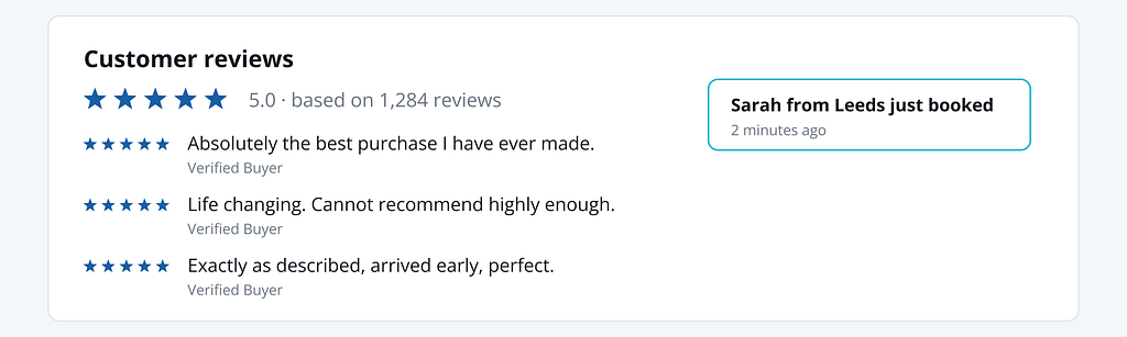
Why it works: We treat other people’s behaviour as evidence about quality, especially when we don’t know how to judge a product ourselves. Fabricated proof borrows the authority of a crowd that isn’t real. It’s also among the most heavily enforced patterns in the taxonomy. Fake reviews attract regulator attention.
Cookie consent banners
While not deceptive on their own, these often combine characteristics of other deceptive patterns. They deserve their own mention, because almost everyone encounters them daily. You won’t find this specifically in Brignull’s taxonomy, but they often use other types like visual interference and obstruction to push users toward the path of least resistance. An option intended to give users choice, designed to take that choice away.

Why it works: Users have been trained to treat the banner as an obstacle between them and the content, not as a decision. The design exploits that impatience — and the asymmetry is deliberate enough that European regulators have repeatedly ruled that consent collected this way isn’t freely given.
Who this hurts most
These patterns don’t distribute their harm evenly. Each one relies on users having the time, attention, confidence, and digital literacy to notice something is off.
That means they land hardest on people with cognitive disabilities or low digital literacy, people navigating an interface in a second language, older users less fluent in current UI conventions, and anyone in a hurry or under stress. Patterns built on visual hierarchy are nearly invisible to screen reader users, who encounter options in DOM (Document Object Model) order with no indication that one button is enormous and blue while another is grey and 11px (W3C, n.d.).
Data backs this up. An interview and diary study with 16 people who use visual accessibility technology — screen readers, magnification, braille displays — documents their experiences across six deceptive design patterns and makes a point worth mentioning in your next design review: some of what participants encountered was intentionally deceptive, and some was an accessibility barrier that behaved as deceptive. From inside the flow, those are indistinguishable. The impact is the same, and access barriers make the harm worse (Lewis et al., 2025).
A pattern that is a mild annoyance can become a real barrier for users with accessibility needs. That’s a better argument, and it tends to land better in rooms where accessibility is already an accepted concern.
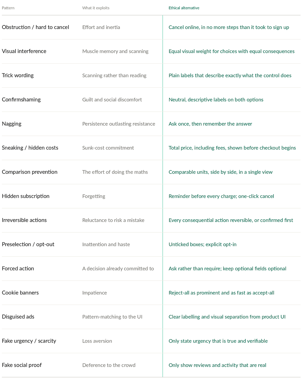
Principles and Ethical Alternatives
To help assess and improve your own designs, keep these principles top of mind:
Clarity: Use plain language to communicate information, choices, and consequences.Be specific to avoid ambiguity that could mislead or confuse users. Actions should set users’ expectations, for example, “Accept” instead of “Okay”.
Reversibility: Opt-out and undo actions should be simple, whether that’s unsubscribing, changing settings, or cancelling a service, without unnecessary barriers.
Informed consent: Give users enough information to make a clear, deliberate choice, especially when sign-ups, subscriptions, or data sharing are involved.
User control: Give users real control over their decisions, rather than nudging them toward the business-preferred option through design tricks.
Transparency: Be upfront about costs, commitments, and any implications of an action. No one likes surprises on their bill.
If a design choice violates one or more of these principles, ask whether a more user-centred approach can achieve the business goal.
Convincing stakeholders
What can you do when “that’s manipulative” isn’t landing with your stakeholders? A few things that can help:
Argue about the metric, not the design. Most of these patterns optimise a conversion event while impacting something further down the funnel. If the metric under discussion is trial-to-paid conversion, ask what happens to 90-day retention, refund rate, chargebacks and support volume. My friend with the hidden fees converted beautifully and then churned — that’s a win on one dashboard and a loss on another. Get both dashboards in the room.
Bring the legal exposure. This used to be the weakest argument available. It isn’t any more (see Where the law is heading below). A specific number attached to a specific regulator changes the discussion faster than an appeal to principle.
Gather evidence of user frustration. Gather key findings, paired with specific user stories or video clips that illustrate the issues. Quantitative data such as support tickets, app store reviews, or cancellation surveys. Qualitative data from support calls and interviews, with direct quotes from users to help support your argument. If the discussion veers toward adoption metrics, bring the cancellation metrics into the conversation. This grounds the argument in both numbers and real user voices, making it more persuasive.
Lead with the alternative. Leading with an objection invites a debate you may lose. Instead, have a proposal ready that meets the business objectives and recommend any testing criteria. If that doesn’t work, you can offer to test both options. Make sure you capture the right metrics in testing, since adoption only tells part of the story.
Keep decisions documented. Write down what was raised and when. It protects you, and when the compliance question arrives in future, you have a record showing the decision was taken despite the risks you raised.
Where the law is heading
Legislation has been slow to catch up, but it’s moving.
United Kingdom. The Digital Markets, Competition and Consumers Act 2024 brings in a new regime for any subscription that renews automatically — including free and discounted trials that convert to paid terms. Put plainly: if someone can start a subscription on your website, they have to be able to end it there too (s. 260). The Act also requires you to tell people clearly what they’re signing up for (ss. 256–257), remind them before a renewal charge lands (ss. 258–259), and give them a window to change their mind after a trial converts or an annual term rolls over (ss. 264–265). While not in force yet, they are set to take effect in January 2027 (Harper James, 2026). The date has moved more than once, so it’s worth checking the current planned enforcement date.
The CMA no longer needs to go to court either. It can decide for itself that a business has broken consumer law and fine it directly, up to 10% of global turnover or £300,000, whichever is greater (Competition and Markets Authority, 2025a, p. 71; 2025b). For anything but a small business, the percentage matters.
Ignoring the directions that come with the decision can also land you with a further penalty of up to 5% of global turnover or £150,000, whichever is greater — plus up to 5% of global daily turnover, or £15,000, for each day the business fails to comply (Competition and Markets Authority, 2025b). The Act expressly permits combining a fixed penalty and a daily rate (Digital Markets, Competition and Consumers Act 2024, s. 193(2)).
United States. The FTC’s Negative Option Rule — the “click-to-cancel” rule — was vacated by the Eighth Circuit in July 2025, days before it was due to take effect. Importantly, the court ruled on procedural grounds (the Commission hadn’t issued a required preliminary regulatory analysis) rather than on the substance, which is why the rule hasn’t gone away: the FTC moved to revive it in 2026. In parallel, Congress has introduced click-to-cancel bills, including the Unsubscribe Act, in both chambers (Greenberg Traurig, 2025).
California’s automatic-renewal laws already impose disclosure and easy-cancellation duties, and state attorneys general have been active in enforcing them (Bonta, 2025).
All of these measures target the same handful of patterns: unclear terms, silent renewals, and cancellation that’s harder than sign-up. It’s no longer a question of if, but when it will become a compliance problem. Staying ahead of the legislation can avoid costly fines later.
Conclusion
As business goals push for more and more engagement, it’s easy to see how these patterns became so common. As more legislation passes, recognising them becomes a matter of avoiding costly fines, not just of advocating for user autonomy.
Fines shouldn’t be the only argument. The short-term benefits of a deceptive pattern don’t match the long-term cost: trust, loyalty, and brand image will all suffer, showing up as churn and poor reviews rather than a line item anyone can trace back to a design decision. Choosing transparent, user-respecting patterns builds the opposite — retention, reputation, and users who recommend you. The businesses that work this out early get to keep their customers.
Pick one flow in your product this week — cancellation is usually the most revealing — and walk it as a user who wants to leave. Does it give the user an easy way out?
Further reading
- Deceptive Patterns — the pattern library and taxonomy
- Deceptive Patterns in UX: How to Recognize and Avoid Them
- Dark Patterns at Scale: Findings from a Crawl of 11K Shopping Websites
- Inaccessible and Deceptive: Examining Experiences of Deceptive Design with People Who Use Visual Accessibility Technology
References
Bonta, R. (2025, September 4). Attorney General Bonta issues consumer alert on California’s Automatic Renewal Law. State of California — Department of Justice, Office of the Attorney General. https://www.oag.ca.gov/news/press-releases/attorney-general-bonta-issues-consumer-alert-california%E2%80%99s-automatic-renewal-law
Brignull, H. (n.d.). Types of deceptive pattern. Deceptive Patterns. https://deceptive.design/types/
Competition and Markets Authority. (2025a). Direct consumer enforcement guidance: CMA200, ch. 7 (Penalties), p. 71. GOV.UK. https://www.gov.uk/government/publications/direct-consumer-enforcement-guidance-cma200
Competition and Markets Authority. (2025b, August 28). How the CMA uses its direct consumer enforcement powers — Final decision. GOV.UK. https://www.gov.uk/government/publications/how-the-cma-uses-its-direct-consumer-enforcement-powers/how-the-cma-uses-its-direct-consumer-enforcement-powers#final-decision
Digital Markets, Competition and Consumers Act 2024, c. 13 (UK). Subscription contracts: Part 4, Chapter 2, ss. 256–265. Direct enforcement powers of the CMA: Part 3, Chapter 4, s. 193. https://www.legislation.gov.uk/ukpga/2024/13/contents
European Commission. (2026). Information for individuals. https://commission.europa.eu/law/law-topic/data-protection/information-individuals_en
Greenberg Traurig. (2025, July 11). Eighth Circuit vacates FTC’s ‘click-to-cancel’ rule. https://www.gtlaw.com/en/insights/2025/7/eighth-circuit-vacates-ftcs-click-to-cancel-rule
Harper James. (2026). New rules on ‘subscription traps’ brought forward to January 2027: what businesses need to know. https://harperjames.co.uk/news/new-rules-on-subscriptions-from-january-2027/
Lewis, A., Martinez, J. J., Das, M., & Fogarty, J. (2025). Inaccessible and deceptive: Examining experiences of deceptive design with people who use visual accessibility technology. Proceedings of the 2025 CHI Conference on Human Factors in Computing Systems. https://homes.cs.washington.edu/~jessejm/data/LewisCHI2025.pdf
Mathur, A., Acar, G., Friedman, M. J., Lucherini, E., Mayer, J., Chetty, M., & Narayanan, A. (2019). Dark patterns at scale: Findings from a crawl of 11K shopping websites. Proceedings of the ACM on Human-Computer Interaction, 3(CSCW). https://doi.org/10.1145/3359183
Nielsen Norman Group. (2024, November 4). Deceptive patterns in UX: How to recognize and avoid them. https://www.nngroup.com/articles/deceptive-patterns/
W3C. (n.d.). Understanding SC 1.3.2: Meaningful sequence (Level A). Web Content Accessibility Guidelines (WCAG) 2.2. https://www.w3.org/WAI/WCAG22/Understanding/meaningful-sequence.html
Recognising and avoiding dark UX patterns was originally published in Bootcamp on Medium, where people are continuing the conversation by highlighting and responding to this story.

 点赞
点赞 收藏
收藏 点踩
点踩 分享
分享