‘Severance’: Color, composition and form. An analysis of dystopia from Design Theory


This article contains no spoilers but offers underlying information that reveals imperceptible aspects of one of today’s hottest series. By the end, you’ll most likely want to binge it. That ‘Severance’ is produced by Apple TV+ and is a masterpiece of retro minimalism is no coincidence.
This article was originally published by Retina Tendencias Spanish magazine.
por Francesco Maria Furno
The dystopian format is one of the richest, because it toys with the human psyche in a whirlwind of situations that could be real — but aren’t — pushing our brains to believe something on the verge of conspiracy. As viewers, we’re constantly walking a tightrope, doubting whether what we see is reality or fiction. For those who love this perverse game, Severance is full of details that hook you into a universe brimming with wild theories. Mark S. is someone who’s chosen to separate his real life from his work life, accepting a position at Lumon, a company whose philosophy teeters between a massive corporation and a cult. Its employees agree to the insertion of a brain implant that splits the individual in two, so they can live their personal lives without any memory of work — and be happy, oblivious to the pressures of their job.

Dystopia of work or current reality?
Ben Stiller, the series’ director, serves us a contemporary philosophical and social dilemma: do we need to disconnect from work? Is it ethical? What are the implications of a private company doing whatever it wants with us for eight hours a day?
Aren’t companies already manipulating sensitive information about each employee? Are we sure Severance isn’t an allegory for what we’re living through today — the Blue Monday, burnout, hierarchical structures, wrongful dismissals, the lack of transparency in large organizations with controls that create two realities: the outside as a person, the inside as a worker?
Can we be certain Lumon isn’t an allegorical representation of American technocracy and its functionalist intentions taken to cult-like extremes? A modern retelling of the myth of Orpheus, mixed with Sisyphus and Plato’s cave.
Moreover, the protagonists choose to split their lives in two to optimize their emotional states by separating everyday life from the grind of work. We’ve all dreamed of keeping workplace pressures outside our existence. What if a private behemoth capitalized on that?
Visually, the series’ dominant colors — icy blue and white — serve as an analogy for our need to isolate and freeze ourselves against pain. In this sense, the story can be read as a clear metaphor for society’s need to disconnect, overwhelmed as we are by psychophysical suffering, in search of a neutral space where we feel nothing. Completely detached from suffering and effort.
A powerful narrative, a dilemma delivered with a negative, paranoid slant, all wrapped in aesthetic sublimation: set design, visuals, framing, wardrobe, sound. It’s a triumph of visual and sonic artistry that portrays a divided society — one that accepts and simultaneously questions Lumon Industries’ lights and shadows through meticulously crafted symbolism.

How do you translate a story into a symbol-filled visual universe?
Severance’s coherence lies in structuring a potent, challenging narrative thread with a pristine aesthetic, conceived down to the smallest detail. When something’s well crafted, you can feel it. It’s a law of life. And with its pale tones, extreme aseptic minimalism, and the chill of a well-told dystopia, Severance is a synesthetic beauty that tickles the mind.
It’s a brazen display of beauty and symbolism. A little 21st-century television Sistine Chapel, either praising or critiquing North American technocracy’s power. Although in some respects it smells a bit like stealth product placement designed to sell more Apple products — generating desire through disgust toward a polished, gleaming contemporary Frankenstein.
Why is visual theory key in the series of the moment?
I’ll explain as briefly as possible, covering:
- Color.
- Composition.
- Form.

1. Color.
To borrow current jargon, the series flaunts staggering chromatic palettes. It uses a three-color system in many scenes.
We can group its visual narrative: Lumon is represented by a cold palette of blues and greens. Meaning: institutionalism, rationality, and coldness — the essence of Fordist productivity. In one word: EFFICIENCY that no one can question.
By contrast, Mark S. and Helly — despite being corporate products of Lumon — wear orange and red, colors tied to nonconformity, passion, and rebellion. Orange is the go-to hue for anyone daring. Any character who challenges the status quo in a story sports orange hair.

This contrast creates a complementary color palette: blue (Lumon/rational) versus red/orange (Mark S./emotional). The entire story hinges on that opposition.
The devil is in the details: when Helly dresses up for the outside world, her gown features two crossed blue and green stripes — a clear symbol of her dualism and how those two paths can intertwine, creating an anomaly in the separation.
Byung-Chul Han’s Society of Fatigue, alongside films like Charlie Chaplin’s Modern Times, can offer even more insights into Apple TV+’s series essence.

It’s also worth noting Lumon Industries’ false humanism — they even have their own LinkedIn profile — with paintings displayed in common areas by the Optics and Design department, emblematic of a sectarian narrative that tries to build an official discourse based on kindness and benevolence.
The color functions much like in Inside Out, with a complementary palette that pits rational cold against the warmth of emotion.

2. Composition.
This is Severance’s great visual narrative element. It relies on symmetry in most scenes to underscore the idea of highly efficient, mass-production. Lumon’s interiors and exteriors always feature symmetry with a chilling balance, only broken in moments like when Mark S. strolls down a hallway holding balloons. The countless nods to Stanley Kubrick’s work — and later Wes Anderson’s — are unmistakable.
In the framing, you can see the subject in the foreground dominate a spacious setting, with diagonal lines converging on the center.

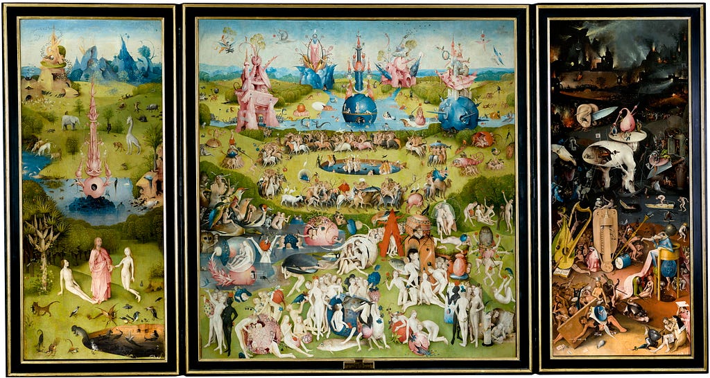
The rule of thirds also creates dynamic compositions, injecting action and tension when subjects occupy the thirds. It could even carry a biblical connotation, alluding to Lumon’s religious origins — a kind of Technological Garden of Earthly Delights.


3. Form.
The logo is ultra-minimalist, with a diagonal cut through the R to represent the splitting of two realities — also echoing rupture, a core plot concept.
Meanwhile, spaces and objects adhere to a minimal Bauhaus rationalism. Products resemble the ideology of Braun, and the interiors draw heavily on mid-century modern design.

Who cares about all this?
Consumers sense intentionality. Over time, as a designer, I’ve realized that asking why helps us understand why graphic design and visual communication are vital in fields like branding and marketing.
A quick conclusion: visual narrative fosters a coherent discourse, even if viewers don’t grasp every detail. They still perceive an underlying intention. Visuals aren’t always obvious; when they operate in the conceptual narrative, they spark a dialogue between sender and receiver that can be pleasurable, entertaining, and even challenging.
A prime example is the series we devour daily. We intuit the craft and intent behind Severance. Whereas in more commercial shows — like Netflix’s Alpha Males — there’s little to uncover.
In Severance, visual coherence shines through the four pillars of graphic design:
- Composition
- Color
- Form
- Typography (a form in itself)
Everything stimulates us to question, reflect, and guess the hidden messages: Why is the color palette dominated by cool blues and greens? Why is one protagonist red-headed? Why so much symmetry, only to shatter its stillness? What’s the meaning of those completely white, spacious hallways?
While we try to predict what will happen in those pristine white corridors, we can only keep following the countless accounts theorizing about every detail of a series that has everyone talking.
‘Severance’: Color, composition and form. An analysis of dystopia from Design Theory was originally published in Bootcamp on Medium, where people are continuing the conversation by highlighting and responding to this story.

 点赞
点赞 收藏
收藏 点踩
点踩 分享
分享