10 films that could change the way you see design

The best design lessons are sometimes hidden in the way films use color, space, objects, and human behavior.

When you’re stuck on a design problem, looking at more design feels like the obvious next step. Another reference folder, another gallery, another collection of beautifully arranged screens. After a while, though, the references start to look suspiciously familiar.
Film offers somewhere else to look. You get to see a world in use. People get lost in it, grow attached to it, misunderstand it and occasionally try to escape it. That’s an interesting place to spend some time if your work involves making things for other people.
While putting this selection together, I looked through Linearity’s list of graphic design films and Digital Synopsis’s recommendations. Documentaries feature heavily in both. I’ve included three here, alongside seven fictional films that open up conversations about colour, objects, behaviour and technology.
Each entry comes with something to watch for. No major spoilers, and no requirement to turn movie night into homework.
1. The Grand Budapest Hotel (2014)
Wes Anderson’s The Grand Budapest Hotel follows a concierge and his young colleague through an increasingly complicated adventure. Meanwhile, the uniforms, signs, packaging and interiors quietly hold an entire visual world together.
What interests me is how far that identity reaches. A box carried through a scene belongs to the same place as the person carrying it. Even small objects feel considered. It’s a useful way to think about a digital product whose personality needs to survive beyond its homepage.
In interface design, colour often has a job beyond decoration: it can signal state, hierarchy, or urgency. In film, its job may be to establish atmosphere and support a story. The purpose changes, but the question still helps: why this colour, in this place?
Watch for: The details around the main action. Which ones keep the hotel’s identity recognisable even when you’re barely paying attention to them?

2. Helvetica (2007)
An entire documentary about one typeface sounds like a very specific evening. Gary Hustwit’s Helvetica starts there, then opens into a conversation about the words around us and the people who decide how they look.
The disagreements are part of the appeal. Something one designer finds orderly and reassuring can feel anonymous to someone else. Words like “clean” and “modern” suddenly seem much less precise than they do in a design brief.
I like this as a starting point for talking about type choices. Readability matters, but so does the voice a typeface gives a sentence. A message can sound institutional, relaxed or distant before we’ve thought much about its wording. Listening to designers explain their preferences is also a chance to examine how we defend our own.
Watch for: When an argument convinces you, ask whether it was the example or the confidence of the person presenting it.

3. Her (2013)
Spike Jonze’s Her centres on Theodore’s relationship with an operating system called Samantha. For a designer, there’s plenty to consider in how that relationship develops through a voice.
We often describe a product’s personality through colours, icons and copy. Here, timing and tone carry enormous weight. A pause, a question or a change in delivery can make a presence feel close without giving us much to look at.
The question I’d bring to the film is what that closeness leads someone to expect. When a system seems interested in you, how does your understanding of the relationship change? How much do you begin to assume about what it understands?
That’s what earns the film a place here. It gives emotional weight to decisions that can sound quite small in a product discussion.
Watch for: The moments when sound, silence or the timing of a reply makes Samantha feel present.

4. Objectified (2009)
Gary Hustwit’s Objectified looks at manufactured objects and the people behind them. Toothbrushes and technology share the conversation, along with questions about use, identity and the things we choose to keep around us.
For anyone working mainly on screens, physical objects offer a helpful change of perspective. Someone has to grip the handle. A hand has to reach the control. The consequences of a shape become easier to discuss when you can see a person trying to use it.
I’d put this on when the phrase “product design” starts to mean apps and little else. A physical object makes it harder to forget the body, habits and surroundings of the person using it. Those considerations belong in digital work too, even when the presentation is a perfectly still screen in Figma.
Watch for: How designers explain a shape. Where do they begin, and how quickly does the person using the object enter the conversation?
5. PlayTime (1967)
Jacques Tati’s PlayTime follows people trying to find their way through a bewildering modern Paris. Glass, repetition and immaculate order create an environment that’s frequently at odds with the humans inside it.
There’s a wonderfully uncomfortable design problem here. A space can look beautifully organised while leaving someone completely unsure what to do next. I think of interfaces where every element lines up, yet the simplest task still requires guesswork.
The film also asks you to look around. Things happen in different parts of the frame, and discovering them is part of the pleasure. I’d give it some time and the largest screen available. It’s funny enough without having to extract a usability lesson from every doorway.
Watch for: Whenever someone hesitates, look at what the environment is telling them. Is a useful clue missing, or is something pointing them in the wrong direction?

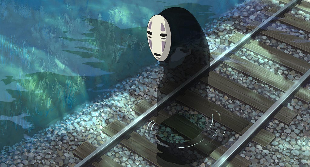
6. Spirited Away (2001)
In Hayao Miyazaki’s Spirited Away, Chihiro enters a world of spirits whose rules she doesn’t know. We work out how it operates alongside her, through places, encounters and the consequences of what she does.
That experience of arriving somewhere unfamiliar interests me. Understanding builds gradually. Some things become clear through observation; others take an uncomfortable mistake. You can recognise the feeling without reducing the film to a lesson about introducing people to an app.
I’d also pay attention to its pace. Busy, richly detailed scenes sit alongside quieter stretches that let a place or a feeling settle. In design, it’s easy to concentrate on everything we can fit into the available space. This film offers a reason to think about how much attention we’re asking for at any particular moment.
Watch for: What continues to communicate when the action slows down. Notice the surroundings, sounds and small movements.
7. Spider-Man: Into the Spider-Verse (2018)
Into the Spider-Verse brings Miles Morales together with Spider-People from other universes. Lettering, textures and movement give its world a strong connection to the language of comics.
I wanted it here because a distinctive visual identity can be exuberant. “Make it simpler” is sometimes good advice. Applied automatically, it can also remove the very thing that makes a project feel like itself.
The interesting exercise is to ask what the style contributes. Does a visual choice help us understand a character, a moment or a shift in energy? How do all those elements work together without losing the story? Those questions are useful even if the thing you’re designing will never need a comic book texture or an animated explosion.
Watch for: Where your eye goes when text, colour and movement compete for attention. What helps you follow the action?

8. The Truman Show (1998)
Peter Weir’s The Truman Show follows a man who doesn’t know his life is a television programme. The world around him has been arranged to keep that programme working, which makes it an unsettling film to consider from a designer’s perspective.
I’d approach it through the question of whose interests an environment serves. The people running a system may want one outcome while the person living in it wants something else. Keeping someone engaged can start to look very different when that person tries to leave.
The comparison with digital products has limits, of course. Still, the film gives us a useful question to take back to work: can someone make a choice we didn’t plan for? A smooth experience tells us surprisingly little about that.
Watch for: How the world responds when Truman attempts to do something outside his usual routine.

9. WALL-E (2008)
Andrew Stanton’s WALL-E begins with a small robot left on Earth, whose encounter with EVE opens up a much larger story. Their shapes immediately distinguish them. Their movements make those differences even more expressive.
There are two reasons I’d include it. First, it communicates so much through behaviour. A tilt of the head or a brief hesitation can make a feeling legible. Second, it invites us to think about the kind of life a thoroughly convenient environment might encourage.
The UX implications of the foldable iPhone raise a similar question: what could extra screen space make possible? WALL-E brings me back to a broader version of that question: when technology gives us another capability, what do we choose to make easier?
Watch for: A moment when you understand a character’s feelings without an explanation. What movement or sound did the work?

10. Rams (2018)
Gary Hustwit’s Rams is a portrait of Dieter Rams that also considers consumption, sustainability and how long products remain useful.
It feels like a good place to finish because it leaves room to question our enthusiasm for making more things. The film’s own description discusses Rams’s concerns about unnecessary products and overconsumption. There’s more to sit with here than the appearance of a beautifully restrained object.
I’d carry that question into digital work. Does the feature we’re adding have a meaningful place in someone’s life? Opening a new section of an app is one decision. Keeping it understandable and worth using over time is a much longer commitment. That’s a responsibility I think deserves more space in conversations about design.
Watch for: The difference between making something appealing today and making something worth living with for years.
What should you watch first?
For a visual world to get lost in, try The Grand Budapest Hotel or Spirited Away. For a closer look at the profession, start with Objectified. If you’re curious about our relationship with technology, Her gives you plenty to think about.
I wouldn’t keep a notebook open through all ten. Sometimes a colour stays with you. Sometimes it’s a person’s hesitation or an object you barely noticed at the time. A few days later, while working on something else, that detail starts to feel relevant.
Pick the film that makes you curious. If you find yourself looking a little more closely at a street sign, a household object or an app afterwards, that’s already a good evening’s work.
Sources
- Linearity: 14 must-see graphic design movies : A design and art film list consulted while researching this selection.
- Digital Synopsis: 7 Must-Watch Graphic Design Movies : Documentary recommendations consulted during research.
- Searchlight Pictures: The Grand Budapest Hotel : Official film page.
- Gary Hustwit: Helvetica : The filmmaker’s description and production information.
- BFI: Film of the week, Her : Film criticism and production credits.
- Gary Hustwit: Objectified : Documentary subjects, participants and production information.
- The Criterion Collection: PlayTime : Film description and production credits.
- GKIDS: Spirited Away : The distributor’s film page.
- Sony Pictures Animation: Into the Spider-Verse : Official film page.
- Into Film: The Truman Show : Film information and a discussion guide.
- Pixar: WALL-E : Official film and character information.
- Gary Hustwit: Rams : The filmmaker’s description of the documentary and its themes.
Originally published at https://hudaverdiural.com on September 13, 2026.
10 films that could change the way you see design was originally published in Bootcamp on Medium, where people are continuing the conversation by highlighting and responding to this story.

 点赞
点赞 收藏
收藏 点踩
点踩 分享
分享