Apple’s Design Got So Good, It Broke the Products

Apple’s best design decade and its worst decade were built on the exact same three instincts. The only thing that changed was whether anyone checked them against reality.

Yesterday I saw John Ternus tweet “hello.” For fifteen years, whenever Apple shipped something new, Tim Cook tweeted “good morning.” One word changed, and somehow that’s how you actually know an era ended.
I grew up watching Apple keynotes the way other kids watched cartoons. The iPhone, the iMac, the MacBook, the iPad, one beautiful reveal after another, and I wanted every single one of them before I understood a single thing about how they worked.
I watched Steve Jobs walk across that stage and pull a laptop out of an envelope and thought, that’s the coolest thing a human being can do. Later I read Walter Isaacson’s biography of him, trying to understand how someone thinks that way.
Then Tim Cook took over, and my own design journey started somewhere in the middle of his fifteen years. I never owned a Mac Pro or a MacBook Pro from that stretch, but I watched people test them on YouTube, teardown videos, thermal throttling benchmarks, the works, and read the blogs picking apart what shipped versus what got promised on stage.
I loved the Mac Pro, the black cylinder, sitting there like a piece of sculpture, in every video I watched of it. And somewhere in watching people actually use these products, not just admiring them from a keynote stream, I started noticing something a keynote never shows you.
The Mac Pro didn’t cool the way it looked like it should. The MacBook Pro everyone wanted so badly ran hot under real use. And then came the butterfly keyboard, a mechanism so fragile that a single piece of dust could take out a key.
That’s when I understood something as a designer that I hadn’t understood as a fan. Sometimes designing too much is exactly what breaks the thing you were trying to perfect.
The clearest single example of this happened in 2019, when Apple released a new Mac Pro with a front panel covered in hundreds of small CNC-machined holes, arranged in a precise lattice pattern. Apple’s own explanation was airflow.
Anyone who has ever done a basic functional pass on an enclosure design can tell you plain round holes move more air with less machining cost than an ornamental lattice. The lattice wasn’t there to cool the machine better. It was there to look like it was cooling the machine, in a way that photographed well.
That’s not a taste problem. It’s a QA failure. Somewhere in that process, a design decision got signed off on a rationale nobody actually tested against the thing it was supposed to serve.
I keep coming back to that panel because it’s such a clean, isolated example of a pattern that runs through an entire era of Apple’s product history, the same era I grew up admiring from the outside and later started studying from the inside.
The same three design principles that made Apple’s products the best-looking thing in any room in the 2000s nearly broke the products they were meant to elevate a decade later. Nothing about the principles changed. What changed was whether they were still being checked against function, or just trusted because they’d worked before.
Three principles, once validated, then just assumed
Curves. Color. Extremes. These weren’t branding decisions; they were specific formal bets that solved specific problems in a market of beige rectangular boxes. The iMac G3’s flowing curved shell and candy colors gave Apple a visual identity nobody else had. The MacBook Air’s CNC-milled unibody proved a laptop could be genuinely thin without falling apart. Each of these was, at the moment it shipped, a validated hypothesis. Somebody tested whether the form served the product, and it did.

The mistake wasn’t picking those principles. The mistake was letting them graduate from tested decisions into permanent truths that no longer got checked against new constraints.
This isn’t even a new mistake for Apple specifically. In his biography of Steve Jobs, Walter Isaacson documents the original Macintosh going through almost the identical failure decades earlier. Jobs insisted on removing the cooling fan because he wanted the machine silent.
As Isaacson puts it,
“fans, he felt, detracted from the calm of a computer.”
Engineers pushed back. He overruled them. The machine ran hot enough that logic boards failed at a noticeably higher rate than they should have. The pattern isn’t an Ive-era glitch or a Cook-era glitch. It’s what happens anywhere in this company when an aesthetic conviction stops being treated as a hypothesis and starts being treated as a rule.
Extremes, unchecked: the 2015 MacBook

By 2015, “thin” had stopped being a validated design choice and become a KPI nobody was allowed to question. The new MacBook chased a fanless, silent body at all costs. That meant the processor had to be an ultra-low-power chip, because there was no thermal budget for anything stronger. Open a dozen browser tabs and the machine audibly struggled. In a slightly warm room, it became close to unusable.
That’s the signature of a single-metric optimization every designer has run into at some scale. Thinness became the only number the team was optimizing against, and every other requirement, thermal headroom, real-world performance, the number of ports a person actually needs, got treated as negotiable. The product was validated in ideal conditions, a cool room, light use, and shipped without ever being tested against how people actually use a laptop.
The keyboard that couldn’t tolerate dust
The butterfly keyboard is the sharpest example in this whole story, because it isn’t really an aesthetic failure. It’s a tolerances failure wearing a design decision’s clothes.

To shave the laptop’s thickness down further, Apple replaced the traditional scissor mechanism, which has real vertical travel and a margin for debris, with a butterfly mechanism compressed to near-zero travel. Typing felt flatter and stiffer, which was already a usability regression on its own. But the real defect was underneath the surface. Because the mechanism ran so tight, a single particle of dust was enough to disable a key entirely. This is what happens when a design spec is engineered for an idealized clean environment instead of an actual pocket, backpack, or desk. A keyboard is the most basic interaction surface a laptop has. Sacrificing its reliability for a few tenths of a millimeter isn’t a bold design bet. It’s a decision that was never checked against how the product would actually live in the world, and it eventually became a class-action lawsuit.
A cooling system that couldn’t cool
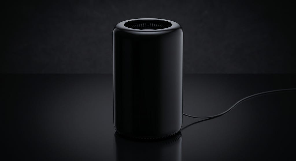
The 2013 Mac Pro is the systems-level version of the same mistake. A single fan, an elegant black cylinder machined from one block of aluminum, cold air pulled in at the bottom and exhausted at the top. It was a genuinely striking piece of industrial design. It also couldn’t handle sustained heavy load without throttling, and the motherboard layout made it impossible for anyone to upgrade the CPU or GPU afterward. Apple never updated the internal specs for the machine’s entire lifespan. Professional users, the exact audience the product was named for, were eventually forced off it entirely. In 2017 Apple took the unusual step of telling journalists directly that the design had been a mistake.
That’s a decision that optimized for a single hero shot on a desk, and quietly sacrificed the product’s entire serviceable lifecycle to get it.
The correction, and what it actually proved

The M1 generation is the interesting part, because it’s not just a story about better chips. Look at what came back alongside the performance. The scissor keyboard mechanism returned. HDMI, a port the ultra-thin bodies couldn’t physically fit before, came back. Thinness stopped being the metric the whole product bent around. None of that was marketed as a retreat. It was marketed as Apple simply making a better Mac.
And the market didn’t respond to a nicer aesthetic. It responded to function being checked again. Mac revenue grew for six consecutive quarters after the M1 shipped. That’s not a taste verdict, it’s the same kind of signal a usability test gives you, except run at the scale of an entire product line. When the function check came back, so did the growth.
The point
None of this is an argument against pursuing beautiful design. Curves, color, and extremes are exactly what took Apple to the top of an industry full of beige boxes in the first place. The argument is narrower and, I think, more useful than that. A design principle is only as good as the last time it was actually checked against what the product needs to do. The moment a team stops asking whether the form still serves the function, and starts assuming it does because it did once, you don’t have a design decision anymore. You have an unvalidated assumption that happened to make it to production.
Steve Jobs is the one who’s quoted saying design is how it works, not just how it looks. His own company’s next decade is the clearest proof of what happens when that standard quietly stops being applied, even by the people who first said it.
Steve did his Job, let Tim Cook, and now it’s John’s Tern.
What that middle stretch actually demanded of Cook, and what it means that he’s already handed the job off, is a story on its own.
Share your thoughts.
Apple’s Design Got So Good, It Broke the Products was originally published in Bootcamp on Medium, where people are continuing the conversation by highlighting and responding to this story.

 点赞
点赞 收藏
收藏 点踩
点踩 分享
分享