From insight to empathy


Using comics in research readouts
Recently, I took what felt like a pretty big risk in an executive research readout. I had just completed contextual research in a complex operational environment, and some of the most important findings were proving difficult to communicate through the typical bullets and quotes. The problems went beyond inefficient processes. They affected how employees saw their own competence and ability to learn. Some were also reluctant to ask questions because it didn’t always feel safe to do so.
I kept trying to figure out how to present the top findings so they would stand out and be easy to grasp. More than anything, I wanted them to stick with people after the presentation.
So I tried something I’d never done in more than 25 years of UX research: I created three comics, one for each of the key findings.
I’d used comics before in UX storyboards, but this felt riskier. The organizational problems were sensitive, and I worried the illustrations might make the work feel trivial.
That concern disappeared pretty quickly once I presented them. The comics became some of the most effective slides in the presentation. Stakeholders seemed to grasp the issues right away, and the contradictions and emotional burden employees were carrying came through without a long explanation. The images gave everyone a shared reference point for what participants were experiencing.
Why comics?
Now, some of you may be wondering why I didn’t just share audio or video clips from the research sessions. That would normally be my first instinct too. Letting stakeholders hear directly from participants by sharing highlight clips is tremendously valuable. In this particular project, though, protecting employees’ identities was especially important because they were speaking candidly about their work environment and management.
Even when clips can be shared, I’ve found that you have to be selective about which ones make it into a readout. If everything is a sound bite, then nothing is. And sometimes a single clip can’t capture the larger story you’re trying to communicate.
That’s where I started to see another role for comics. A short visual story can pull together context, sequence, and emotion in a way that gives stakeholders the bigger picture before you get into the supporting evidence.
Example
Unfortunately, I’m not able to publish the proprietary findings or comics from my recent readout, so I created a fictional example to demonstrate the technique.
I used Gemini’s image generator to create both the original comics and the fictional example below. I’ll come back later to why I chose AI and how I used it, including the very real concerns around AI-generated imagery. For now, I want to focus on what changes when the same finding is presented as a comic.
The finding: Bereaved customers see notifying a company about a death as a one-time task, but fragmented systems across departments and channels force them to repeatedly resubmit information and relive the loss.
The standard readout version:

The comic version:

Which version are you more likely to remember tomorrow?
What the comic adds
The research finding stays the same. The comic makes the consequences easier to see.
In the standard readout, you can understand the problem: Evergreen Bank’s systems don’t carry bereavement information across channels, so the customer keeps getting asked for the same documentation.
The comic lets you watch the experience unfold. She starts online. Then she calls. A few days later, she goes into a branch, hoping someone there can help. By the final panel, she’s back home at the same computer with her head in her hands.
Seeing that sequence changes how the problem lands. One failed interaction could easily look like a minor service issue. Here, you see the failures pile up. Each attempt takes more time and forces someone who is already grieving to deal with the death again.
Comics can also break the rhythm of a research readout in a useful way. Most presentations rely heavily on findings, quotes, charts, and screenshots. A visual story stands out. If there’s a finding you especially want people to notice and remember, that extra attention can matter.
There’s another benefit I hadn’t anticipated. Showing the surrounding experience can make certain assumptions harder to fall back on. In this example, you can see the customer trying several Evergreen Bank channels and getting essentially the same result. It becomes harder to dismiss the issue as something she may have done wrong.
For me, that’s where comics become especially useful. They can show the accumulation around a UX problem: what happened before, what happens next, and what the person is carrying with them by the end.
You want stakeholders to feel what the problem is costing the person experiencing it.
Why the usual readout format isn’t always enough
Most research readouts rely on a familiar mix of findings, quotes, screenshots, charts, and recommendations. There’s a good reason for that. These formats are efficient. They help stakeholders understand what we learned and see the evidence behind it.
But some findings lose something when they’re reduced to a summary and a supporting quote.
Earlier, I mentioned that some employees in my research didn’t always feel safe asking for help. A bullet point can communicate that finding, and a quote can show what someone said about the experience. But neither necessarily conveys the split-second decision an employee faces when they need help and are afraid to ask for it.
Some findings work perfectly well on a conventional slide. Others need more context, especially when the meaning lives in a sequence of events or in everything surrounding the interaction.
This is why. It’s also why I keep experimenting with different ways to present important insights. The format we choose can have a big influence on whether a finding sticks and how people see the problem.
“Lead with the eye and the mind will follow”
— Dan Roam
How comics changed my research readouts
Using comics has changed the way I present certain findings. When a comic appears on the screen, I pause for a moment and let people take it in before I start talking.
Then I walk them through what they’re seeing. I point out the moments that matter, explain how the experience unfolds, and connect it back to the research finding. The comic gives me a visual story to tell rather than a slide full of text to work through.
That shift gives me more control over pace and attention. With a typical slide, stakeholders may start scanning bullet points while I’m still talking. With a comic, I can pause, let them look, and then guide them through the experience before moving into the implications and what we might do about it.
Part of my job as a UX researcher is helping stakeholders who weren’t there to observe the research understand what participants were experiencing. That has always been difficult. You can describe the frustration someone expressed in an interview, but much of the surrounding context can disappear by the time it reaches a slide.
Comics have made that part of the readout easier for me. They give me another way to carry some of that context into the room without needing a long explanation.
I also like what happens after the presentation. A comic can become a useful leave-behind because it captures a finding in a form that’s easy to revisit and share. A memorable visual posted in Slack or Teams may have a better chance of pulling someone back into the research than another screenshot of a findings slide.
When to use comics (and when not to)
I’m selective about which findings I turn into comics. They’re most useful when the story itself helps explain why the finding matters.
I tend to consider a comic when the insight involves one or more of the following:
- A contradiction or no-win situation
- A sequence of events that builds over time
- A workaround that stakeholders would otherwise never see
- A gap between what the organization believes is happening and what participants actually experience
- An emotional consequence that happens outside the interface
- A small interaction problem that creates trouble later
These are situations where a finding can lose something important when compressed into a bullet, quote, or screenshot.
There are plenty of times when I wouldn’t use a comic. If a video clip clearly shows a participant struggling with an interface, I’d usually rather show the clip. A straightforward usability issue may need nothing more than a screenshot and a good explanation.
I also wouldn’t turn every major finding into one. Part of what made the comics stand out in my readout was that there were only three of them. If every finding becomes a comic, I suspect they’ll lose some of that effect.
There’s also a methodological boundary I think is important to protect. Comics are powerful enough to accidentally dramatize beyond the evidence. I don’t create one if doing so requires inventing emotional reactions, context, or causality that the research didn’t support. Because comics can make a situation feel vivid and real, invented details can easily start to look like evidence.
Dan Roam’s work on visual storytelling has influenced how I think about presentations and puts truth at the center of a good presentation. I think that matters even more when we’re visualizing research. The more convincing the story feels, the more careful we need to be about what we’re claiming happened.
For me, comics work best as narrative punctuation. They can introduce or crystallize an important issue, while the surrounding slides still do the usual work of showing evidence, participant quotes, observations, and analysis.
The research establishes the finding. The comic gives stakeholders another way to see the experience surrounding it.
Why I used AI for these comics
If you have illustration skills yourself, access to an illustrator, or the time and budget to commission one, that’s the ideal option. For polished brand assets, conference materials, and illustrations intended to stand on their own, I hire a designer or illustrator.
I’ve made that choice before. For my , I hired illustrator Rich Woodall to create the artwork, and I later repurposed those illustrations for a public conference talk. I had the time and budget, and I knew the work would have a life beyond a single internal presentation.
But that isn’t the reality of most of my research readouts.
A few years ago, I probably wouldn’t have considered using an image generator for this. The results were too unreliable. Extra fingers became a running joke, text was often gibberish, and faces or objects could come out strangely distorted. For a research comic, those problems were more than funny glitches. They distracted from the finding you were trying to communicate.
In my experience, the tools have improved enough that I can now create a coherent comic, keep characters reasonably consistent across panels, and make very specific revisions without getting stuck in an endless cycle of generations.

Timing matters too. By the time I’ve synthesized the research and figured out which findings deserve the most attention, I’m usually deep into preparing the readout. Commissioning an illustrator means writing a brief, explaining the research, reviewing concepts, and going through revisions together. That can absolutely be worth the investment, but for a one-off internal presentation, I often don’t have the budget or time for that process.
I think of these comics as rapid narrative prototypes. They give me a way to explore how a finding might be told visually while I’m still shaping the research story. Sometimes I’m testing the idea as I create it. Does this sequence make the problem clearer? Is this the moment that matters? Does the visual add enough to justify putting it in the readout?
Many internal research projects don’t include a budget for illustration or design support. Before I had access to image generation, I simply wouldn’t have made these comics. I would have built the readout with the tools already available to me: findings, quotes, screenshots, and participant clips when I could use them.
AI gave me another option I could realistically try within the constraints of the project.
Internal research readouts are the main use case I have in mind for these comics. For polished brand assets, conference materials, or illustrations intended to stand on their own, I bring in a designer or illustrator. Within the readout, the comic helps me experiment with how to make an important finding land while there’s still time to do something with it.
Addressing the controversy over AI-generated imagery
Generative AI makes creating research comics dramatically more accessible to people who, like me, aren’t illustrators. There are also real concerns about what we give up, who bears the cost, and how these tools are being used.
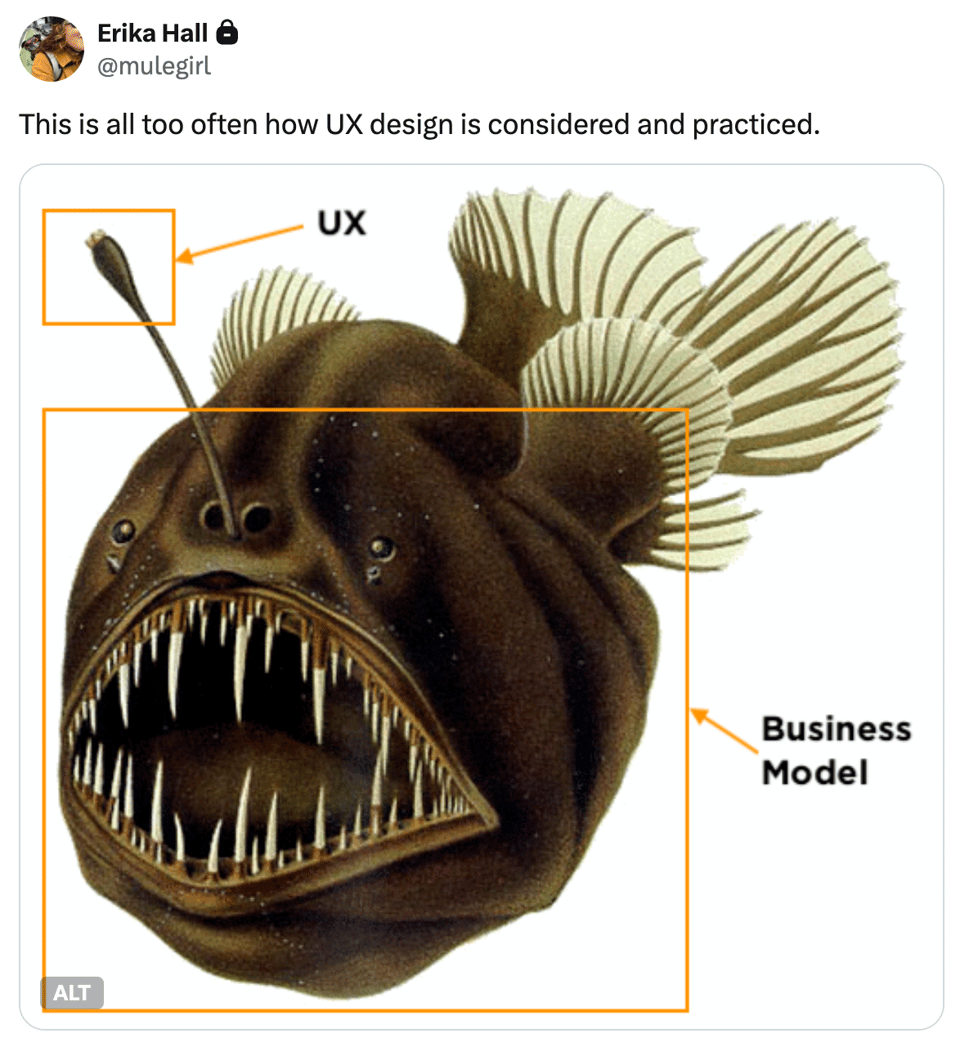
Erika Hall has been sharply critical of AI-generated imagery, particularly the flood of generic visual filler created without much specificity, intention, or point of view. Her well-known anglerfish illustration offers an interesting contrast. Hall didn’t draw the fish. She found a public-domain illustration, annotated it, and turned it into a visual metaphor. She argues that the unique value she contributed was what she was saying with the image.
I don’t take that as an endorsement of AI. Hall very clearly isn’t offering one. What I take from her example is narrower: a visual needs a point of view. A generic image of “a frustrated customer” dropped into a research deck doesn’t accomplish much.
That puts more responsibility on the researcher creating the comic. I still have to decide which moment matters, which details belong in the story, how the experience unfolds, and what the research actually supports. The generated image is a draft that I shape and check against the evidence.
Indi Young raises a harder objection. She argues that generating imagery for publication instead of paying an artist comes at a cost to creative professionals, and in her framework she sees no ethical gain in that particular use of AI. I don’t think that concern should be waved away simply because AI is convenient.
That objection is part of why I keep this use of AI fairly narrow. I’ve already described the boundary I’ve set for myself in the section above, and I don’t expect everyone to draw it in the same place.
I also avoid asking an image generator to imitate a particular artist. I describe the medium and visual characteristics I’m looking for instead. And I want a reason for generating the image beyond making the slide prettier. The comic should materially help communicate the research.
The environmental cost deserves consideration too. Pinning down the footprint of a single generated image is difficult because energy use varies substantially by model and configuration. One study comparing 17 image-generation models found as much as a 46-fold difference in energy consumption. Meanwhile, electricity demand from AI-focused data centers continues to grow quickly.
For me, that’s another reason to generate deliberately. I don’t need twenty variations just to see what else Gemini might come up with.
Before I generate a comic, I want to know that the visual is doing useful work for the research and that I’m comfortable with how I’m making it. Someone else may draw that line differently.
AI can render the comic. The researcher still has to take responsibility for what it says, how it was made, and whether it was worth making.
How I used AI to create comics
With those considerations and boundaries in mind, here’s the process I used to create the comics.
By the time I opened Gemini, I already knew what the research finding was and what the comic needed to communicate. That part matters. The image generator shouldn’t be deciding what happened in the story.
My process
Step 1: Start with the finding
Before writing a prompt, I get very clear on the finding I’m trying to communicate and the evidence behind it.
I think through what actually happened, which moments matter, and what context is necessary to understand the problem. I also look for any details I might be tempted to add that the research didn’t actually support.
That evidence defines what belongs in the comic.
Step 2: Translate the finding into scenes
Next, I decide what someone would need to see for the story to make sense. Usually that means one to four panels, with each panel doing a specific job.
For the bereavement example, the sequence was the story: online, phone, a few days later, branch, back home.
Then I think through each scene. Who needs to be there? What are they doing? What should their body language communicate? Is dialogue necessary? Which environmental details help explain what’s happening?
I also try to keep the comic as simple as possible. If I need six or eight panels to explain the finding, that’s usually a sign that I’m asking the comic to do too much.
Step 3: Write a very specific prompt
I describe the visual treatment in concrete terms, such as “black-and-white hand-drawn pencil and ink illustration.” I stick to visual characteristics and avoid naming a particular artist as a style reference.
Then I get specific about the storytelling. I include the panel arrangement, location of each scene, character actions, body language, and anything that needs to remain consistent across panels. I also spell out things I don’t want the model to add or change.
Dialogue needs extra attention. I write the exact words I want each character to say or think and specify whether they belong in a speech bubble or thought bubble. Another option is to generate empty bubbles and add the text yourself afterward.
I also specify where the comic will ultimately appear. For a presentation, for example, I might include:
“The image should fit nicely in a widescreen Keynote slide (16:9).”
For the bereavement comic in this article, I wrote a detailed prompt specifying the visual style, panel sequence, character behavior, dialogue, and details that needed to remain consistent.
View the full prompt I used:
ux-research-comic-prompt-bereavement-example.md
Step 4: Revise in small pieces
My first generation is usually a draft. When prompting the model to revise, I’ve had better luck asking for one or two changes at a time rather than handing it another long list. I’m also very explicit about which panel needs attention.
For example:
“Change Panel 1 so the photograph of the deceased husband is on the same desk as the laptop.”
This is also where I check the comic against the research again. Facial expressions, body position, character consistency, objects in the scene, and interface text can all affect how the story is interpreted. A seemingly minor detail can accidentally suggest something the research never showed.
Sometimes the easiest fix is outside the image generator. If a speech bubble or label keeps coming out wrong, it may be faster to correct it when assembling the final slide.
Step 5: Be transparent when you present it
I label the comic as AI-generated, usually with a simple caption such as:
“AI-generated illustration created with Gemini.”
I also mention it when I present. I’ve found that acknowledging it quickly keeps the production method from becoming a distraction.
If the subject matter is lighter, I might say something like:
“I decided to have a little fun with Gemini on this one and turned the experience into a short comic.”
Then I move into the story.
I experimented with comics because I had three findings I wanted stakeholders to understand and remember. The comics made the weight of those findings more tangible. They helped stakeholders feel what the problems were costing the people experiencing them. I plan to keep exploring what this format can do for research readouts, while continuing to carefully consider how those comics are made.
A special thank you
I almost didn’t publish this article because of the recent backlash around AI-generated imagery. Seriously, I sat on it for weeks.
I’m grateful to the colleagues who took the time to read early versions, challenge my thinking, and encourage me to keep working through it. You know who you are.
And if you’ve made it this far, thank you too. I’m genuinely interested in hearing where you agree, where you don’t, and especially what other approaches you’ve found for helping research insights land with stakeholders.
I may feel differently about some of these choices a few years from now. For now, sharing what I learned, including the questions I’m still wrestling with, felt worth doing.
References and further reading
References
- Bertazzini, Giulia, et al. “The Hidden Cost of an Image: Quantifying the Energy Consumption of AI Image Generation.” arXiv, 20 June 2025.
- Hall, Erika. “Let’s Have an Art Fight!” Mule Newsletter, Buttondown, 11 Aug. 2026. Accessed 18 Aug. 2026.
- International Energy Agency. Key Questions on Energy and AI. IEA, 16 Apr. 2026.
- Roam, Dan. Show and Tell: How Everybody Can Make Extraordinary Presentations. Portfolio, 2014.
- Young, Indi. “I Trained It to Copy Your Style: Categories for How We Use AI.” Inclusive Software, Medium, 19 Mar. 2026. Accessed 18 Aug. 2026.
Further reading on comics and visual storytelling in UX research
- Cameron, Janna. “Sharing UX Research Results with Comics.” UX Planet, Medium, 17 June 2018. Accessed 6 Aug. 2026.
- Colville-Hyde, Bonny. “UX Comics.” Almost Exact. Accessed 6 Aug. 2026.
- Colville-Hyde, Bonny. “UX Comics: Communicating Experiences & Sharing Ideas.” Speaker Deck, 22 July 2014. Accessed 6 Aug. 2026.
- Colville-Hyde, Bonny. “UX Comics: Visually Communicating User Experiences.” Interview. Constructive, 17 Jan. 2016. Accessed 6 Aug. 2026.
- den Dekker, Natasha S. “Using Visual Storytelling to Increase UX Research Report Success.” User Interviews, 6 Mar. 2025. Accessed 6 Aug. 2026.
- Hamill, David. “Communicating UX Issues with Comics.” Skyscanner Design, Medium, 16 Feb. 2018. Accessed 6 Aug. 2026.
- Haughney, Evangeline. “Using Comics to Communicate Qualitative User Research Findings.” CHI ’08 Extended Abstracts on Human Factors in Computing Systems, Association for Computing Machinery, 2008, pp. 2209–12.
- Hunt, Nicole. “Storytelling with Comics: Communicating UX Research Findings.” Accelerant Research Virtual Insights Conference, Accelerant Research, Oct. 2023. Accessed 6 Aug. 2026.
- Krause, Rachel. “Storyboards Help Visualize UX Ideas.” Nielsen Norman Group, 15 July 2018. Accessed 6 Aug. 2026.
- Ricketts, Delanie. “Innovative User-Research Artifacts.” FiscalNoteworthy, Medium, 9 Feb. 2021. Accessed 6 Aug. 2026.
- Sedaca, Rebekah. “Comics: Not Just for Laughs!” Boxes and Arrows, 22 May 2007. Accessed 6 Aug. 2026.
From insight to empathy was originally published in Bootcamp on Medium, where people are continuing the conversation by highlighting and responding to this story.

 点赞
点赞 收藏
收藏 点踩
点踩 分享
分享