Two weeks, one campaign, real data.

FROM THE DESIGNER’S NOTEBOOK ARTICLE SERIES.
How I planned, launched and measured a full digital marketing campaign from scratch.

This article shares insights from a digital marketing campaign I ran for a coursework assignment. I created a 14-day campaign for a fictional product called “Calmly,” an AI-based wellbeing app that helps detect early signs of burnout in students and young professionals. I built a microsite, developed an SEO plan, crafted social media posts, set up a lead capture form, configured Google Analytics, and launched an email campaign.
I’ll outline what I did during those two weeks, the results I gathered, and tips for anyone looking to run their first campaign, no matter how small. Everything is supported by actual screenshots and reports from the campaign.
Starting with strategy, not tools
Before I touched a single platform or tool, I sat down and worked out who I was actually talking to. I want to understand my target group. Calmly’s main audience is individuals aged 18 to 30, mostly university students and people in their first 5 years of work, based in Sri Lanka and South Asia more broadly.
To understand the target group, I asked the following 4 questions, as mentioned in Armstrong’s Marketing book.
- Where do they live?
- Their age and occupation
- Their attitudes toward wellness and productivity tools
- Their actual online behaviour, things like high screen time and previous searches for burnout-related content.
Once the audience was clear, I mapped the customer journey using Ash’s marketing funnel, which helps me to break things into 3 main steps,
- Acquisition
- Conversion
- Retention
This modal became the backbone of my whole campaign. Every channel/ tool I picked was placed in one of those three stages afterwards.

Building a landing page first
Before running any promotional content or posting anything, I built a microsite using Google Sites. This gave the campaign somewhere to send people, rather than just posting content into the void. Initially, I planned five pages for my website,
- Home
- About Calmly
- How It Works
- Join the Beta
- Blog
The first decision I made was to keep the structure flat. Every important page is reachable within three clicks from the homepage, and the call-to-action buttons all point toward one goal (Join Beta Program). That decision alone made a big difference later when I looked at the analytics data.

Getting found (SEO)
I found this part really interesting because many people overlook it when they are excited to launch a website. They often forget to consider how easily it can be found on search engines. Before I launched my full website, I did some research to see what terms people were actually typing into Google.
I used “Google Keyword Planner” to check the search volumes for terms related to burnout. Upon investigating the keyword, I realized I had made an incorrect assumption about keywords. I had to redo the first version of my website to better align with the keywords I identified, since it was overly focused on my personal opinions. I initially thought that sharing my views would help me rank higher on Google, but by the end of the process, I realized that wasn’t the case at all.

Doing this actually helped me identify low-competition keywords that I can use on my website to optimize its visibility. To summarize my findings, I created a “Keyword Tree” diagram to aid understanding.

Once I had a clear understanding of the keywords, I conducted a “Keyword Density Check” on every page using the “SEO Review Tool.” It allowed me to quickly assess each developed page by using its URL. Through this process, I realised I had focused too much on the wrong keywords, such as “calmly” and “join beta,” rather than on the actual search terms people typically use to find this type of website.
By comparing this analysis with later reports, I recognized that this was one of my earliest mistakes. This situation often arises when you rely on personal bias and fail to use a keyword density checker to confirm whether you’ve met the searchability threshold for each page. This is crucial for enhancing digital visibility.

The difference in results before and after the changes was evident when I compared the keyword density reports. On the homepage, the keyword “burnout” transitioned from a low, scattered mention to a leading keyword with over 7% density. Additionally, phrases like “Calmly, join, beta,” which had been overused, were replaced with more natural, search-relevant language based on insights from Google Keyword Planner. To improve search engine optimization, this process was also applied to the other pages of the website.
Here is an example:
Before Search Engine Optimization, this is how “Home Page” Keyword Density percentage looked.


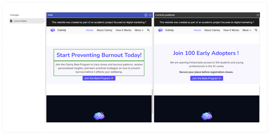
How I recreate content for the “Home” Page based on Keyword Planner suggestions. Screenshots showcase the before-and-after of the homepage content update.


After the content update, I checked the keyword density again using the SEO Review Tool. Here are the results I obtained.


for summery, these reports provide how much this process improves the website’s quality.
Difference between internal links and external links
Internal and external links work together to create the foundation of a website’s SEO and user navigation. Internal links connect different pages within the same domain, helping search engine crawlers discover new content, establish a logical site hierarchy, and distribute ranking authority (Page Ranking) across your pages. On the other hand, external links point from your site to a different domain. These links enhance your content’s credibility and search visibility by referencing trusted, authoritative sources. By strategically balancing both types of links, you can improve user experience, keep visitors engaged on your site longer, and signal to search engines that your content is deeply relevant to the topic.

Internal Links: In this screenshot, the Hero Section CTA and the last section (CTA Banner Section) CTAs are linked to the Join Beta Page. The “How It Works” and “About Calmly” CTAs are also linked to their respective pages.

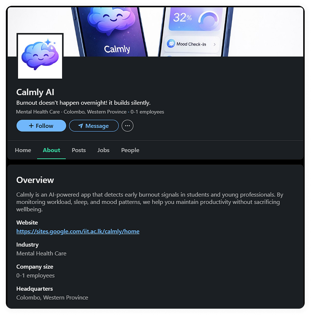
External Links (Backlinks): To further optimise my website, I developed a strategic linking structure with off-site backlinks. Authoritative backlinks are crucial for ranking, as they signal credibility to search engines. The screenshots above showcase the LinkedIn and Facebook pages I created to generate organic traffic to my website.

Getting the word out
By utilizing external platforms, I began promoting my brand through two main channels. I shared a combination of awareness content and announcements about the beta program. For instance, on a Facebook page, I published articles related to burnout to raise awareness rather than directly linking to the website. My goal is to create brand awareness. Each post links to a dedicated blog article, and at the end of each page, a call-to-action (CTA) invites readers to register for the beta program.

On the other hand, LinkedIn was utilized more for building credibility than for expanding reach. It is the ideal platform for a well-being product targeted at young professionals, and it also serves as a source of backlinks for SEO. I maintained a more professional tone there compared to Facebook. However, the ultimate goal was to direct viewers to the beta join page.

Turning visitors into leads
The “Join the Beta” page had one job. To collect an email address for future email marketing. I linked it to a five-section Google Form that collected basic info (name, age group), background (student or working professional), a couple of questions about burnout symptoms, and consent for future updates.

I deliberately kept the consent question separate and clearly worded, rather than bundling it into the main sign-up, because the form also collected sensitive information about stress and burnout.

Setting up analytics before you need it
I chose Google Analytics 4 over four other tools I compared (Adobe Analytics, Clicky, Sprout Social, and WebTrends), mainly because it’s free, scalable, and event-based, which fits a small pre-revenue project much better than a tool built for large enterprises.
I connected GA4 to the microsite via the Measurement ID in Google Sites’ settings and selected three events to track: page_view, first_visit, and scroll for my coursework. These three together told me who was arriving, where they landed first, and whether they were actually reading or bouncing straight off.


What happened after 14 days
This is the part where the theory meets reality. Honestly, some of it wasn’t what I expected.
(1) Traffic sources
Between March 17 and 30, approximately 80% of visits to the site came from direct traffic. This indicates that most visitors either typed the URL directly into their browser or clicked a shared link, rather than finding the site through organic search. LinkedIn generated about 11% of the visits, while Facebook contributed a smaller percentage, split between desktop and mobile referrals. This data suggests that my organic search visibility remains weak, primarily because the new microsite operates under a Google Site domain with an institute subdomain, which lacks a standalone domain. As a result, it cannot achieve direct keyword-based searches.

(2) Location
Approximately 63% of active users were located in Colombo, with only a small presence in Negombo and other cities. This concentration was logical since the campaign targeted Sri Lankan students and young professionals. My own network is primarily based in Colombo, which is where the sharing of information began.

(3) Age
I tried to confirm that my visitors are aged 18–30 and are primarily early young professionals. I checked the “age” reports, but unfortunately, the report did not generate. This indicates that GA4 did not have enough eligible data to display that dimension. This issue could be due to privacy thresholds, limited traffic, or demographic data settings not being fully enabled. It’s important to note that this is not a technical failure on the webpage itself, but rather a reporting limitation caused by a small sample size and privacy controls.

However, the beta program registration form confirms that most users are in the predicted age group.

(4) Pages people actually spent time on
The homepage received the most views and kept visitors engaged for an average of about a minute and a half, which is quite good for first-time visitors. The “Join the Beta” page had the second-highest number of views, but the average time spent on the page was only around 22 seconds. This indicates that although people clicked through quickly, they spent little time reading, suggesting the page successfully converted interest into action. Additionally, the blog article on burnout among Sri Lankan students performed well, accounting for nearly 12% of the total page views. This suggests that the topic resonated more with readers than I anticipated.

(5) Devices and browsers
About 65% of visitors came in on mobile, but their average engagement time was only around 37 seconds. Desktop users made up a smaller share, roughly 32%, but stayed for closer to 5 minutes and had a much higher overall engagement rate. Chrome users also engaged far longer than Safari users. This was probably the single most useful finding from the whole campaign. Mobile drove traffic, but Desktop delivered depth.


(6) Overall engagement and returning visitors
The average engagement time per active user was just under two minutes over the two-week period. Notably, there was a significant spike in engagement toward the end of this timeframe, likely related to a specific article post or share that resonated better than the others. Of the 74 new users, 20 returned for a second visit within the same timeframe, a promising sign for a brand-new site with no existing audience.


End of the campaign
Once the 14-day registration period was completed, I closed the registration. By that time, we had received 28 responses. Although I initially estimated around 100 user emails, this number is still a positive outcome, as I managed to collect about a quarter of the planned target.
After the campaign ended, I wanted to explore how users would respond to email marketing and check their retention. To do this, I set up a Mailchimp campaign to notify selected users. I kept the email brief and mobile-friendly, considering that analytics indicated most traffic was from mobile devices. I divided the content roughly 80/20 between useful information and the actual call-to-action button.
In the email, I expressed my gratitude to the users since this was a demo campaign and thanked them for their participation with my campaign.
The results, pulled directly from the Mailchimp report, are provided below.

The open rate for the initial email was better than I expected, especially since there was no prior relationship with the recipients. However, I was honestly disappointed by the click rate, which was zero. I believe the call-to-action button could have been more prominent. Additionally, since I don’t actually have a product to promote, the lack of interest may have contributed to the lack of clicks.

What I learned during this campaign
A few key observations stood out after I analysed all the data rather than just the plan.
Firstly, I realized that I relied too heavily on direct traffic. Almost all of it originated from my personal network sharing the link, which may work for meeting a coursework deadline, but wouldn’t be sustainable for a real product. Basic SEO requires more time than two weeks to start generating significant traffic. To improve this, I need to purchase an actual domain for the product, allowing me to compete more effectively with other competitors and attract more user traffic to my website.
Additionally, most of the engagement occurred on mobile devices. The noticeable gap between mobile and desktop engagement times was the most significant signal in the entire report. If I were to run this again, I would focus on improving the website’s mobile responsiveness and loading times. Conducting user testing could help identify why users tend to leave the mobile site more often than the desktop version.
Lastly, the email strategy needs a stronger, singular call to action. While a 51.9% open rate is a solid start, it’s ineffective if readers don’t click through afterward. I could also utilize email notifications to inform subscribers about newly published articles, which I missed doing this time.
A simple checklist, If you’re doing this for the first time
If you’re about to launch your first campaign, whether for a class project or a small business, here’s the order I recommend based on my experience:
1. Define Your Audience: Always start by identifying your target audience before choosing any tools or platforms.
2. Map a Simple Methodology: Create a straightforward framework. Even three stages enough. This can effectively guide your decisions. I used the funnel method, but you could opt for “Miller’s buying cycle” if you’re familiar with it.
3. Build a Central Page or Site: Establish a central landing page or website before posting anywhere else. This gives each channel a place to direct traffic.
4. Conduct Basic Keyword Research: Perform keyword research before writing your copy. This step is crucial! Otherwise, you’ll end up wasting time, as I did.
5. Choose Manageable Channels: Select one or two channels that you can handle well, rather than spreading yourself too thin across five different ones.
6. Set Up Analytics Before Launching: Ensure your analytics are in place before you go live, so you can monitor performance from the start.
7. Track Relevant Events: Focus on tracking a small number of key events that actually matter to your goals, rather than everything that Google Analytics 4 offers by default. Take the time to learn about custom event setups.
8. Be Transparent About Data Collection: If you’re requesting personal information in a sign-up form, be upfront about your data collection practices.
9. Review Your Data Objectively: Analyze your data honestly, paying attention to the aspects that didn’t work as well.
Following these steps will help you navigate your campaign more effectively. Good luck!!
My name is Harshana Pangoda, and I am a passionate UI/UX designer and an aspiring writer. This article is part of an ongoing series titled “From the Designer’s Notebook”. Please note entire campaign was part of my university coursework and not a real product launch. “Calmly” is a fictional app created for the module. However, the process, strategic planning, SEO research, analytics setup, and analysis of the results reflect what a genuine early-stage campaign would look like.
Two weeks, one campaign, real data. was originally published in Bootcamp on Medium, where people are continuing the conversation by highlighting and responding to this story.

 点赞
点赞 收藏
收藏 点踩
点踩 分享
分享