The 10 Rules that make any app feel Effortless

Jakob Nielsen wrote them in 1994. Every great product still follows them today.
Good design feels invisible. Bad design makes you feel stupid.
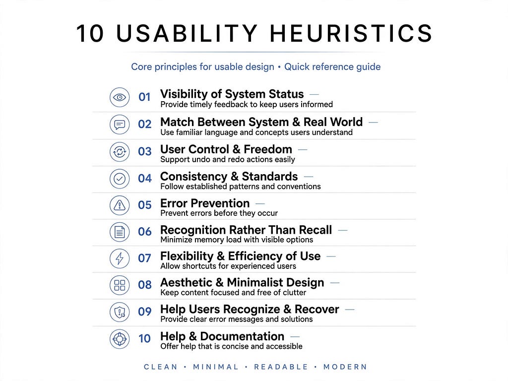
Back in 1994, usability expert Jakob Nielsen listed 10 general rules for how interfaces should behave. He called them Usability Heuristics. They are not strict laws, but quick checks to spot problems before users do.
Let’s break them down.
1. Tell me what’s happening
Heuristic: Visibility of system status
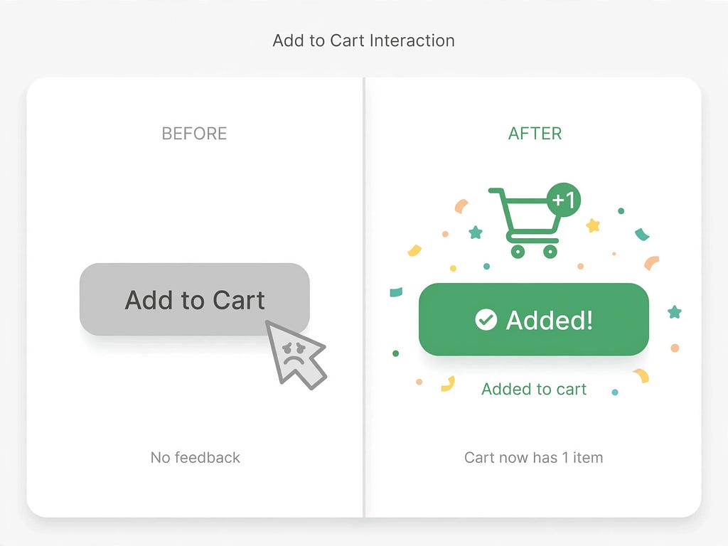
Your system should always keep users in the loop. For example
- Loading? Show a loader.
- Item added to cart? Show that little bump on the cart icon.
Trust comes from feedback.
2. Speak my language, not code
Heuristic: Match between system and the real world
Don’t say “Error 404: resource not found.” Instead say “We couldn’t find that page.” Use words, icons, and flows people already know from real life. A trash bin means delete. A shopping cart means buy.
3. Give me an undo button
Heuristic: User control and freedom
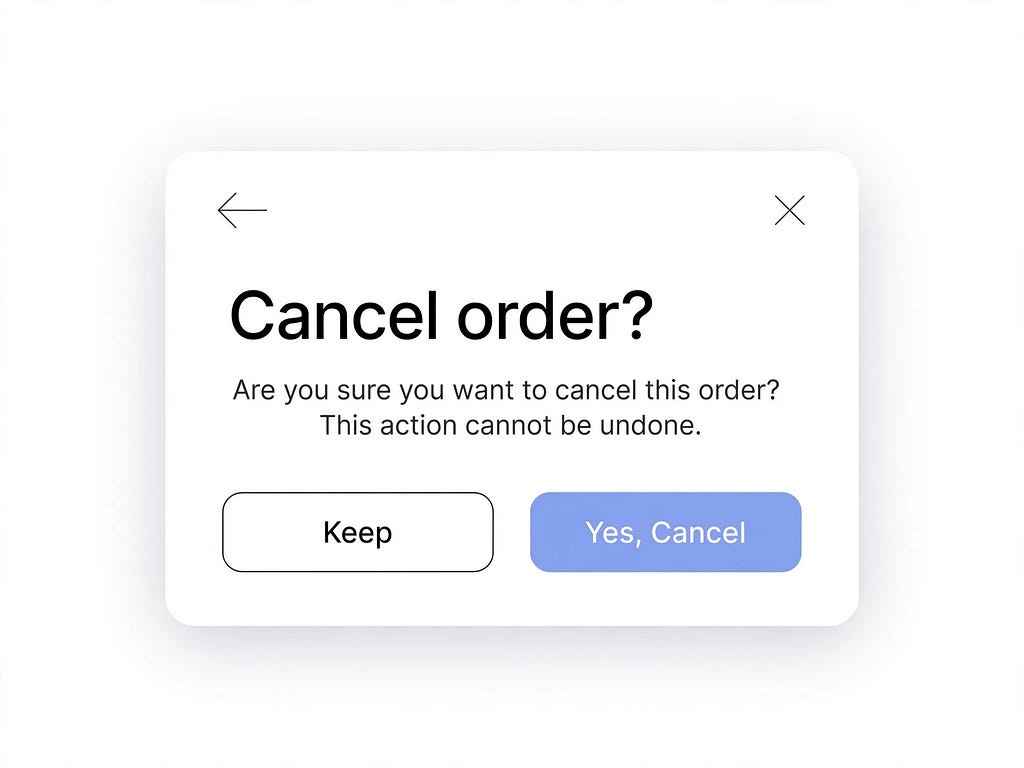
We all click wrong. Users need a clear emergency exit — Back, Undo, Cancel, Close. Don’t trap them in a process with no way out.
4. Don’t make me learn two designs
Heuristic: Consistency and standards
If underline means link on one page, it should mean link everywhere. Users learn patterns from other apps. Follow them.
Your logo on top-left, search on top, profile on top-right. Don’t reinvent basics just to be creative.
5. Stop the mistake before it happens
Heuristic: Error prevention
Best error message is no error at all. If a date format is DD/MM/YYYY, show a placeholder for it. Disable the “Pay” button until all fields are valid. Predict and prevent.
6. Show me, don’t make me remember
Heuristic: Recognition rather than recall
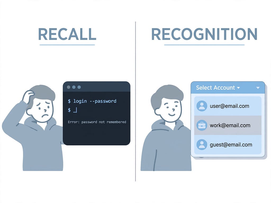
Memory is hard. Don’t make users remember info from one screen to another. Show recent searches, saved addresses, visible menu options. Recognition is easy, recall is work.
7. Fast lane for pros, clear path for beginners
Heuristic: Flexibility and efficiency of use
New users need guidance. Expert users need shortcuts. Support both. Let people pin favorites, use keyboard shortcuts like Ctrl+K to search, or customize their dashboard.
8. Less is more
Heuristic: Aesthetic and minimalist design
Every extra button, colour, and animation competes for attention. If it doesn’t help the user achieve their goal, remove it. Clean design isn’t boring — it’s respectful.
9. When I mess up, help me fix it nicely
Heuristic: Help users recognize, diagnose, and recover from errors
Errors will happen. Don’t blame the user. Say what went wrong in plain language and how to fix it.
Bad: “Invalid input.”
Good: “Password needs at least 8 characters with 1 number.”
10. Help should be there, but not in the way
Heuristic: Help and documentation
Ideally, your product needs no manual. But when help is needed, make it easy to find. A small tooltip, a searchable Help Center, an onboarding checklist. Keep it short, task-focused, and right where the problem is.
Key Takeaways
- Usability is empathy: These 10 rules are just 10 ways to respect the user’s time, memory, and emotions.
- You don’t need users to find issues: You can do a quick heuristic check on any screen in 15 minutes and find 80% of problems.
- Apply everywhere: App, website, dashboard, even a form — these principles still work in 2026.
- Simple test: Before shipping, ask — Does it give feedback? Is it consistent? Can I undo it? If yes, you’re mostly safe.
A bit about me
Hi, I’m Vijay Ram — a designer and product thinker based in Mumbai. I write simple breakdowns of complex UX ideas so that anyone — founder, developer, or student — can build products people actually enjoy using.
Your turn
Pick one app you use daily — say Swiggy, Notion, or Instagram. Open it and spot one place where it breaks one of these 10 rules. Screenshot it and post it in the comments with the heuristic number.
Let’s learn to see design, not just use it. Which heuristic do you see broken most often?
The 10 Rules that make any app feel Effortless was originally published in Bootcamp on Medium, where people are continuing the conversation by highlighting and responding to this story.

 点赞
点赞 收藏
收藏 点踩
点踩 分享
分享