3 Questions for Revisiting a Title and Image, So They Reach the Right Reader

What 10 years as a UX designer taught me by applying my everyday design process to writing an article: 3 questions for revisiting a title and image
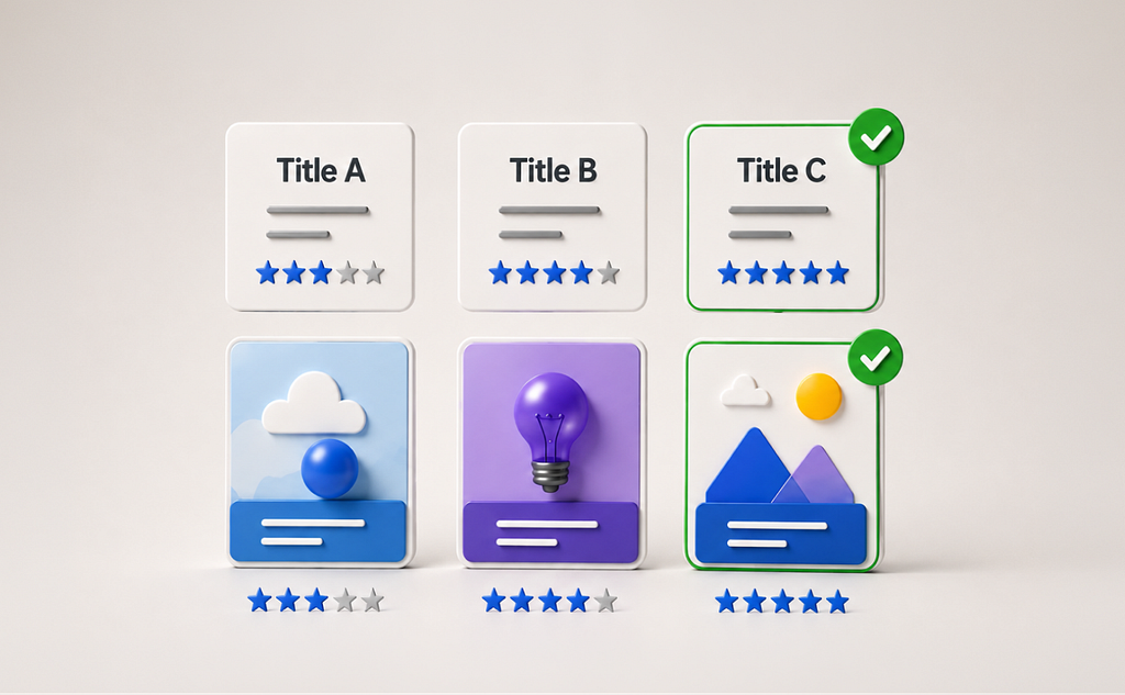
In client work, it’s common for the person writing the copy and the person making the image to be different people.
As the designer, I make the image to match a title that’s already been decided. At the end, when I look at the whole picture, because I know something about how writing works, there are times I sense: as it stands, this might not get read much.
Even accounting for the extra work of redoing it, that’s the moment I want to flip the whole thing over and pitch something better.
So how do you actually go about proposing something better?
This time, I’ll walk through it by treating an article I actually made myself as if it were client work.
To Start: The Image Was Already Decided
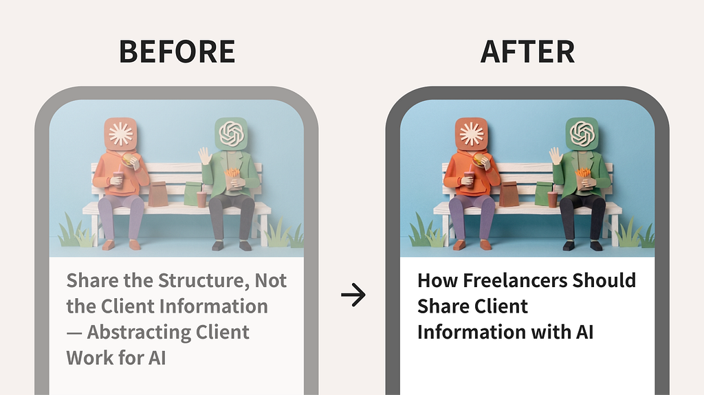
The example here is my article, “How Freelancers Should Share Client Information with AI.”
For the cover image, I chose a scene of two AI services represented as human figures, with their service icons as heads. They sit on a bench and wave at the viewer. “It’s precisely because AI feels close that you lose track of how much you can say.” I used that sense of distance to express the article’s core problem.
At this point, the image was already decided. Thinking of it as client work, my own part of the job was, for the moment, done.
But the Title Looked Like This
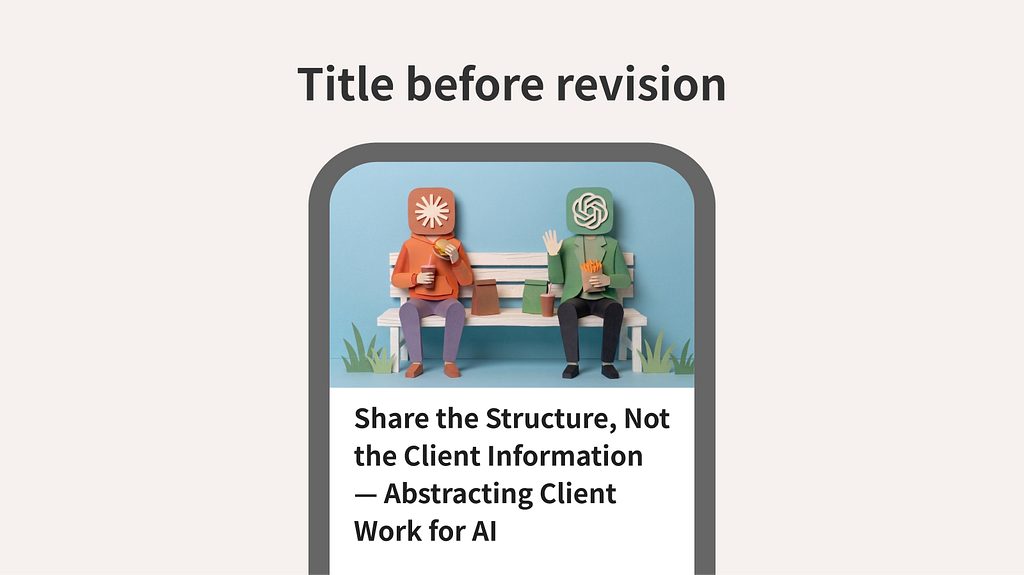
What You Hand to AI Isn’t Project Information but Structure — The Art of Abstracting Client Work
As a description, it’s accurate. But next to the image, the title alone felt stiff — the two gave off separate impressions.
Redo the image? Change the title? Or leave it as it is?
Of course, if this were real client work, I’d first need to check whether there’s room in the schedule to redo anything.
For this exercise, I assumed that room exists, and decided to look at both together to reconsider.
Compare Using 3 Questions
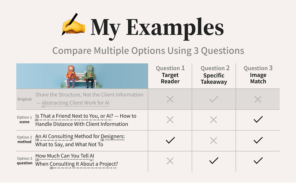
First, I asked AI to generate several options in directions different from the original title. Here are the three I compared:
Option 1: Lead with the image’s scene
Option 2: Lead with the method
Option 3: Lead with the reader’s question
Then I apply the three questions introduced here to all of them.
Question 1: Target Reader
Question 2: Specific Takeaway
Question 3: Image Match
That said, these three aren’t a universal formula that fits every article.
For me, what matters most is that the person who needs this article can tell it’s relevant to them. So for the title alone, I check who it’s for and, specifically, what they’ll learn.
On top of that, since my starting point this time was matching the impression of the image and the title, I added whether it matches the image.
And to keep the comparison from turning vague, I scored each criterion as a plain pass (✓) or fail (×).
Apply It to the Actual Title Candidates
Option 1: Lead with the image’s scene
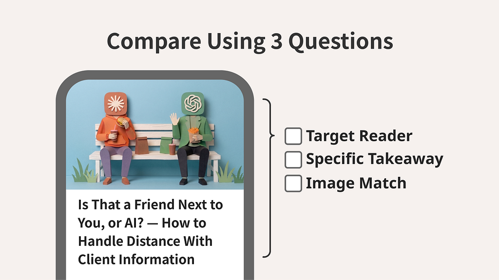
Is That a Friend Next to You, or AI? — How to Handle Distance With Client Information
- Target Reader
(×) The target reader isn’t clear. - Specific Takeaway
(×) “How to handle distance with client information” leaves it to the reader to fill in whether this is about organizing information before a conversation, or something to watch for while talking with AI. - Image Match
(✓) After taking in “a friend, or AI?” and then looking at the image, you can picture a situation of uncertainty about closeness with AI.
Option 2: Lead with the method
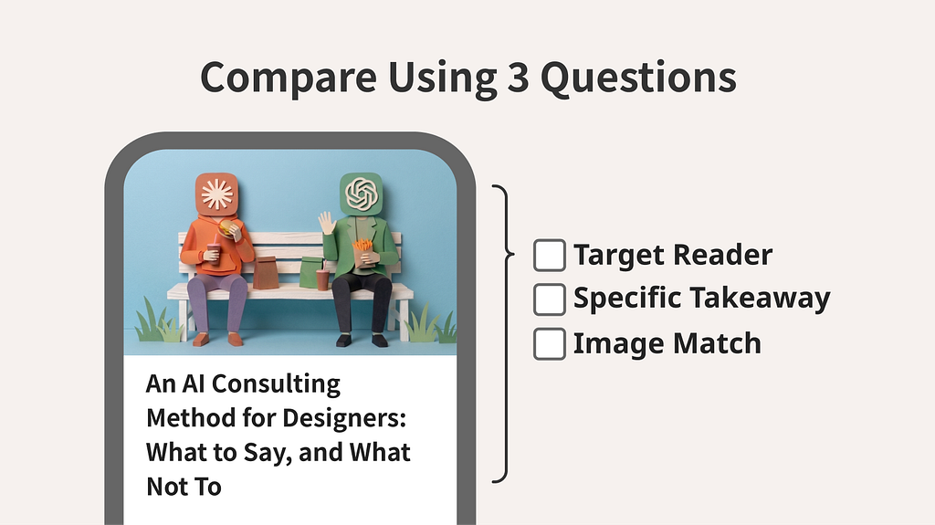
An AI Consulting Method for Designers: What to Say, and What Not To
- Target Reader
(✓) The word “designers” makes the target reader clear. - Specific Takeaway
(×) “What to say, and what not to” alone doesn’t let you picture concretely what kind of situation the article is about. - Image Match
(✓) After taking in “AI consulting” and then looking at the image, you can picture a situation of talking with AI.
Option 3: Lead with the reader’s question
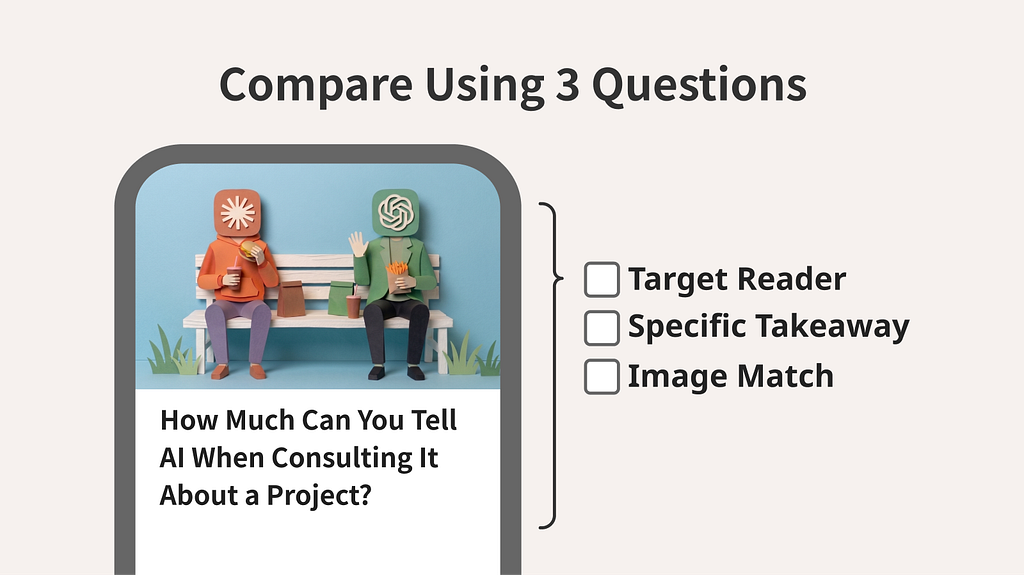
How Much Can You Tell AI When Consulting It About a Project?
- Target Reader
(×) The target reader isn’t clear. - Specific Takeaway
(✓) The words “how much you can say about a project” let you picture, specifically, an article about judging what information to share when consulting AI about a project. - Image Match
(✓) After taking in “consulting AI about a project” and then looking at the image, you can picture a situation of talking with AI about work.
When in Doubt, Put the Judgment Into Words
And when in doubt, try putting it into words using this template:
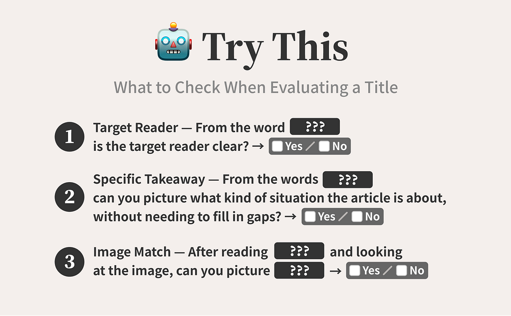
- Target Reader — From the word “___,” is the target reader clear? → Yes / No
- Specific Takeaway — From the word “___,” can you picture what kind of situation the article is about, without needing to fill in gaps? → Yes / No
- Image Match — After reading “___” and looking at the image, can you picture “___”? → Yes / No
Add the Target Reader to Adjust It
Options 2 and 3 scored the same on all three criteria. So I built on Option 3, which uses language closer to the article’s core problem: the reader’s question of how much you can say (about a project).
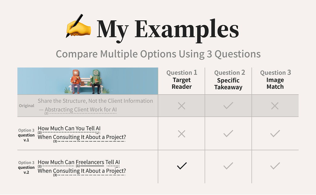
How Much Can Freelancers Tell AI When Consulting It About a Project?
What I tried to avoid here was praising each option on different terms.
Comparing them as “Option 1 is approachable,” “Option 2 seems searchable,” “Option 3 is straightforward” just applies a different single criterion to each — it can’t tell you which option actually fits the goal.
You need to align not just the grain of the options, but the grain of the criteria too.
For the English Title, One More Criterion Showed Up
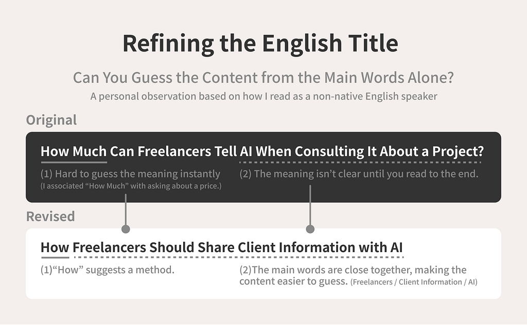
For the English version, the first title I came up with was this:
How Much Can Freelancers Tell AI When Consulting It About a Project?
It gets the content across. But viewed at something close to feed size, it felt a little long — you had to follow the sentence structure all the way through before the meaning landed.
I’m not a native English speaker. I also often screenshot English articles and run them through a translation tool.
I added “can you guess the content from the main words alone, even without context?” to my criteria, thinking it also mattered for readability among readers who aren’t native English speakers.
Rather than only rewording the original, I also compared options with different sentence structures against the new criterion.
That said, what I’m looking at here isn’t keyword design for SEO — it’s readability: whether someone who sees the title in Medium’s feed can guess the content from the main words alone.
Compare the English Titles the Same Way
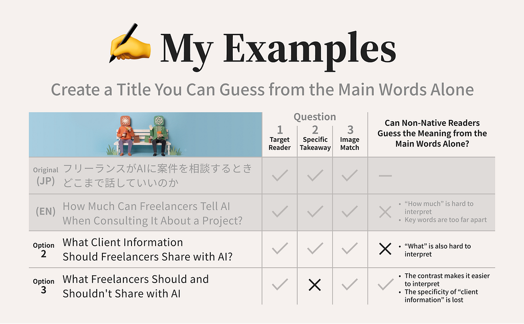
The original English draft made the audience and problem clear, but “How much” is a phrase I associate with asking about a price, which made it hard to guess the meaning instantly. On top of that, the key words were far apart, so the meaning didn’t land until you read to the end.
So I asked for alternatives to “How Much,” and got these two options:
- Option 2:
What Client Information Should Freelancers Share with AI? - Option 3:
What Freelancers Should and Shouldn’t Share with AI
Option 2 states the subject clearly, but I found the word order starting with “What Client Information” hard to read instantly in a feed (a personal observation, based on how I, as a non-native reader, take things in).
Option 3 prioritized clarity, which is why AI suggested a contrast structure, but “client information” as the subject disappears from the title entirely, leaving it vague what exactly is being discussed with AI.
What this showed me is that, even when translating into English, it matters to hold on to the basic design you started with.
When You Spot a Missing Condition, Generate a New Option
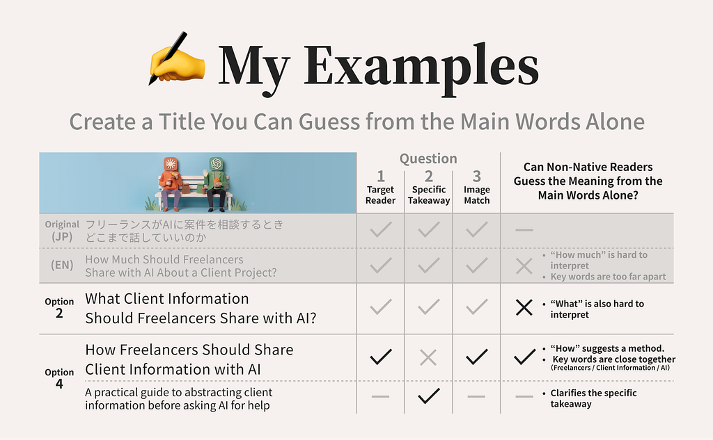
Comparing the original and the revised options showed me that none of them satisfied audience, subject, method, consistency with the image, and readability in the feed, all at once.
So I kept Option 2, which held on to the basic design, and generated Option 4 from there.
How Freelancers Should Share Client Information with AI
“Freelancers” leads the sentence, so the audience is clear. “How” signals this is a how-to article, and “Client Information” and “AI” convey the subject. It also stays close to the image, in terms of who’s sharing what with whom.
Still, this title leaves room for the reader to fill in gaps, and could be read as an article about how to share client information with AI as-is.
So I added the following subtitle to fill that in:
A practical guide to abstracting client information before asking AI for help
The Japanese Title Got a Second Look Too
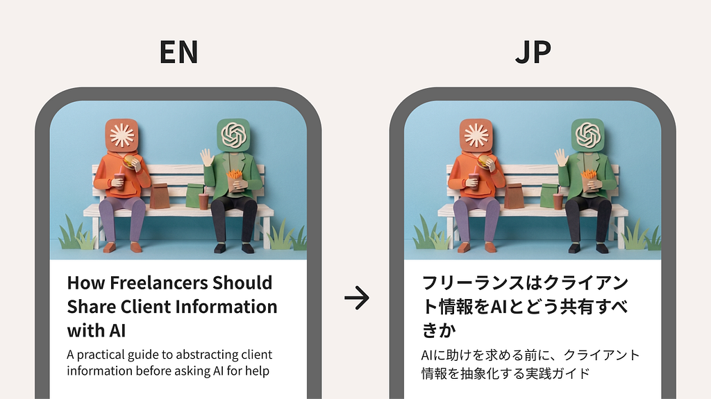
I publish this series in more than one place, so I need both a Japanese version and an English version.
To match the meaning I’d settled on in English, I also revised the original Japanese title to match.
It reads a little more formal in Japanese as a result, but keeping the two languages consistent mattered more to me than matching the more natural Japanese phrasing.
I don’t think this title and subtitle are the one correct answer in English. They’re the combination that best satisfied the conditions for this particular audience, cover image, article content, and my own readability, this time around.
It’s Fine to Update Your Criteria Midway
Looking back, “can you guess it from the main words” wasn’t a criterion I started with. I could only put it into words after checking the English title at something close to real feed size, and noticing I found it hard to read myself.
Organized, this round’s decision process looked like this loop:
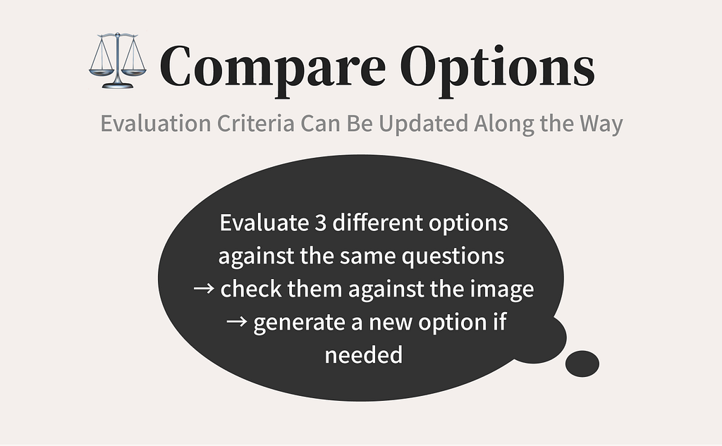
Evaluate 3 different options against the same questions → check them against the image → generate a new option if needed
You don’t need to land on the right title from the start. I think it’s enough to check it at something close to how it’ll actually display, feed any problems you find back into your criteria, and let the conditions for “done” get clearer little by little.
What I Observe After Publishing Becomes the Next Hypothesis
On the other hand, watching the response after publishing gave me a separate observation from the criteria I used while making it.
I now have a new hypothesis: that things beyond how clear the content is — like how upbeat or unexpected a title feels — may also play into how readers respond.
I don’t have enough to judge yet, but it’s one of the things I want to watch in the next article.
This article is the bonus piece in a 3-part series, written so that anyone interested in UX — not just UX designers — can put it into practice: rethinking content creation on Medium as a form of overall UX design.
- Learning the three account-design conditions that support showing up
- Turning an AI conversation into an article that’s useful to someone else
- Learning to judge AI images by your own criteria
- Bonus: Resolving the friction between an image and its title (this one)
That’s it for this one.
To everyone who’s read this far, thank you, really.
This series wraps up here for now, but I expect that as I keep publishing, new questions and new judgment criteria will keep showing up.
I hope to share those in a future article too.
3 Questions for Revisiting a Title and Image, So They Reach the Right Reader was originally published in Bootcamp on Medium, where people are continuing the conversation by highlighting and responding to this story.

 点赞
点赞 收藏
收藏 点踩
点踩 分享
分享