Why users thought our KYC flow was a phishing scam (and what it taught me about designing trust)

A redesigned identity verification flow cut registration drop-off by 42% by treating trust as the core design problem, not an afterthought
I was leading the redesign of SaveInGold, a consumer fintech app that lets people buy and save in gold. Onboarding funnel data showed a cliff: users sailed through account creation, then vanished at identity verification. Not a gentle slope of attrition, a cliff. 90% of sessions lasted under thirty seconds. 41.5% of our support tickets were related to account setup and registration. And registration itself had a 42% drop-off rate.
The obvious hypothesis was friction. KYC (Know Your Customer) is the most tedious part of any fintech product: document photos, selfies, waiting. So the obvious fix was to make it shorter, clearer, prettier. Except when I actually watched users go through the flow and talked to them about it, friction wasn’t the word that kept coming up.
Suspicion was.
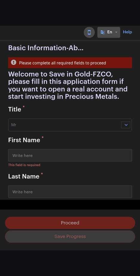
The moment trust broke
Our KYC flow, like many fintech apps, relied on a third-party verification provider. When users reached the identity step, the app handed them off to an external browser to complete six separate screens: basic information, financial information, a declaration, email verification, two-factor authentication, and an OTP entry, all on a domain that wasn’t ours.
From an engineering standpoint, this was completely reasonable. From the user’s side of the glass, here is what actually happened: they were in an app they had just trusted with their personal details, considering trusting it with their money, and suddenly they were ejected into a browser, looking at an unfamiliar domain, on a page with different branding, being asked to photograph their passport.
“I wasn’t sure if I was still in the app or taken somewhere else. It didn’t feel secure enough to connect my bank account.” — User interview, registration flow
Every signal users had learned about phishing, unexpected redirect, unfamiliar URL, mismatched branding, a request for sensitive documents, was present in our legitimate flow. We had built something indistinguishable from a scam, and users were behaving exactly as internet safety training had taught them to: they closed it. It’s a pattern others have written about too: seamless, familiar-looking flows are exactly what phishing design preys on, which means a legitimate product that breaks its own visual continuity, even briefly, is speaking the same language as an attack.
This is the part I find most interesting. The drop-off wasn’t a usability failure. It was users being smart.
Diagnosing the failure mode, not the symptom
It would have been easy to treat the symptom. Add a loading screen that says “you’ll now be redirected.” Shorten the form. Send a reminder email to people who abandoned. All of these were tempting; none of them address why people were leaving.
The actual failure mode was a broken chain of trust. Users extend trust to a product gradually, and every context switch is a point where that chain can snap. Ours snapped at the worst possible moment, the exact step where we asked for the most sensitive thing.
Once we framed it that way, the design direction became clear: the verification had to feel like it never left the app, even though a third party was still doing the work underneath. This lines up with what Nielsen Norman Group’s research on trust and credibility has documented for years: trust isn’t a single moment; it’s accumulated gradually across an experience, and it only takes one broken link in that chain to undo it.
What we changed
Working with engineering and compliance, we rebuilt the flow around one principle: no visible seams.
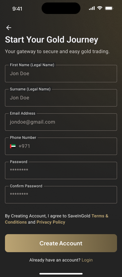
- Embedded verification in-app, not an external browser, so users never saw a foreign URL or lost the app’s visual context. The full seven-screen registration flow, account creation, email verification, document upload, KYC approval, now lives natively inside the app with progressive disclosure breaking the process into manageable steps.
- Biometric-first security. Face ID and fingerprint login were designed as the primary authentication path from the start, not bolted on afterward. Users handling real money need to feel secure without friction.
- A visual language built for trust, not decoration. A dark interface with warm gold tones reinforces the premium, serious nature of the product, and reduces visual noise in data-dense screens like the trading module.
None of these changes made the flow meaningfully shorter. That’s worth repeating: we barely reduced the number of steps. We reduced the number of moments where a reasonable person would wonder if they were being scammed.
There was a real constraint here too: our KYC provider’s API imposed rigid field requirements and validation rules that couldn’t be changed on our side. My first attempt at a streamlined form had to be scrapped because the provider required fields in a specific order with exact rules. I had to work backward from those technical constraints to design a flow that felt simple while still satisfying every compliance requirement underneath.
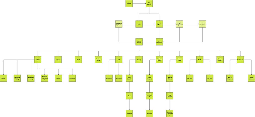
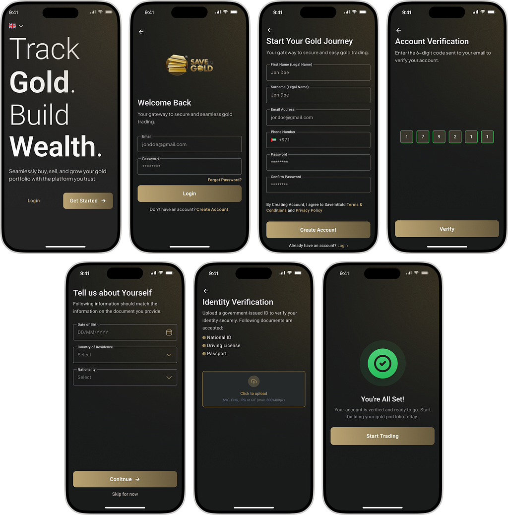
The result
After the redesign shipped, registration drop-off fell by 42%. In usability testing, all eight participants, a mix of existing users and new signups, completed registration without assistance or hesitation. No one asked where they were. No one dropped off. No one needed to restart. Support tickets related to account setup declined substantially as a direct result.
The number I care about most, though, isn’t the 42%. It’s what the sessions afterward sounded like. Users stopped asking “is this safe?” and started asking questions about the product itself, which is what onboarding is supposed to let them do.
What this generalises to
I’ve carried four principles out of this project into everything I’ve designed in fintech since:
1. In regulated products, trust is the primary interface. Before users evaluate whether your product is useful, they evaluate whether it’s safe. Every design decision at a sensitive step is a trust decision first and a usability decision second.
2. Users’ security instincts are a design constraint, not an obstacle. People have been trained for two decades to distrust redirects and mismatched branding. You cannot copy-write your way around those instincts, and you shouldn’t want to, they protect your users. Design flows that pass the tests users are already running.
3. Diagnose the failure mode, not the symptom. Funnel data tells you where people leave, never why. If we had optimised the step where people dropped off, we’d have polished a screen users were closing out of self-preservation. It took qualitative research to find the actual mechanism.
4. The seams are the product. Integrations, handoffs, third-party steps, the places where systems meet are where trust breaks. If you design only the screens you own and leave the seams to default behaviour, the seams will define your user experience. It’s the same root cause behind most dark patterns: a gap between what a flow was designed to do and what the person on the other end actually experiences, whether that gap is intentional or not.
Fintech is about to get more of this problem, not less. As AI-driven verification, open banking connections, and embedded finance multiply the number of third parties inside a single user journey, the designer’s job is increasingly to make a federation of systems feel like one trustworthy product. That’s not a visual design challenge. It’s an architecture-of-trust challenge, and it’s worth taking seriously before your funnel tells you about it.
Why users thought our KYC flow was a phishing scam (and what it taught me about designing trust) was originally published in Bootcamp on Medium, where people are continuing the conversation by highlighting and responding to this story.

 点赞
点赞 收藏
收藏 点踩
点踩 分享
分享