Fewer screens, better conversion? Not always

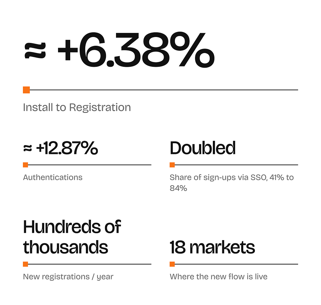
How we stopped redesigning screens and started reading the funnel and users properly, and got 6.38% more sign-ups across 18 markets.
Sometimes the biggest product wins come from seeing a familiar flow with fresh eyes. At exmox, people earn real money for playing games, a promise that sounds too good to be true when you have never heard of us. We rebuilt the pre-sign-up journey around that one problem, and the version that answers the doubt before it asks for an email is the one that won. Here’s how we got there, and why the result surprised us.
Episode 1: We lost them at the door
exmox runs several reward apps where people earn real money for testing apps and games. Growth is bought: we pay for every install.
Which makes one number matter more than any other: Install to Registration. If someone installs the app and never finishes signing up, we have paid for a user we don’t have.
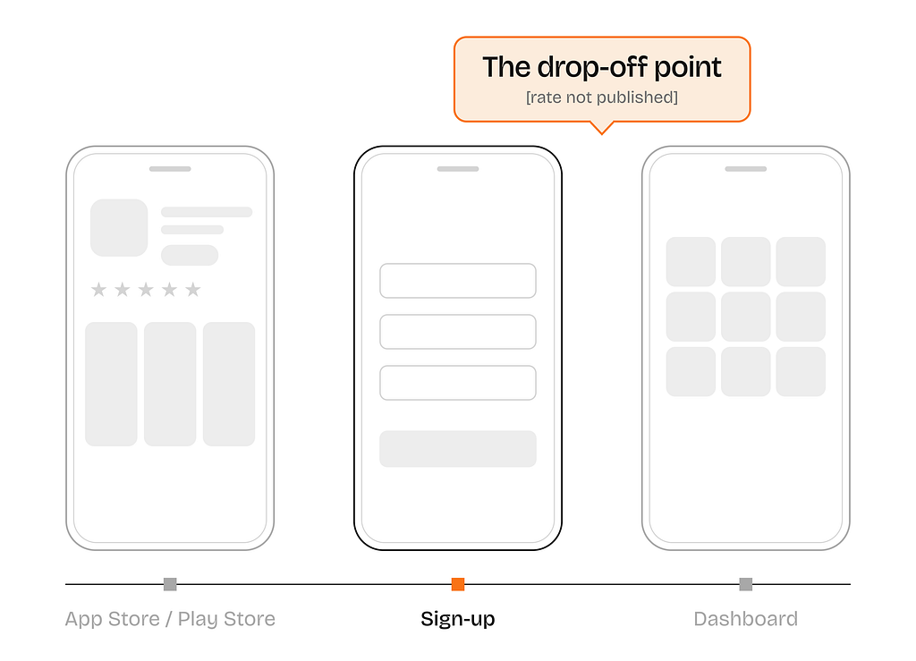
These were not cold users. They tapped the ad, read the listing, downloaded, opened the app. Four yeses. They just would not give us a fifth.
Episode 2: Making a faster horse
The hypothesis on the table was that the welcome screen looked dated and did not communicate much, such as trust signals. So we rebuilt it with new imagery, trust signals, motion, etc. Everyone agreed it looked better.
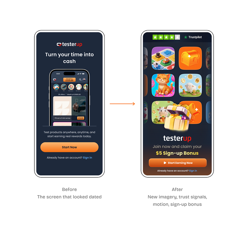
We ran an A/B test. Install to Registration did not move. Why? Because we had been looking at one screen, not the whole journey.
A closer look at the registration funnel showed that nearly everyone who reached that screen was already tapping straight through.
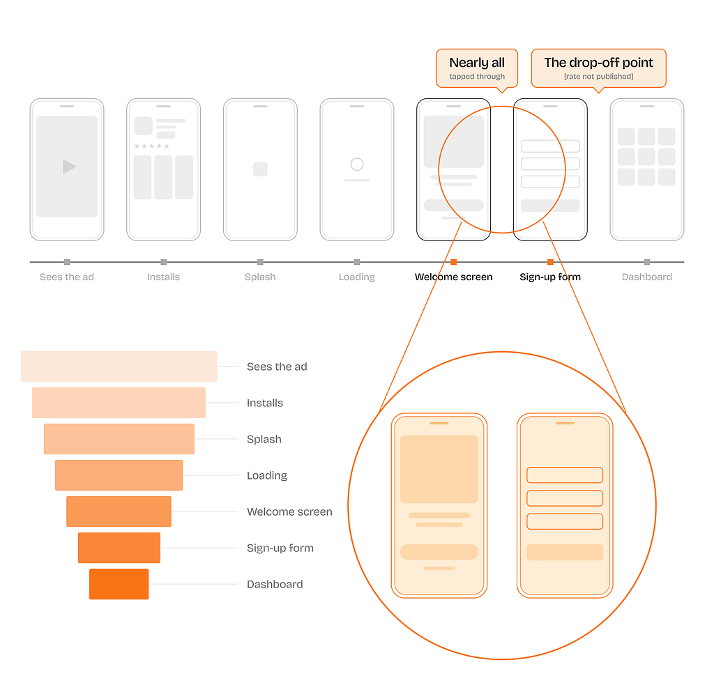
They walked past the screen we had just rebuilt. The question was no longer what it looked like, but what we were asking of them.
Episode 3: In which we ask, and then we steal
A failed redesign leaves you holding a why, and a why is when you stop arguing in a room and go talk to people.
Eleven strangers
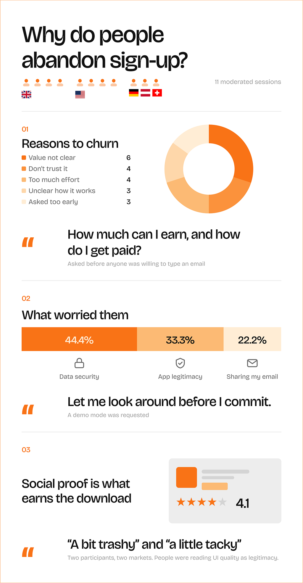
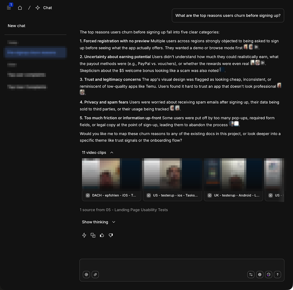
Our UX researcher ran eleven moderated sessions across the UK, US and DACH. One question at the centre of all of them:
What would make you stop and not sign up.
Five thefts
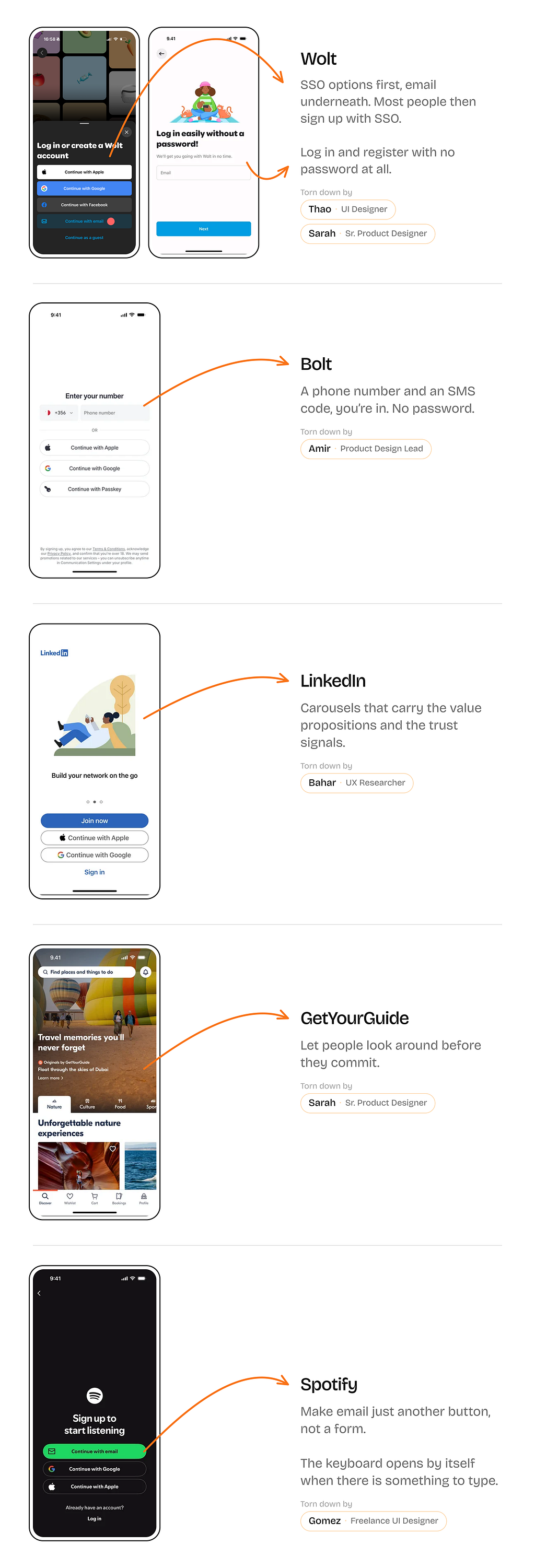
In parallel, each designer took one app they admire and pulled its sign-up flow apart, screen by screen. Every one of them taught us something we could use.
Episode 4: In which we take the walk with them
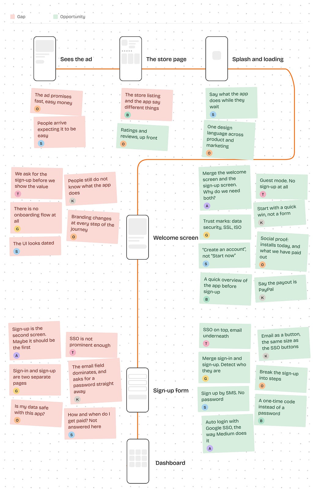
We ran a kick-off workshop and walked the journey the way a user does, from the ad to the dashboard. At every step, two questions: What are the gaps? What are the opportunities?
The full product design team was there, plus the product managers.
Episode 5: Four proposals, one difference
We turned the workshop’s ideas and pain points into four concrete proposals, ordered from easiest to hardest to implement. All four shared the same core set of improvements. For example:
Pain point: Users aren’t yet convinced of the app’s value.
Idea: Show how it works, backed by social proof.
The only difference was how people sign up.
Proposal 1. Email and a password.
Proposal 2. Email and a one-time code. No password.
Proposal 3. Phone number and a one-time code. No password.
The first three kept the SSO options (Google, Apple, Facebook).
Proposal 4. No account until you want to cash out. Guest mode.
Baymard’s research on delayed account creation makes the same argument for checkout: ask for the account once the value has already landed.
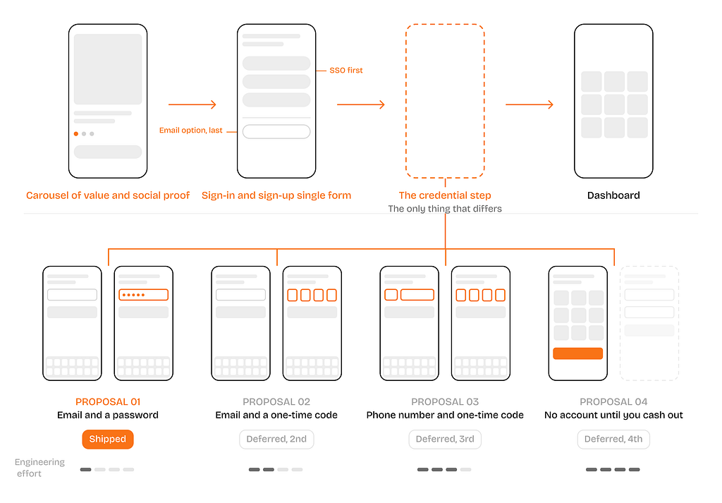
We presented all four to tech leadership. We agreed to start with Proposal 1, as it needed no backend work, and it still carried nearly everything we had learned.
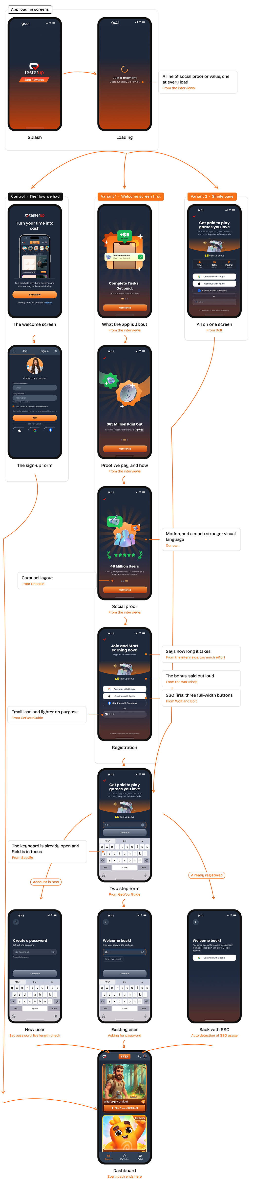
The content: trust signals, a plain answer to what the app actually does, social proof. The flow: one merged form that detects whether you are new or returning, SSO first, the keyboard already open.
Episode 6: In which ideas turn to screens
Proposal 1 was designed in two variants. Same content, same merged form. The only difference was where that content sat.
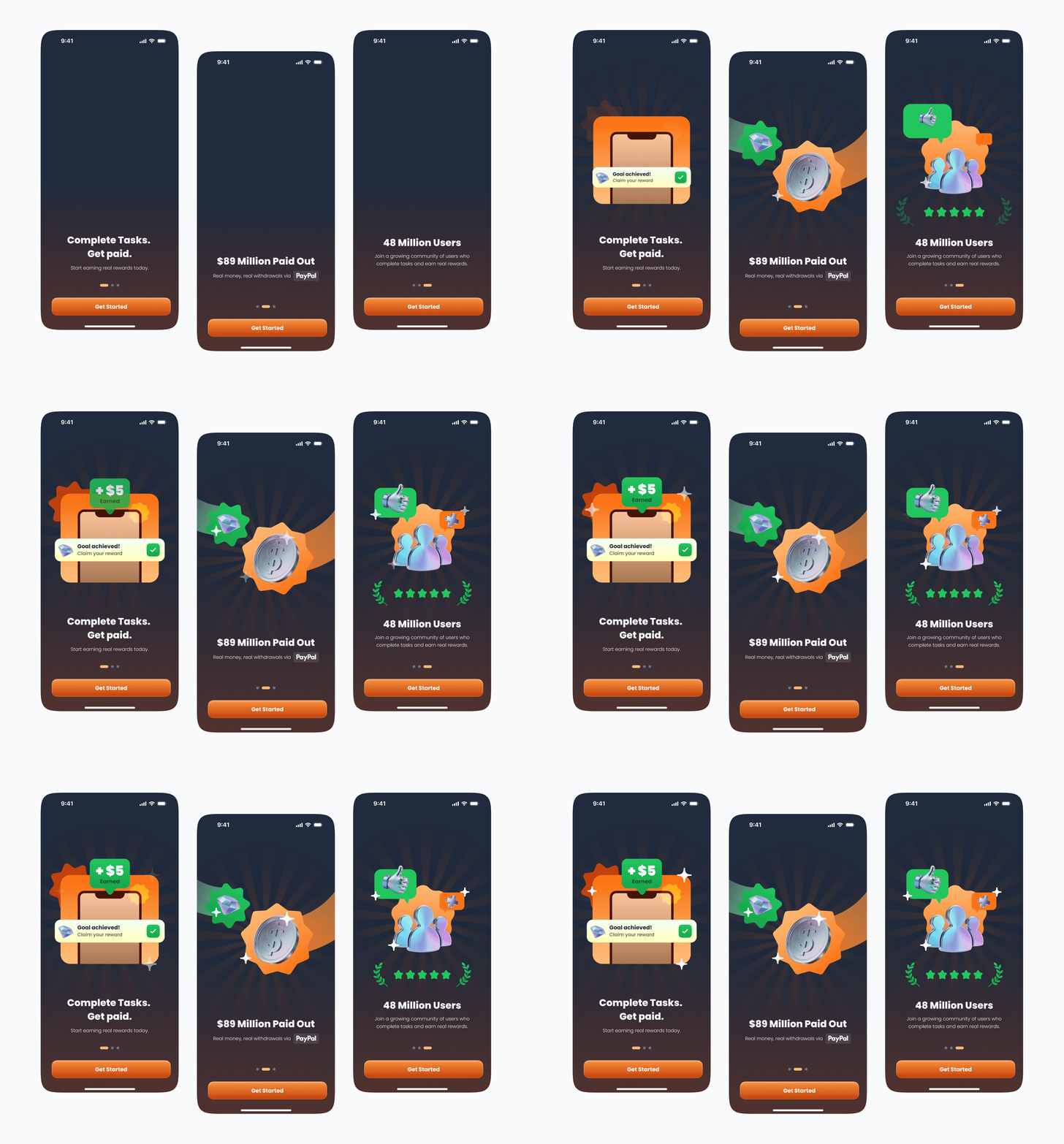
Variant 1: A progressive disclosure approach. Opens with a three-screen carousel answering what the app is, what it pays, and who else uses it, and asks for a sign-up afterward.
Variant 2: Puts all of it on one screen, with the sign-up, assuming fewer pages will result in better conversion.
Episode 7: Six point three eight
Designs were implemented and underwent an A/B test: the control and 2 variants were exposed to 341K users, split evenly.
One honest confession: we expected the single-screen version to win. Fewer screens, fewer steps, less to abandon. That is the factory setting of the designer brain.
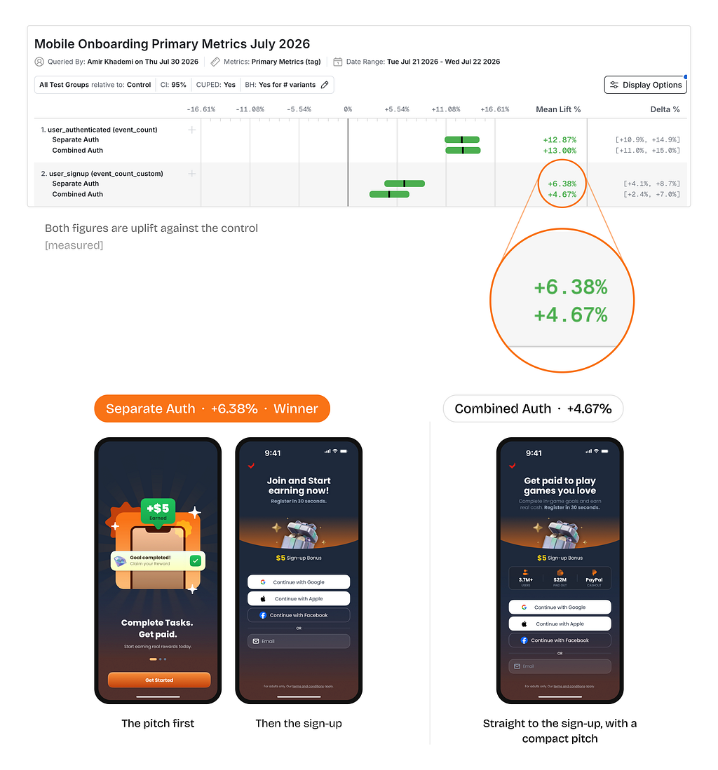
the sign-up after it. Combined means both on one screen.
Both new versions beat the old one. The winner was the one that let people read before it asked for anything. Fewer steps is not the same as less effort, and our test made that difference expensive to ignore.
Episode 8: Beyond sign-ups
Logins went up too
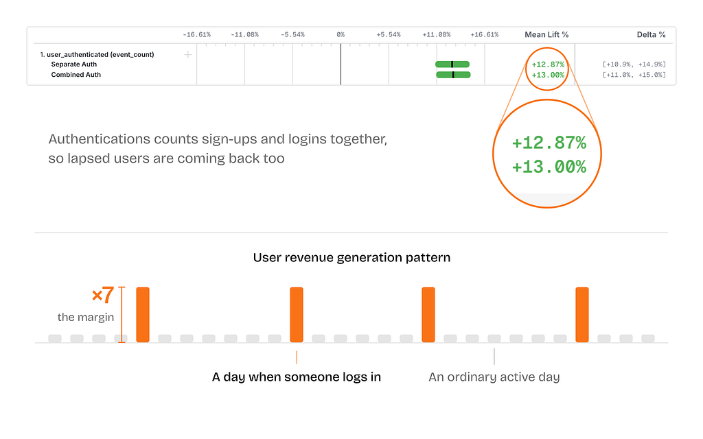
Authentications rose 12.87%, roughly double the sign-up lift. So lapsed users are coming back more easily too.
Our data shows that a day on which someone logs in earns around 7x the margin of an ordinary active day.
SSO took over, a quiet win for fraud and support
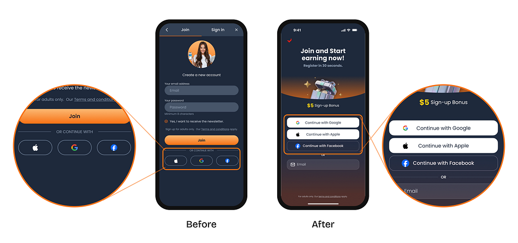
The old screen asked for an email and a password first, and hid Google, Apple and Facebook behind three small icons near the bottom. The new one turns that around: three full-width buttons, with the email field underneath.
People took the door we opened. Sign-ups using SSO went from 41% to 84%, and email and password fell from 59% to 16%.
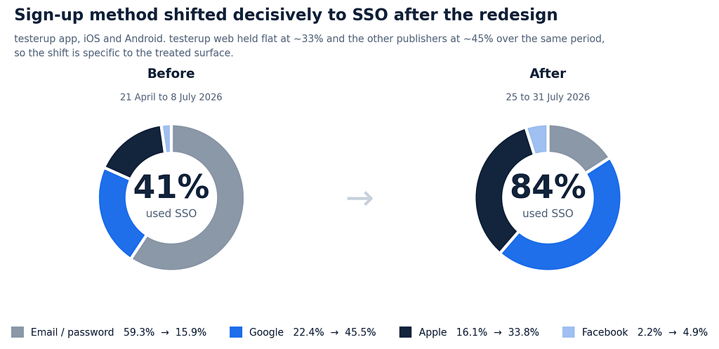
Why is it a win? An account with a password can be taken over. An account that goes through Google or Apple has no password to steal. And nobody forgets a password they never set, which is one less reason to ever contact support.
The flip side ⚠️
Less friction on the way in means the people coming in are, on average, less motivated. Revenue per user inside the advertisers’ games falls, and with it their return on ad spend (ROAS). That is a real cost to the people who pay us, and it is the next thing to work on: raising what a user is worth, now that there are more of them.
Episode 9: Shipped everywhere, finished nowhere
exmox runs several brands across eighteen markets. The flow we designed for one of them went live in all. The others took it without running a test of their own.
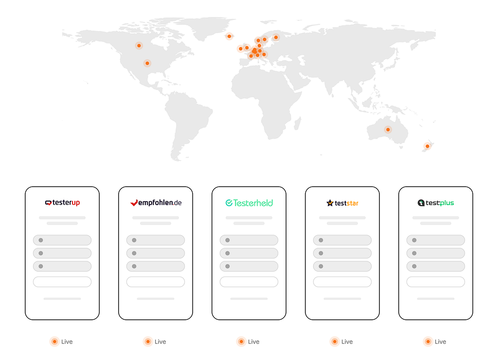
And this was only proposal 1, the cheapest for engineering to build. Passwordless, phone number, and guest mode are lined up to be designed and tested.
Episode 10: Design, all the way to the money
A design decision that stops at a metric, Install-to-Registration in this case, is still an argument. Someone can always ask what the metric is worth, and “conversion went up” is not an answer in the language the business speaks.
McKinsey’s research on the business value of design found that the highest-performing companies measure design with the same rigour they apply to revenue and cost.
So we kept going. Queries against our Databricks warehouse revealed how much the new registrations are worth to the business in terms of revenue. The findings were shared as a report internally and can’t be shared, for an obvious reason.
Last but not least
Twice we were wrong.
The welcome screen was not the problem. Fewer screens did not win. Both times the evidence said so, and we moved, and that is the only part of this worth copying.
Your users are not our users
This design worked for us. That does not mean it will work for your app. While reviewing other apps’ registration flows, we noticed: there are common patterns, but each app has a flow optimized for its own audience. Ours needed convincing before signing up. A product like Spotify may not, and adding three value-communication screens ahead of the form could cost them more churn.
This was never my work alone
This was a product design team initiative; people from product design, product management, and engineering were involved:
- Sarah, Sr. Product Designer. She turned a wall of sticky notes into flows you could build. The wall was chaos. She was not.
- Bahar, UX Researcher. She gets strangers to explain their own behavior better than they understand it.
- Leo, Sr. UI Designer. He makes screens that hypnotize you. People stared long enough to read the words, which was the plan all along.
- Thao and Gomez, UI Designers. They came to the workshop, tore other people’s apps apart for us, and left their best ideas on the wall.
- Onur and Aleksandra, Senior Product Managers. They kept the roadmap open long enough for the right thing to get built, which is most of the job.
- Melissa and Owais, Engineers. They built it, shipped it, and did not complain once. Not once.
The number is theirs.
Fewer screens, better conversion? Not always was originally published in Bootcamp on Medium, where people are continuing the conversation by highlighting and responding to this story.

 点赞
点赞 收藏
收藏 点踩
点踩 分享
分享