How We Redesigned TikTok Like a Real Product Team in Five Weeks

Exploring the user experience issues behind TikTok’s high churn rate. A five-week UX redesign sprint with three rounds of usability testing and final concept validation.
Can a team define and solve a product problem like a real product team in just five weeks? This is a look back at how we explored the reasons behind TikTok’s high churn rate over a five-week project. Through three rounds of usability testing, we improved how users could control buttons, the algorithm, and their viewing time. In the final prototype, the brand trust score increased from 5.5 to 7.5.
At the start of the project, my first proposal as team lead was to create prototypes rapidly with AI and run more rounds of testing, rather than spend most of our time perfecting a single prototype. Instead of trying to find the right answer on our own, we chose to listen to participants and make quick changes based on their feedback. We planned our schedule and divided our roles around this principle.
WHY: Can Addictive Design Really Sustain MAU Growth?
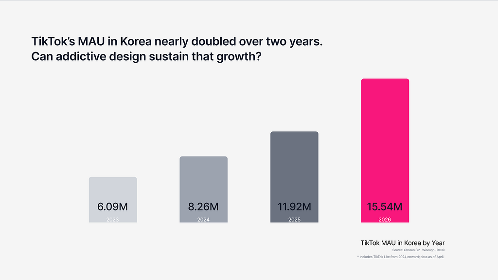
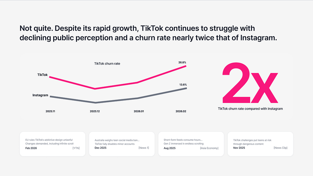
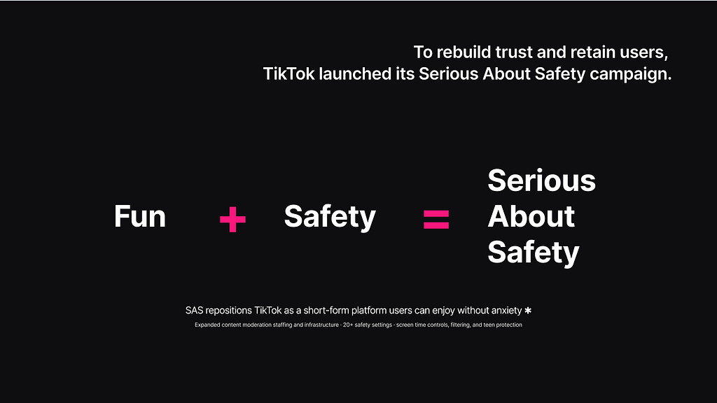
When we worked on this project in February 2026, several countries were raising serious concerns about overuse and mental health problems linked to TikTok’s addictive design. TikTok was promoting a safer user experience through its “Serious About Safety” campaign, but our desk research painted a different picture. TikTok’s monthly active users in Korea nearly doubled in two years, but its churn rate was also twice that of Instagram.
We explored the reasons through a survey and our first usability test. The first test used the live TikTok app. Across both the survey and the test, the main issue that appeared repeatedly was a loss of control caused by dark patterns. In the button-control task, five out of seven participants (71.4%)* either could not find the “Not Interested” feature or tapped a different button and followed the wrong path.
*Seven people took part in the first usability test. One participant was excluded from later rounds, so the comparison of brand trust across rounds was based on the six people who completed all three tests.
These button-control and recognition problems, including accidental taps and difficulty finding “Not Interested,” also pointed to clear violations of usability heuristics.
Behind these numbers were three different failures of control. Button mis-taps came from an addictive layout that doesn’t distinguish intended actions from accidental ones. The low awareness of well-being features meant there was no clear stopping point to break unconscious content consumption. And the sense of helplessness about the feed came from a recommendation system that works as a black box.
Based on these findings, we defined the problem as follows:
When people who enjoy short-form content spend a long time in the app, being unable to control the experience on their own terms can reduce brand trust and long-term retention.
What kind of experience could TikTok offer if its goal of safety and users’ need for control were better balanced? Our goal was to redesign the core experience so users could control buttons, the algorithm, and their viewing time without taking away the fun. We also wanted to test how restoring that control could affect brand trust. Under the vision “Beyond Addiction, Toward User Control,” we aimed to propose a safer TikTok that kept both fun and peace of mind.
WHAT: What Did We Use to Judge Success?
Because this was a concept project, we could not measure actual retention. We therefore chose brand trust as our main validation metric. We also believed it could serve as a leading indicator we could use to test our hypothesis later on.
Our assumption was that giving users more control, the biggest issue found in the first usability test and in-depth interviews, could improve trust and possibly delay churn over time. A higher trust score would not automatically mean a lower churn rate, but it could still provide a signal related to retention. If we had access to TikTok’s live user data, we would have followed the roadmap by measuring adoption of the control features, churn, and long-term retention to evaluate whether our hypothesis and solution worked in practice.
How We Measured Brand Trust
- Five items from Koschate-Fischer and Gärtner (2015): Reliance, Trust, Safety, Performance confidence, Promise delivery
- Each item was rated on a 10-point scale
- The average of the five items was used as the brand trust score
HOW: How Did We Run the Project?
We used Figma Make to reduce prototyping time and repeated three rounds of usability testing and iteration over five weeks.
- Survey → In-depth usability testing × 3 → Concept test
Looking more closer at the three usability tests, the process repeated the same cycle of prototyping, testing, and iteration.
Usability Test 1 and Iteration 1
The first in-depth usability test showed that users reacted strongly to losing control. This included accidental taps caused by a crowded screen and a lack of tools for controlling the algorithm. Participants also felt guilty about being unable to stop chasing the next dopamine hit and wanted something that could help them stop. This was reflected in a low average trust score of 5.5 out of 10 among the six participants evaluated for the cross-round comparison.
We needed to return control to users across three main areas: buttons, the algorithm, and time. At this stage, our goal was to improve usability by addressing the problems found in the first test. Instead of spending most of our time increasing prototype fidelity, we used Figma Make to build medium- to high-fidelity prototypes rapidly and test how users responded to the updated designs and features.
We changed the hidden, long-press “Not Interested” feature into a swipe gesture so users could use it more easily. We adjusted button hierarchy and spacing to reduce accidental taps, and redesigned the Explore tab around curated content to give users more control over the algorithm. Participants also wanted a stronger way to stop watching when the app began to feel empty or unproductive, so we added and tested a forced-exit feature.
Usability Test 2 and Iteration 2
We ran the second usability test with the six participants from the first round who continued to the next stage. Misclicks and path errors decreased, and participants reported less difficulty controlling content, the algorithm, and their viewing time. But one thing still wasn’t solved: trust.
Participants were satisfied with the features, and the trust score had improved, but it had not reached our target of 7.5. In the second iteration, we added an algorithm dashboard and a feed tuner to make the recommendation system more transparent. We added more detailed controls so users could manage everything from individual buttons to the algorithm itself, with the aim of improving not only usability but also how the experience made them feel.
Usability Test 3
In the final test, the average brand trust score, measured with the same scale, increased by 36%, from 5.5 after the first test to 7.5. This met our target for the main validation metric.
Final Concept Validation
Because the usability tests used a small sample, we could not generalize the findings. We therefore ran a final concept test with a larger group to check how people responded to the same prototype.
The team debated whether to run this final test because the schedule was tight. However, since the first three tests were based on a small sample, we believed a larger group could help address more of the limitations. After a long discussion, we reduced the test to a small set of key questions and moved forward.
A total of 67 people took part in the final concept test. We analyzed the valid responses for each quantitative question. We also used the 35 responses that included the open-ended questions to review detailed feedback and suggestions for improvement.
Of the 33 people who answered the recommendation question, 27 (81.8%) said they would recommend the redesigned TikTok. The average design quality score…

 点赞
点赞 收藏
收藏 点踩
点踩 分享
分享