The boring screens that run the world: a designer’s case for taking admin tools seriously.

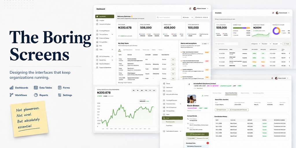
The most consequential design work in most companies happens on screens no one wants to design.
Article Image
A Nigerian financial services company was losing money every day on its lending operation, and the cause wasn’t fraud, a market downturn, or bad credit modelling. It was a usability problem on an internal screen.
The screen lived inside a sales agent’s backend portal. Customers were applying for loans, and agents were processing them. The trouble was that customer records often looked almost identical: overlapping names, the same date of birth, partial address matches. Under the pressure of a sales quota, agents were clicking through the workflow and approving loans for the wrong people. Money left the company every day, attached to applications that had never actually been made, because a verification step never asked the agent to slow down.
I was brought in to audit it. I ran a usability test on the existing portal, watched a few agents work, and found the failure mode quickly. The screen treated picking a customer record as a low-friction action, the way a consumer-app checkout treats “select shipping address.” It assumed the right answer was obvious. For agents working under load, it wasn’t. So I designed a confirmation screen that made the agent verify each loan against a unique customer identifier, the one piece of information that genuinely belongs to a single applicant, instead of trusting a name and a date of birth that so often collided. Errors dropped sharply, and most of the daily loss disappeared with them.
Here is what I want to say about that screen.
Nobody is going to put it on Dribbble. It has no soft shadows, no delightful microinteraction. It is a verification step on a sales agent’s backend portal, and most designers I know would consider being assigned to design it the worst day of their week.
That is the problem.
The screens that run the world
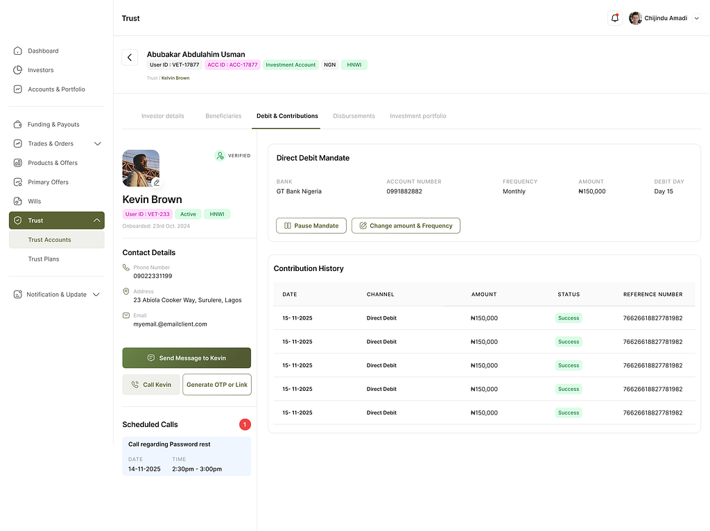
Admin screen monitoring user’s contributions through direct debit.
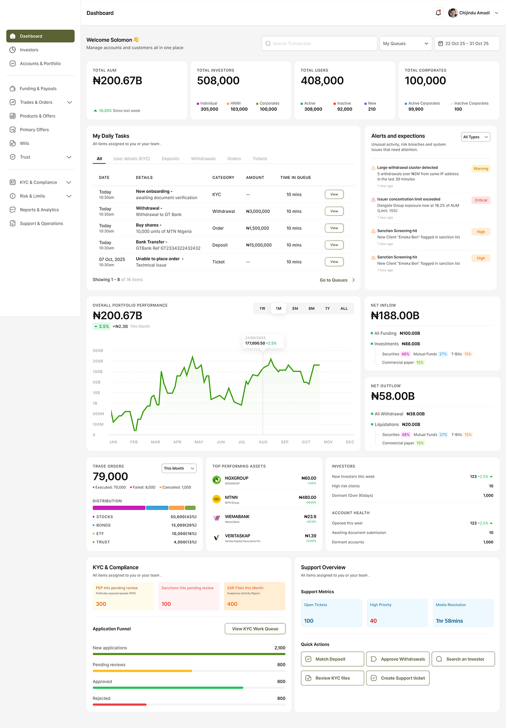
Design culture has quietly decided that admin tools, internal dashboards, ERPs, and backend portals are not worth taking seriously. These are the screens that run the operational engine of almost every company, and they get treated as an afterthought. They are not on Dribbble. They are not on Awwwards. They are not in anyone’s portfolio. Junior designers avoid them. When senior designers get handed “the admin,” they sigh.
But these are the screens that move money. They process the loans, route the trades, onboard the clients, manage the reconciliations, and tell an operations team which orders are about to breach an SLA. They are where the actual work happens. And because we do not take them seriously as a design problem, they fail in expensive ways. The screen I described above quietly drained money every day until somebody finally treated it as worth thinking about.
I have been designing in fintech for over five years. I have worked on consumer investment platforms, ERPs for institutional users, sales backends, admin dashboards for compliance teams, and the operational tooling that sits behind a customer-facing product. The pattern is consistent. The admin side is where the harder design problems live, where the higher-stakes mistakes happen, and where the smallest fraction of the design community is paying attention.
This is not a new observation. The designer Charles Klein has called internal tools the most underrated design challenge in the field, and the collective indifference to it has been remarkably persistent.
Why designers don’t take admin tools seriously
A few reasons, and we should be honest about them.
The first is the inspiration economy. Designers learn what design looks like from what is visible online: Dribbble, Behance, Twitter, design blogs, Mobbin. Admin tools do not make pretty screenshots. They are data-dense, often ugly to outsiders, and they sit behind NDAs and login walls. You will never see a beautiful client-onboarding flow on a “100 best admin dashboards” listicle, because no company is going to risk leaking its proprietary internal tooling. So the work that gets visibility in design culture is almost entirely the work consumer-app designers make. The rest is invisible, and invisible work does not shape a young designer’s instincts.
The second is the portfolio problem. New designers build portfolios on consumer concepts because that is what gets them hired into junior roles. You can mock up a fictional plant-watering app or redesign a delivery service. You cannot mock up an institutional KYC exception-handling flow without having actually worked on one, because the domain knowledge is not available outside the building. Designers self-select away from this work before they ever encounter it.
The third reason is the one designers will fight me on. The dominant aesthetic of consumer design (whitespace, large type, one primary action per screen, soft minimalism) actively breaks when you apply it to operational work. A trader needs eleven data points visible at once. A loan officer needs every flag, every risk indicator, and every prior application on one screen. A compliance reviewer needs the audit trail sitting in their peripheral vision. For these users, whitespace is not breathing room. It is hostile. It is the design equivalent of being asked to do your job through a peephole. Designers trained on consumer aesthetics keep applying that aesthetic anyway, and the result is admin screens that operators quietly route around. They export everything to Excel. They ask IT for “the old version.” And in the worst case, they make the expensive mistakes the design was supposed to prevent.
What it actually takes
On one project, I worked on the admin platform behind a consumer investment product. The company wanted to make investing more accessible to ordinary Nigerians, to go past an existing institutional client base and bring everyday people into the market. There was a constraint that consumer-app designers do not usually think about. The company could not afford to outsource client onboarding to an external verification provider. Those third-party services charge for every successful check, and at the volume the company was aiming for, that cost grows into something significant over time. It was money the company could not give away when the entire point was to lower the floor for retail investors.
So the admin platform had to handle onboarding from start to finish, in house. Identity verification. Document checks. Manual review queues. Exception handling. KYC failures and resubmissions. Institutional clients sitting alongside retail users under different compliance regimes. None of those screens were going to win an award. All of them had to absorb real regulatory complexity, real document-quality problems, and a hundred small operational realities that consumer-app designers never see, because consumer apps usually push that complexity out to a third-party verification vendor.
This is the texture of admin work. It is not a styling problem. It is the problem of holding operational complexity legibly, in front of a person whose job is to make consequential decisions under load.
I have got this wrong too
I should tell you about a time I got this wrong myself, because the failure is more common than the success.
Early in my career, I was asked to design the admin platform for a hotel and B&B application. I built what I thought was a thoughtful dashboard. Clean, modern, with the kind of metrics that read well in a review. It shipped. And then it failed. The dashboard focused on the service providers, the hotel operators, and largely ignored the customers, even though the operators’ core daily job was managing customer activity: bookings, check-ins, complaints, refunds, special requests. I had designed a tidy one-sided view of a two-sided problem. The operators could not actually run their day from what I had built. The company eventually dropped it and bought an off-the-shelf admin template to customise instead.
That …

 点赞
点赞 收藏
收藏 点踩
点踩 分享
分享