The Empty State is Not a Placeholder. It is Your Product’s First Real Conversation.

Designers treat blank screens as an afterthought. Here is why they are actually the most critical moment of user trust.
I still remember the exact moment I realized we had completely misunderstood our users. It was a Tuesday afternoon, and our product team was gathered around a monitor looking at the analytics for a brand new project management dashboard we had just launched. We were incredibly proud of this feature. We had spent three months refining the data visualization, perfecting the drag and drop interactions, and ensuring the layout was responsive across every device.
But the adoption metrics were abysmal.
We pulled up the session recordings to figure out what was going wrong. We watched user after user log in, navigate to the new dashboard, and stare at the screen. The dashboard was completely empty because they had not created any projects yet.
What happened next was painful to watch. The users would move their mouse to the center of the screen. They would hover over the vast, white, empty space. They would scroll down, realize there was nothing else to see, and then close the tab. The entire session lasted less than twelve seconds.
We had designed a beautiful destination, but we had completely ignored the front door.
Looking back, the mistake seems almost laughably obvious. But at the time, it was a profound shock to our design ego. We had fallen victim to one of the most persistent blind spots in digital product design. We treated the empty state as a temporary inconvenience. We viewed it as a lack of data, a void that would eventually be filled once the user figured out how to use the product.
We were wrong. The empty state is not a lack of design. It is a highly active psychological moment. It is the exact point where the user decides if they have the energy, the clarity, and the trust to actually use your product.
What surprised me most was not that our metrics were failing. It was the realization that we had been treating “nothing” as if it meant nothing. In physical space, an empty room is just a room. In digital space, an empty screen is a demand. It is a blank canvas that instantly transfers the burden of creation onto the user.
If you have spent your career focusing entirely on the populated, happy path of your user interface, this article is going to challenge your foundational assumptions. We are going to explore the hidden psychology of the void, the difference between decorative and functional empty states, and why the blank screen is actually the most important screen in your entire product.
The Anatomy of the Blank Canvas Paralysis
To understand why users freeze when they encounter an empty state, we have to look past the interface and look directly into human psychology. We have to understand what happens inside the brain when it is confronted with absolute nothingness.
When a person opens a populated dashboard, their brain goes into recognition mode. They scan the screen, identify familiar patterns, read the data, and make decisions. The cognitive pathway is clear. The environment is providing cues, and the brain is simply reacting to those cues.
But when a person opens an empty screen, the brain is forced into creation mode.
This is a fundamentally different cognitive process. Creation requires executive function. It requires the user to generate ideas, structure information, and initiate action without any external scaffolding. This consumes a massive amount of mental energy.
Psychologists refer to this as the blank canvas paralysis. When faced with infinite possibilities and zero constraints, the human brain often defaults to doing nothing. The sheer volume of potential choices creates a bottleneck in the decision making process.
I noticed this pattern clearly when we were redesigning a note taking application. The original version opened to a completely blank white screen with a single plus button in the corner. We thought this was the epitome of minimalism. We thought we were giving the user a pure, distraction free space to think.
Instead, we were giving them a cognitive cliff.
Users would open the app, stare at the white screen, feel a sudden spike of mental fatigue, and close the app. They were not lacking motivation to take notes. They were lacking the activation energy required to start.
Most people assume that an empty screen is neutral. They think it is just a quiet place waiting to be filled. But an empty screen is never neutral. It is highly charged with psychological pressure. It is a mirror reflecting the user’s own lack of progress back at them.
When you present a user with a void, you are implicitly telling them that the work starts now. You are telling them that they have to build the value from scratch. If the perceived effort of building that value is higher than their current mental energy, they will abandon the task.
This brings us to a critical realization about digital product design. We spend ninety percent of our time designing for the moment when the product is full of value. We spend ten percent of our time designing for the moment when the product has zero value. But the empty state is the gatekeeper. If the user cannot get past the empty state, they will never experience the value we worked so hard to build.
The Scaffold Principle
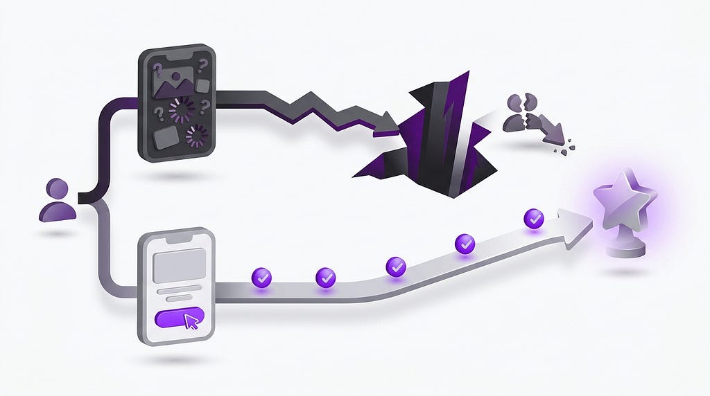
Moving from decorative to educational empty states transforms a blank screen from a dead end into a compelling vision of future value.
If you want to overcome blank canvas paralysis, you must adopt the Scaffold Principle.
Never present a truly blank screen. Always provide a cognitive scaffold.
A scaffold is a structural framework that supports the user while they build their own content. It reduces the cognitive load by providing constraints, suggestions, and starting points.
Instead of a blank white screen, give the user a template. Instead of an empty list, give them a suggested first item. Instead of a blank text editor, give them a prompt or a structured outline.
The scaffold does not do the work for the user. It simply lowers the barrier to entry. It transforms the task from “create something out of nothing” to “modify something that already exists.”
When you provide a scaffold, you shift the user’s brain from creation mode to editing mode. Editing requires significantly less cognitive energy than creating. The user feels immediate momentum because they are interacting with something tangible, even if it is just a starting point.
Designing for the empty state is not about filling the screen with noise. It is about providing just enough structure to help the user take the very first step.
The Three Archetypes of Empty States
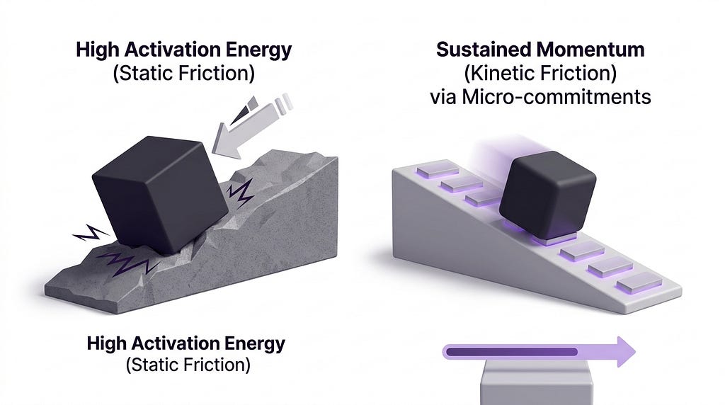
The hardest part of any digital task is overcoming the initial static friction. Designing for micro-commitments keeps the user in a state of kinetic momentum.
Understanding the psychology of the void is only the first step. Executing it in a visual interface is where the real challenge begins.
When you strip away the data, you are left with a very sparse screen. The instinct of most designers is to fill that empty space with something to make it feel less lonely. We add cute illustrations. We add witty copy. We add secondary links. We are terrified of the void, so we decorate it.
But decorating the void does not solve the user’s problem. It just makes the void look prettier.
Over the years, I have categorized almost every empty state in the software industry into one of three archetypes. Understanding these archetypes will completely change how you approach the blank screen.
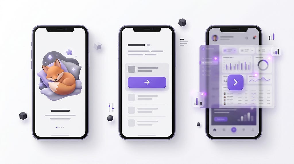
The first archetype is the Decorative Empty State. This is the most common, and unfortunately, the least effective. It features a custom illustration, often slightly abstract or whimsical, accompanied by a short, cheerful message. Something like a drawing of a sleeping cat with the text “Nothing here yet! Go create something.”
The problem with the Decorative Empty State is that it treats the user’s lack of progress as a joke. It acknowledges the emptiness without offering a way out. It is the digital…

 点赞
点赞 收藏
收藏 点踩
点踩 分享
分享