Foam #67, “The Test of Time”

Contributed by Robert Huber
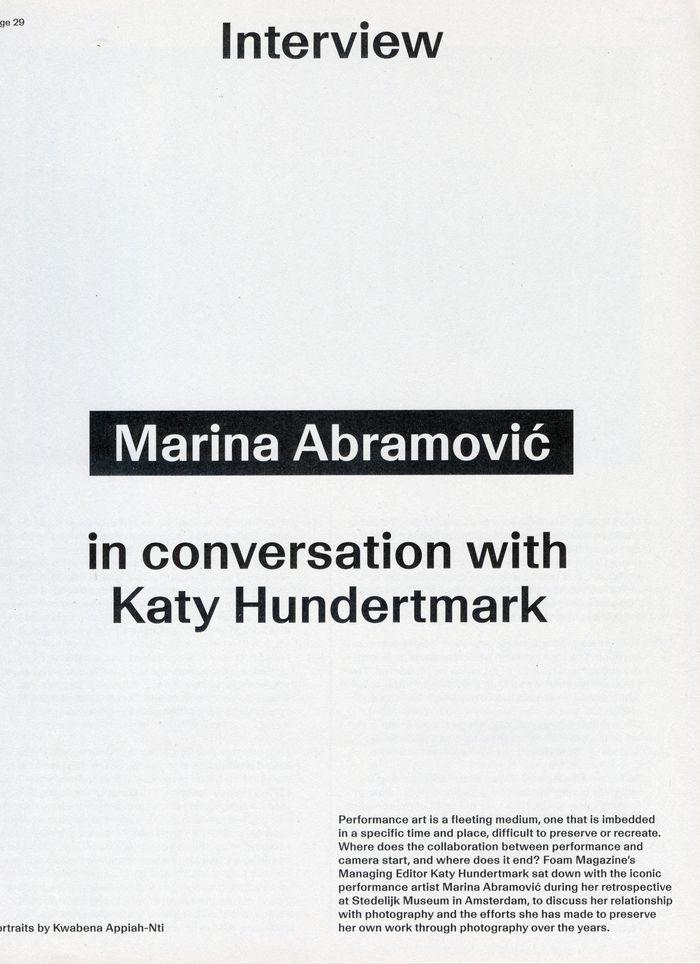
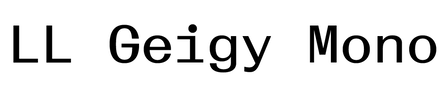
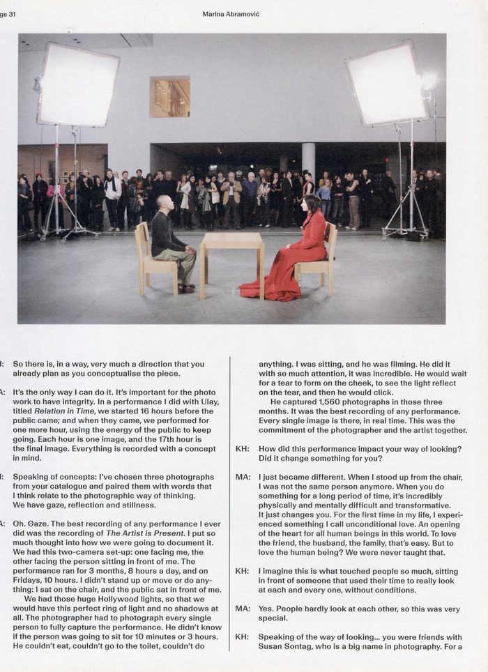
Scans from Foam Magazine #67. License: All Rights Reserved.Issue #67, “The Test of Time”, marks the 2025 redesign of Foam magazine by David Bennewith and Sandra Kassenaar. The publication is set entirely in LL Geigy and LL Geigy Mono, which are used throughout to establish the magazine's typographic system and identity. While LL Geigy serves as the principal typeface for titles and running text, LL Geigy Mono is employed across a range of editorial contexts. The pairing lends the magazine a quiet, systematic rhythm while bringing a distinctive texture and personality through LL Geigy's lively curves and pronounced thick–thin contrast. The result is a consistent typographic framework that complements the photographic work while giving the publication a distinctive editorial voice. The redesign also marks a new editorial format, with Foam becoming an annual print publication.
Scans from Foam Magazine #67. License: All Rights Reserved.
Scans from Foam Magazine #67. License: All Rights Reserved.
Scans from Foam Magazine #67. License: All Rights Reserved.
Scans from Foam Magazine #67. License: All Rights Reserved.
Scans from Foam Magazine #67. License: All Rights Reserved.
Scans from Foam Magazine #67. License: All Rights Reserved.
Scans from Foam Magazine #67. License: All Rights Reserved.
Scans from Foam Magazine #67. License: All Rights Reserved.
Scans from Foam Magazine #67. License: All Rights Reserved.
This post was originally published at Fonts In Use

 点赞
点赞 收藏
收藏 点踩
点踩 分享
分享